The NHL Rebrand series by Elliott Strauss is starting to wind down. This week he tackles the Devils, Wild and Predators. His own comments are in bold text.

 Elliott Strauss Elliott Strauss |
I thought that the old mustard alternate crest had potential to make an interesting primary logo, so I just cleaned it up. A simplified version of the current primary remains as a secondary. I came up with a custom font for the wordmark and numbers, and I'm happy with the way the numbers look on the jerseys.
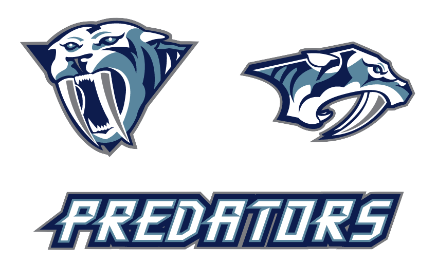
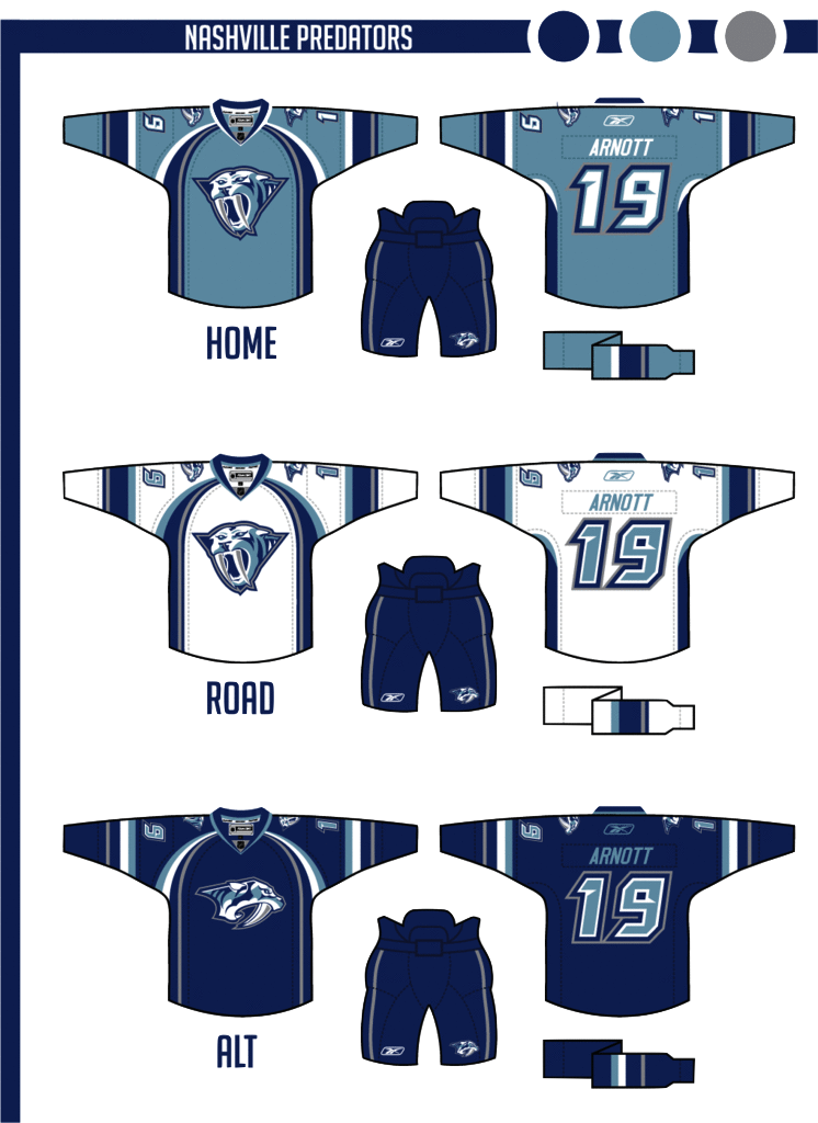
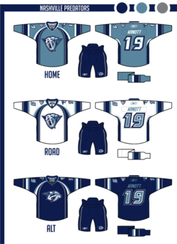
The color scheme keeps navy and silver but adds an icy blue-gray in the place of yellow. The home jersey color of "steel blue" would make a unique addition to the NHL. The alternate slightly modifies the home/away template.
A strong entry here, to be sure. Personally, I never realized what a great logo the Predators' had on that old alternate until Elliott did some work to it. Certainly looks more like a hockey logo now. And overall, this is a really sharp uniform set. I'd by that home jersey in a heartbeat.
|
 Elliott Strauss Elliott Strauss |
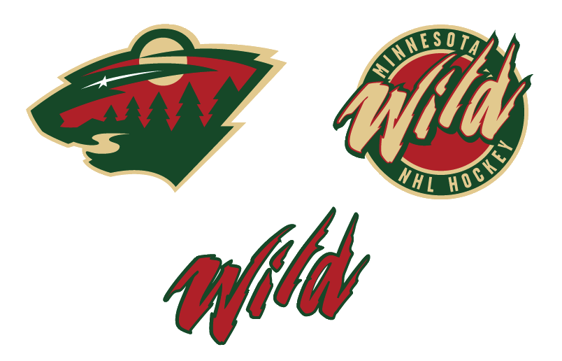
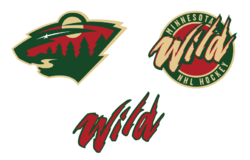
I dropped the two-tone gold thing they have going, the darker yellow is gone, and wheat takes its place. Other than that, the logos stay the same, this is one of my favorite primaries of all time, so I got rid of the circle thing on the primary crest to focus on the awesomeness of this logo.
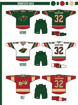
Pretty simple uniforms. No white in the homes, but I think the small amount of wheat really makes the red stand out. Then green has a prominent role in the roads as well. The alternate simplifies things even further. I do like how these uniforms turned out.
Great to see that primary logo back on the front of a green jersey. That's where it belongs. Only thing I don't like about this set is the alternate uniform. I understand what Elliott was going for but the style of that wordmark clashes with the simplicity of the sweater. At least the team got that right for real with the new thirds this year.
|
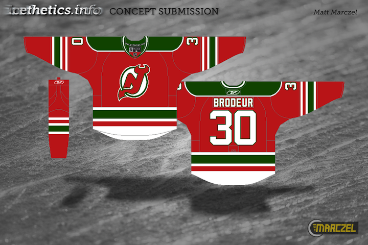
 Elliott Strauss Elliott Strauss |
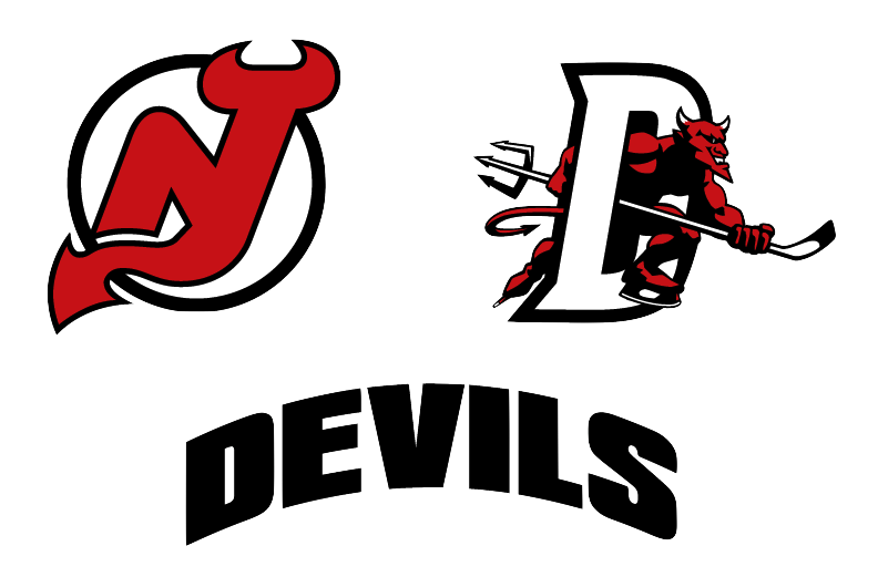
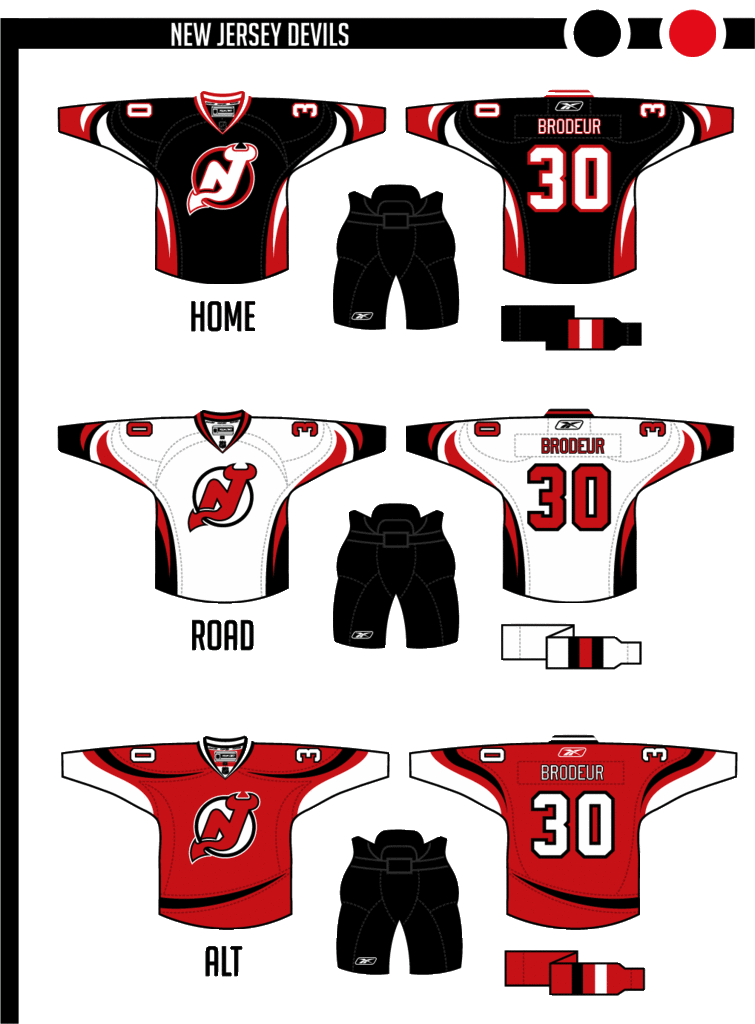
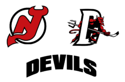
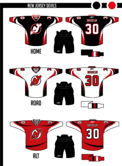
I love what they wear now, but I wanted to try a modernization. I actually made the home jersey black, which is new, and then tried some devil-horn striping. I had to keep a lot of red, so the alternate brings back the red base, with a different take on a modern devil-horn stripe.
The striping on these jerseys is just flat-out cool. The shift back to classic style uniforms means we probably won't get to see anything like this in the NHL for another 15 to 20 years. I also like the secondary logo, borrowed from the AHL's Lowell Devils, but disappointed it didn't make an appearance on the uniforms, not even the shoulders of the alternate.
And if I'm being completely honest in my review, I'm also disappointed that we didn't get a modernization of the logo along with the updated jerseys. The Devils' logo is very clearly a product of the early '80s. That's not necessarily a bad thing, but it seems out of place on the "futuristic" jersey designs. However I do like the re-coloring on the home sweater.
|
One more edition of Elliott's NHL rebrands to come. And by process of elimination, I'm sure you've figured out that the Rangers, Canucks and Blue Jackets are on deck. Spoiler alert: Rangers get the best rebrand!


 Chris
Chris