


What's in a Third?
 19 Comments
Monday is here again. But while you guys are headed back to work or school, I'm probably in a casino wondering what time it is or something like that. Not to rub it in or anything.
Here we are at the fourth of five auto-posts featuring all new concept art from talented Icethetics artists. Today's theme is another fan favorite — third jerseys. Several of you have come up with ideas for alternate sweaters based on what's actually being worn in the league right now. Let's get started.
 Ryan Haslett Ryan Haslett |
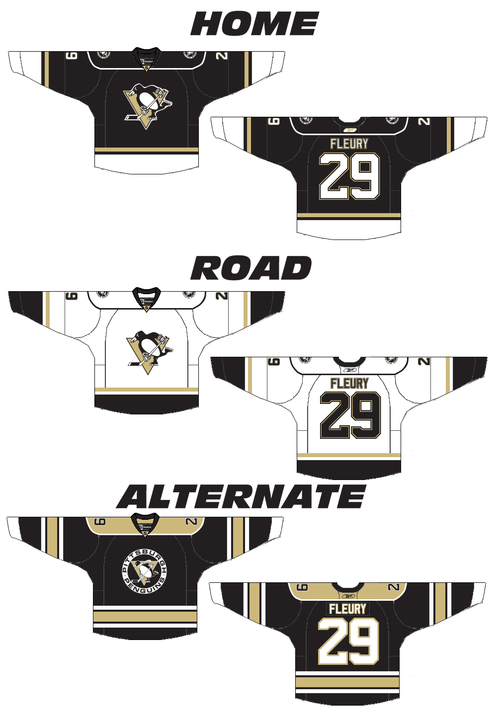
The Pittsburgh Penguins are up first because we're pretty sure they're actually getting a new third jersey next fall. Folks keep saying the powder blue sweater is on its way out. Personally, I think that paves the way for an '80s style third reminiscent of the Mario Lemieux/Jaromir Jagr days, but I digress. Ryan's got a whole new set of jerseys here which includes a black third loosely based on the team's earliest NHL days — sans the blue, of course. But it might suffer from the same problem that Bruins currently have. That being both the home and alternate sweaters are black. One of them needs to be gold (I'm speaking both about the Bruins and Penguins). Gold will solve all their problems. |
 Charles Cadieux Charles Cadieux |
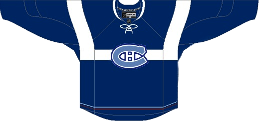
Also in the east, the Canadiens introduced — or should I say re-introduced — a handful of vintage sweaters to celebrate their 100th anniversary. They started last season and continued into this one. One of the favorites was the blue one with the big white C. I believe Charles' attempt was to turn it into a third jersey but putting the classic CH we've all come to know and love, front and center. I'm torn. Part of me likes it because it means this jersey could stick around. But the other part of me says it's just wrong. |
 Brian Brideau Brian Brideau |
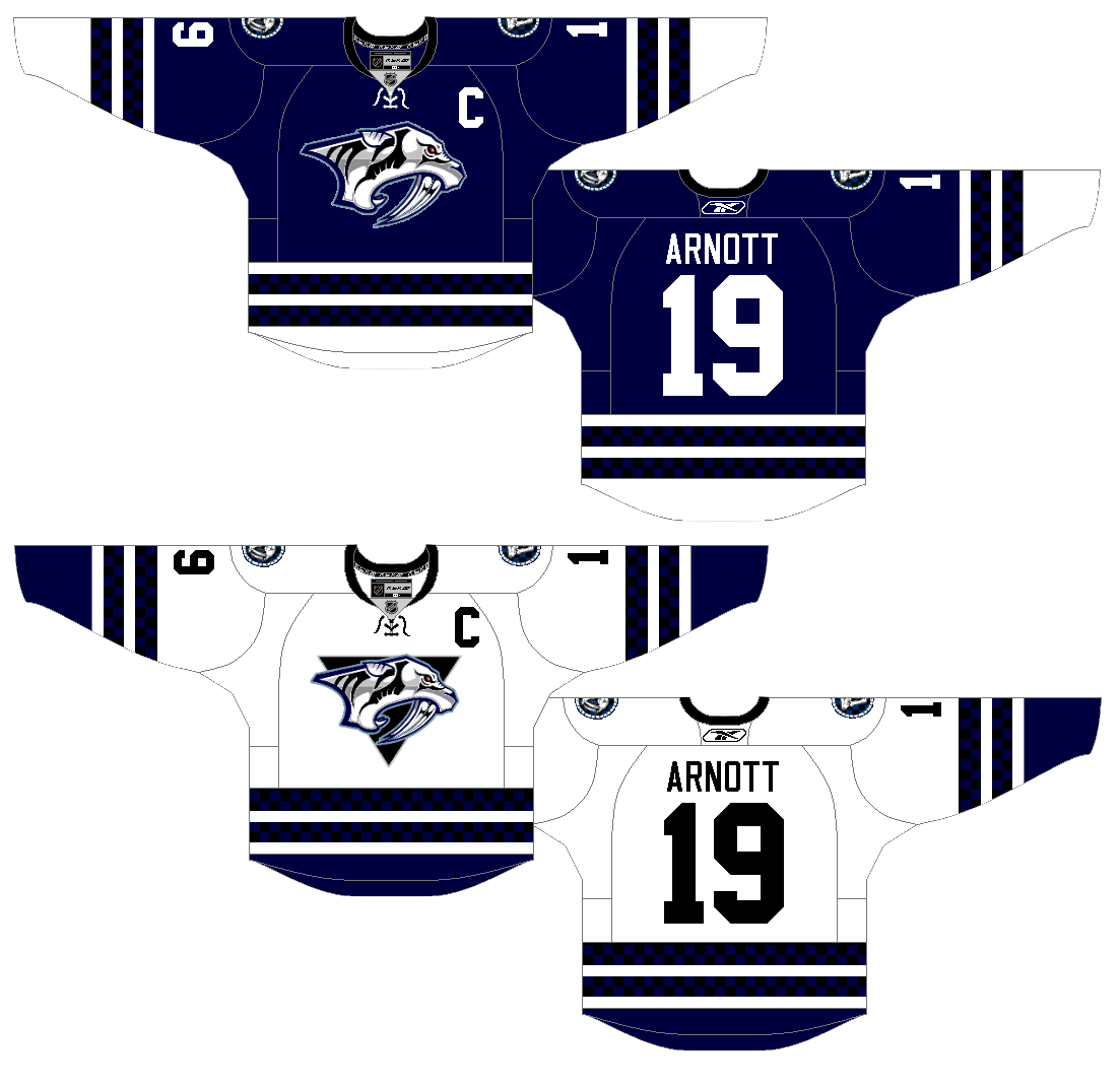
Moving ever westward, we now land in Nashville. The Predators have discussed making wholesale uniform changes to just simplify. Brian, here, thinks they'd be wise to just make a light version of the new third jersey and go with it. He's saved them the extra steps by having already designed it. This is hard not to like and the Preds are in need of some jersey overhauls. This could just be the ticket. The only thing I'm not sure about is the triangle on the white jersey. It's not necessary to making the logo stand out and it actually takes away from the simplicity effort. That aside, these are top notch. |
 Chris Fraterrigo Chris Fraterrigo |
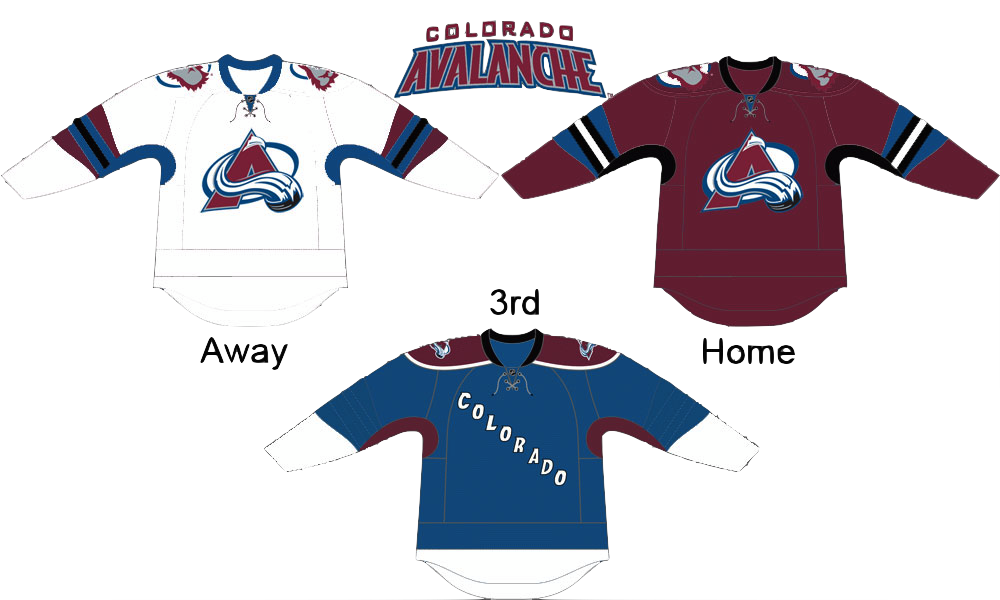
Sticking to the direction of the sunset, Chris Fraterrigo thinks the Avalanche could use a uni redo. And ever since the Age of Reebok was ushered in, I can't say I disagree with him. In this new set, the "modern" striping elements are gone. Instead, the simple striping from the new third jersey is carried over to the home and road shirts. And the alternate here is simplified losing all striping — which actually doesn't hurt it. I'm a big fan of incorporating the black into the burgundy sweater. However it's not done as well on the white one here. Overall, though, a solid look. The only thing I might add is some striping around the bottom — just so it doesn't look like a t-shirt. |
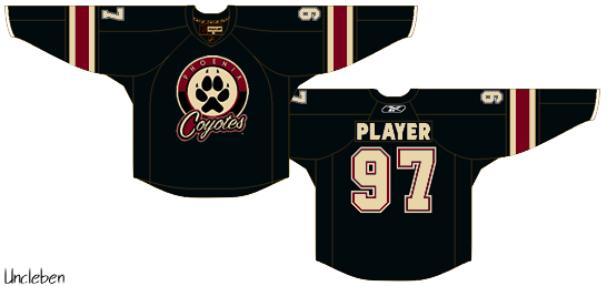 Uncleben Uncleben |
At last we find ourselves as close to the west coast we're going to get today. I think the Coyotes have a pretty decent third as it is and this one may be a little cluttered. Still I'm a big fan of that paw logo and traditional jersey striping. It has its pros and cons. But the largest con is probably the use of the Maple Leafs' lettering and numbering. Huge no-no. But we won't crucify anyone for it. We just don't want to see it on a real Phoenix jersey is all. |
One more auto-post to go! You'll see right here tomorrow morning at 9. But at this point, my concept art reserves are beginning to dwindle. If you've thought at all about dipping your toe into the artistic pool, email your designs to me at icethetics@gmail.com.

Reader Comments (19)
Being a Nashville fan, I think that white Preds sweater is awesome! I would love to see that as a part of the road uniform. I kind of like the triangle behind the logo; it stays consistent with what we've always had on our white jerseys....
On a side note, I'm still not a fan of the "NP" logo on the pants for the 3rds this year...
As another Nashville fan I totally agree with everything stated in Paul's post. That away jersey looks fantastic, but the NP on the pants needs to go away.
Good, all around. That Pens alternate kicks ass. The shade of Vegas gold (since you're in Las Vegas, hehe) contrasts the black so perfectl.
The others are fair. I don't know how I feel about the Coyotes' jerseys, but it looks like too much on the front. Nashville's is nice, Colorado's seems too plain (if there was a way to go back to the pre-Rbk jersey, that'd be nice. Those were perfect.
The Canadiens usually look weird in any color but red. In fact, only the Penguins should be allowed to wear powder blue, as far as I'm concerned. But this actually looks nice.
DAMN THAT WHITE NASHVILLE JERSEY LOOKS SEXY, Maybe without the checkered pattern, but the stripes look pretty awesome. I would hope they switch to those jerseys; much simpler than all the different colours in the current jeresys.
As another Preds fan, with the record we have in those 3rds this year I don't want them next year if it continues to go down South! But signs around the arena and the website all but point to this year's 3rd as the primary next year.
I'm not really a fan of the new Reebok jerseys.. but for some reason, I can't stop looking at those Avalanche concepts. Especially the white one.
FINALLY, a Penguins concept that doesn't make me cringe. Lose the shoulder piping and patches, and we've got a winner.
I'd like the Pens to go back to the triangular-penguin logo. You know the triangle with the penguin head at the middle of the top. I prefered that one to the logo they're currently using, so I'd at least like it to be on their third.
As yet another Preds fan, the white version of the current third is fantastic. I would like to see a hint of yellow in the jersey, maybe yellow and white checkers, or even silver and white checkers to keep it subtle. I agree with Paul in keeping the triangle for consistency in the whites.
DonThemine: I agree with you 100%(though I would like to see the yellow gold brought back) and lose the RBK Edge crap
Jay QC : NO NO NO NO NOOOOOOO Pigeon logo. No to anything that is associated with Howard Baldwin
just sent in a winter classic concept. hope it makes it.
Wonderful job on the Preds whites. I agree, dumb the triangle and use those jerseys for a long, long time.
And I'm betting the pens bring back a different powder blue jersey. The one from their first year would be cool, with the unique bunched up striping. An 80's revival wouldn't surprise me at all though.
Sorry, dump the triangle. I need sleep.
Say no to the yellow gold. Vegas Gold all the way. Let the yellow gold stay with the legacy of the early 90's Penguins and allow this new generation of Penguins forge their identity with Vegas gold.
On the Pansy blue uniforms the triangle is yellow gold. It's not that I don't like vegas gold BUT I like the vegas gold on the uniforms from '02-'07
http://www.nhluniforms.com/Penguins/Thumbnails/Penguins30.png
The so called vegas gold on the RBK Edge crap looks tan/beige
Pittsburgh's colors are Black and Gold(not tan/beige)
This is my favorite Pens uniform of all time
http://www.nhluniforms.com/Penguins/Thumbnails/Penguins21.png
Vegas gold = tan. Drab, drab, drab.
I'm glad that the Penguins are getting rid of their blue jerseys. I was always a fan of the side-view Penguin logo from the 90's and I think it would be cool to see that incorporated into their new alternate uniform.
i find a website which wholesale top quality NFL Jerseys,NHL Jerseys,NBA Jerseys,MLB Jerseys and Soccer Jerseys.if you are interested in it.welcome to visite the site: http://www.nflcheaper.com ,you will have a unexpected surprise.