


Freak Out Friday XLIV
 18 Comments
Happy Friday, all! Right now, I'm on an airplane bound for Las Vegas. This is the first of five auto-posts that should keep you guys occupied with new concept art while I'm off getting married. I've scheduled one for every day that I'm away and each one has its own theme.
Today's theme is an Icethetics fan favorite: Freak Out Friday! For new readers, this was a very popular regular feature of the site when I used to get loads of concept art sent in. Sometimes it would miss the mark — meaning we would never want to actually see it on the ice. Here's what I mean...
 John B John B |
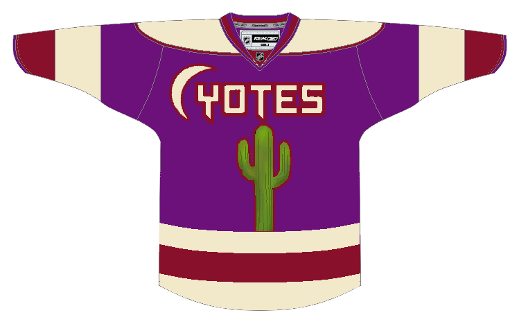
The last time the Coyotes put a cactus on their jersey, it came to us in the form of one incredibly unpopular green third jersey in the late '90s. Unfortunately, this makes no improvements on that. The designer is obviously trying to take a bad page out of the Lightning and Senators' books by running the nickname across the front. Yotes works about as well as Bolts and Sens. And while the sand and brick colors are still used today in the Phoenix color scheme, the purple and green are not. |
 John B John B |
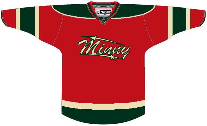
While we're on the subject of colloquialism failures on jerseys, let's add Minny to the list. I think Wild fans would agree there's just no call for it. I don't want to dismiss this design out of hand, though. The striping is pretty nice, if not based somewhat off of Minnesota's current home and former third jersey. The red and beige color combo is one of the best looks in hockey right now. |
 Jules Jules |
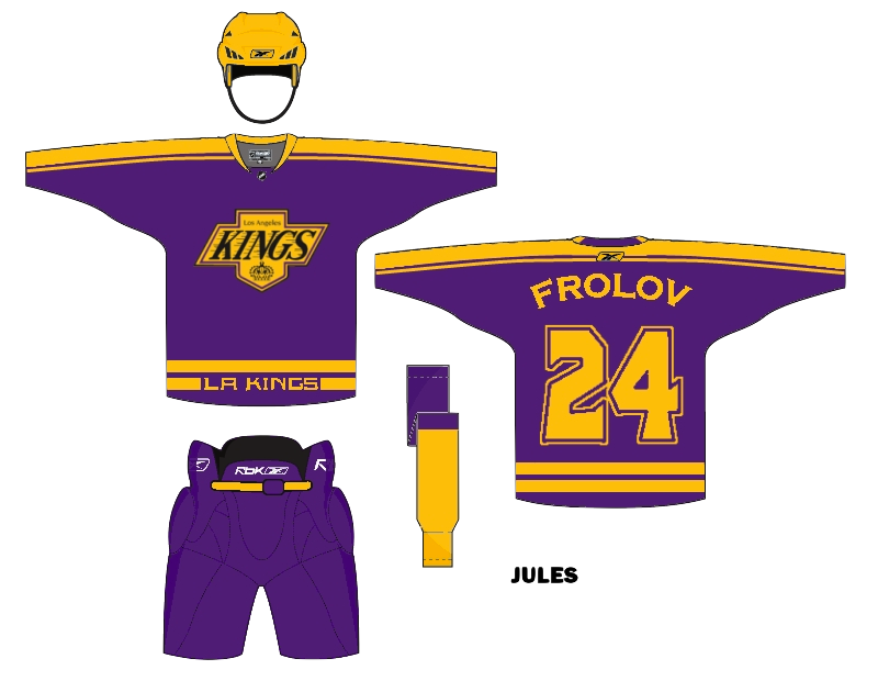
Some of you may not necessarily be freaked out by this idea of a Kings third jersey, but I sure am. It may not be a popular notion, but I think one of the best uniform overhauls in NHL history was when the Kings switched to silver and black. Then they improved upon it by adding the purple back. But at no point do I want to see them wearing yellow on a regular basis again. The only way I could excuse it is for a special night with historical significance as a one-off jersey. But now that I've said my peace, I'm curious what the rest of you think of a return to the '60s color scheme. At least at that time the NHL wasn't overrun with only two colors. Variety is good. |
 Matt McElroy Matt McElroy |
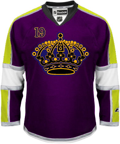
But hopefully we can all agree that such a variety of color on a single jersey is not a plus. A deep purple sweater with neon yellow sleeves and silver accents is in the dictionary next to "ugly." That was harsh, but look, even the purple in the logo doesn't match the purple of the jersey itself. Same with the gold. And that numbering style is not a saving grace either. This jersey design needs to be buried. Deep. |
So while I'm enjoying myself in Vegas, I hope this post freaked you out sufficiently. As I mentioned earlier, there will be new concept art posted right here automatically every day until Tuesday.

Reader Comments (18)
that "minny" script was hard to see. Anyway, I hope you have a great marrige Chris and a great time in Las Vegas as well.
I'd buy that Yotes jersey.
I'm out of firewood and it'd probably burn nice.
congrats on the marriage and thanks for all the new posts!
Is that a cactus on your jersey, or are you happy to see me?
As much as I'd like to like this post..... 50% of the freak out concepts are of my Kings :( The purple and gold is so loved here in Los Angeles, of course since the Lakers are the symbol of greatness in the NBA. I'm on record as saying the early '80s jersey is one of my favorites of all time, with the full arm trim. That's the jersey the piping on the current alternate came from...
...the Kings are a weird team. Only the Canucks surpass them when it comes to crazy uniforms that have no relation from one generation to the other. I'm not sure even they know what they're gonna do. I like the move to black and silver when Gretzky came, and the fact that they brought the purple back with the modernized crown in 1997, but the third jersey last year was their opportunity to bring back the gold and purple, like the fans really want.
PLEASE DO IT!!! I don't know which'll happen first, the Kings will add gold to their uniform, or the Canucks will make their alternate their primary. In the spirit of Las Vegas, let's make a pool.
Also, the Yotes and Minny concepts look extremely similar in striping. Made me wonder if they were done by the same person...... they were. Nice designs, especially the Wild. But as far as I'm concerned, the Kings are the only team that should wear a purple jersey.
I agree with the notion that the overhaul to silver/black was one of the best in league history back in 1988.. but I can't help thinking that a touch of yellow - similar to what the Sharks did with the orange trim - would make their jerseys so much more interesting. As they stand right now, they're dull as dishwater.
Whoa...2 Ian's, this could get complicated...
A tame return of Freak Out Friday, come on everybody, let's get Freak Out Friday back on a regular basis. It's something that I miss from this site.
However, Cactus on shirts? No thank you, I'd rather buy a Flames jersey than see that in the NHL, and I'm an Oilers fan.
The Minny idea isn't way out, and the shirt isn't too bad, it isn't perfect by any means though.
As for the Kings designs, please no!!! We all know how badly Reebok have messed up the shirts as it is, god only knows what they'd do wrong with those colours.
To me, the third that the Kings are currenty rocking is one of the nicest jerseys in all of hockey. They need to make a white version ASAP. As for the purple/yellow vs. black/silver argument, I get that the people of LA like the old color scheme, but the guys on the ice aren't the Lakers. The black and purple they have now is their own identity, which is nice to see when, as Chris said, the league is dominated by red and blue. Personally, I think the Kings should go back to the black and slver full time. It's different, but no one in the NHL has anything like it.
I actually really like that second Kings concept. Just get the colours in the crest and sweater matched up, and change the black on the crown to silver.
Congrats Chris
Wow. I'd say the Phoenix jersey is actually a misspelling of Coyotes (the crescent moon serves as the C) but it's still hideous. As is the second Kings one. The others aren't too bad, though/
Didn't you get married a while ago?
Hi Chris,
I know that you're not a fan of yellow/gold, but I'm afraid that I have to disagree with you and Ian big time. The purple and gold scheme was the TRUE LA Kings identity and was a very underappreciated look due to the Kings' constant on-ice futility. They are the colours of royalty and it's simple and unique. They go as naturally together as Detroit's red and white and Edmonton's blue and orange. ANY team can wear black and white with silver. While I liked the uniforms of the Gretzky era, it was the worst overhaul of a uniform because it took away one of the NHL's unique looks and it started the black uniform domino effect in the 90s. What the Kings could have done is have a purple and white combo with yellow trimming and a yellow uniform as a third. Remember, Team Sweden wears yellow with blue and it's a sharp look.
For everyone's information, the LA Lakers original colours were double blue and white when they moved from Minnesota. The Kings' original crown crest was designed after the Real Madrid soccer club's crest.
I'm glad people are finally realizing that the mysteriously popular word-mark-nickname logos belong in Freak Out Friday and nowhere else.
congrats on your wedding. don't copy the hangover if you don't want to be punched by mike tyson
Haha! No, this one would be the first.
Unfortunately, the use of the "'Yotes" abbreviation next to that crescent moon simply makes it look like poor spelling. And the cactus' placement is just way too phallic to be taken seriously.