


Rebranding the East
 12 Comments
I'm sure I'm enjoying Sin City right about now. And I'm sure you guys are enjoying these daily concept posts. This is the second of five auto-posts and today's theme is rebranding.
Rebranding has become a very popular topic among Icethetics concept artists — giving a complete uniform and logo overhaul to a given team. Sometimes the overhaul is drastic and sometimes it's subtle. But it usually results in something better than which actually exists.


 Robert Giannone Robert Giannone |
We start with Robert Giannone's rebranding of the Philadelphia Flyers. Robert isn't looking to replace the classic P logo so much as give it a nice complement that could be used as a shoulder page, third jersey crest or merchandising mark. He's created an F lettermark based on the P used on the team's old orange alternate sweater. And he's put an awful lot of work and thought into it. He's had patches embroidered and attached to an actual Flyers jersey as well as a cap. They don't look out of place at all. So I'm completely with him — that is until we get to his wordmark. That's where you lose me. That does not say Flyers at all. To me, it says graffiti. But aside from that, I like this logo, and although we've seen versions of it before — and by that I mean this Zephyr X-line hat — it's always nice to see someone putting some effort in. You can see more of Robert's work on his web site. |
 Ryan Broda Ryan Broda |
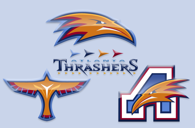
Next, Ryan Broda offers the Atlanta Thrashers a newer look. He's kept the same color scheme and wordmark but has made some adjustments to the other logos — ridding them of the primary mark often ridiculed as looking like a bird stirring itself into a bowl of soup. Ryan's kept the strongest element of that design — the bird head — and has added some additional details to the logos to make it look a little meaner. It's a very sharp concept. |
 Julian Kazmierczak Julian Kazmierczak |
Julian offers us something a little different for the Ottawa Senators. He's decided to drop the gold completely and stick with the black and red which were most prominent when the Sens first existed in the early 20th century and were later revived in 1992. The logo is back-to-basics but the striping may be a bit much. Overall, however, I think he may be on to something. It's simple and isn't that what we've been wanting ever since the beginning of the Age of Reebok? |
 Matt Marczel Matt Marczel |
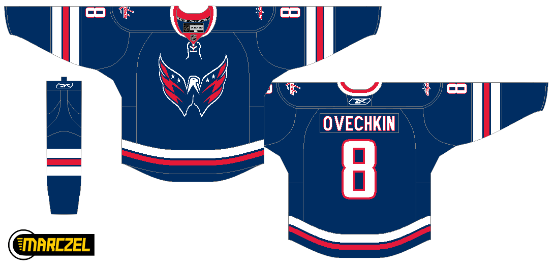
I've got one more item to share today. This comes from the always prolific Matt Marczel. However, Matt hasn't so much rebranded the Capitals here as offered up a third jersey to die for. Every time the topic comes up, we look for ways of getting the Caps into a blue third jersey with the Weagle heavily featured. This does that in the best way. But better yet, I'd vote that this be the primary home jersey. And even if we can't have that, what about putting the Weagle on the front of the red jersey? The Capitals have a brilliant logo here and it seems to just be going to waste. |
Excellent work by all of these artists. They should be proud. And you should come back tomorrow for more concept art.

Reader Comments (12)
Everyone assumes that will be the Caps third jersey design when they get to it, but with all the effort put into the "rock the red" campaign, I doubt they'll go with blue. What I'd like to see is that same design but on a red jersey, except not the bright red of the current homes, but a deeper burgundy red. I have no graphic design skills - could someone try to give that a go?
Also digging the nod to the Atlanta Flames on the Thrash concept.
The thing I like about the Thrashers rebranding, in particular, is how the "A" recalls the old Atlanta Flames logo. And I agree - the Weagle is definitely underused by the Capitals.
Except a deep red isn't part of the Caps' color scheme. People assume it'll be a blue jersey because their colors are red, white, and blue. Not to mention it looks awesome. Marketing schemes change, and they're not putting out a third jersey this year anyway. By the time they do, why not rock the red, white, and blue?
Even better if there was some super awesome planning going on and fans manage to get the lower bowl wearing jerseys in the proper spots to make the American flag. That'd be beyond epic...
Where's Matt ghettoboy?
Cool third jersey for the Caps, but there's no way they're replacing their home uniforms The red re-branding of the Caps is the second biggest reason for their newfound life in the DC sports market, only after Alex Ovechkin. Switching home colors would be insanity. Even wearing blue for six home dates a year would be a major move, and one that the Caps clearly aren't yet ready to make.
Notice how I added the little stars to the wings of the Weagle on the Caps third concept? I thought this little detail made the logo stand out a little better against the dark blue on the jersey. The logo itself is definately one of my favorites.
I have dozens of different designs for other NHL teams which I have recently completed, and will include them in the public portfolio which I am currently working on putting together. Thank you Chis for displaying my work on your awsome site.
I agree with Arturu, the Caps look fantastic in their traditional red. Even with the Weagle, the blue look would just remind me of those dismal blue and black 90s monstrosities.
Thanks for putting up the Thrash logos Chris, Congrats on the Wedding.
I'm currently making some concept jerseys for the thrashers amongst other things. Hopefully i can finish them and get them up soonish.
Thanks for the input guys, This is the best Hockey Jersey and Logo Site on the net!!!
For the other concepts,
I would like to see the caps try a blue third with the primary Capitals mark. I know word marks aren't that cool at times but i think its pretty slick and they have done a nice job reinventing the old. I guess i'm probably in the minority of not really being a big fan of the "weagle" atleast as a primary logo. Looks great as a shoulder patch. I do like the overall jersey design though.
I love that the Sens concept dropped the gold. I would love to see and hopefully ill get to it soon enough. A senators updated version of there original jerseys. Something about the Black jersey with just the red stripes on the sleeve really makes me happy. I like the logo but think it needs a bit more to it. it feels a bit basic and again maybe more suited for a shoulder patch. As its another take of a circular wordmark that seems to be taking over the nhl these days with logo designs. Although i know there current one is similar
Anyways this site is incredible, even the freak out fridays give great inspiration!
I work for an NHL team in the Pacific division and the Caps were just visiting. I will tell you that the "Weagle" logo is used prominently in their locker rooms (door magnet, signs, carpets). I'm sure the team is planning on incorporating it more if it is a symbol that the players recognize just as much as their primary.
The Capitals use the shoulder logo for just about everything except the primary - which is awesome by me, because it isn't a primary. It looks really weird that blown up.
love the caps jersey!!
the flyers logo is pretty cool too.
but i agree with Chris about the graffiti looking wordmark, it just doesnt look like something for a hockey team, i like how he incorporated thier current logo into the R in the wordmark tho.
I never thought that the Thrashers should have changed their logo and color scheme in the first place. Their yellow, red, and dark blue uniforms are far better then the powder blue ones they have now and I loved their old logo with the view of the bird from above.
I like the winged-F Flyers logo as a shoulder patch, but I don't like the 3-D effect that was put on it. I hated that alternate jersey the Flyers used to have and I hated the 3-D logo even more.