


Quebec, Conceptually
 13 Comments
Last week, fans rallied to bring the NHL back to Quebec City. So let's look at some Quebec Nordiques concept art this afternoon.
 Brendan Anderson Brendan Anderson |
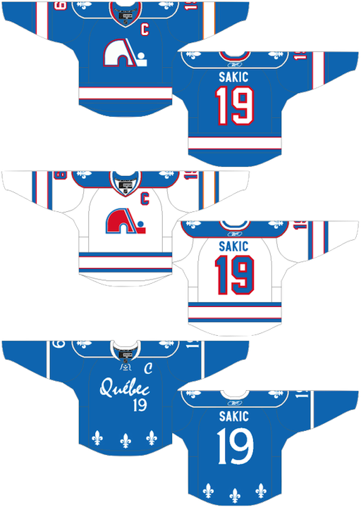
Brendan kicks things off with a rather traditional blast from the past. That is, until you get to the alternate jersey. The Nordiques missed the NHL Third Jersey Program by a year but I'm not sure they would've gone with a number on the front. Still, I don't think anybody in Quebec would complain if it meant getting their team back. |
  Peter Debay Peter Debay |
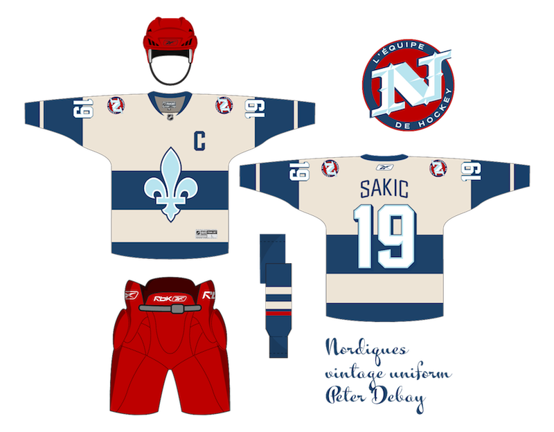
We get a completely new direction from Peter. Rather than the classic logo with its subtle NQ, we here's a lowercase q made out of a distorted hockey stick. The one I really like, however, is the vintage design with its retro striping and crest design. That would be a nice looking hockey sweater — even with the red helmet and pants. |
  Scot McCormack Scot McCormack |
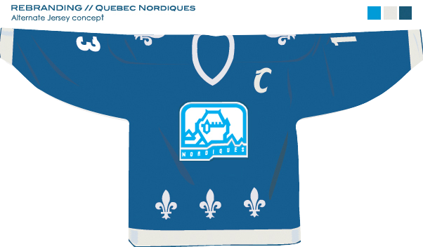
Scot also tried his hand at new Nordiques logos. The jersey remains mostly unchanged. Personally, I'm not as big a fan of this set as the previous one and I think that's because of the difference in creativity levels. I think if fans had their pick, they'd go with more of a retro style to the uniforms. |
 Jack Martineau Jack Martineau |
And just for the heck of it, I thought we'd toss in an Avalanche concept. After all, they used to be the Nordiques. With his design, Jack is bringing back the abstract mountain at the base of the jersey. Personally, I'd love to see the mountain range that used to be on the sleeves. I think more than any other team, the Avs were ruined by Reebok. This helps, but it's just not what it could be. |
Email in your concept art and it may well find its way onto this very page.

Reader Comments (13)
The white version of the Nordiques' logo never looked quite right to me... too much negative space. Although I love the fleur-de-lis. That's the perfect logo for a team based in Quebec, which is why it was thrown all across the jersey.
Oh, and love the Avs concept. They were weird, because at one point, they darkened the shades of their colors. Not sure why, but I always liked the brighter hues. I don't like everybody going to darker colors; I think every league needs a bit of diversity, and the Avs were unique in their scheme. Nobody was anything like that, and the logo is as perfect as can be.
Brendan's concept is excellent. I love it. I also love the designs by Peter. I would love to see those beige jerseys come to life.
I am a huge Avs fan, but of course I had a soft spot for the Nordiques.
The Avs concept I'm not too crazy about though.
Fact is, Nords had the best logo ever (ok, might have to fight it out with the Whalers) and one of the best jerseys, so no need to really change anything if they return. I do like the blue shoulders on the first concept though. That's going serious WHA old school.
Scot's logo is a clip art wolf. Literally. Sportslogos found it I think.
Love both the top concepts, the one by Scot leaves a lot to be desired. Avs concept is pretty good. However, I disagree with one thing. The Stars might've been even more ruined by the Edge move. Even more than the Avs, Tie for most screwed? I think so.
I love the Nordiques concepts. However, I prefer keeping the Nords' crest red on the blues as on the whites. When the Nords make their return, all they have to do is wear what they had before they left Quebec.
As for the Avalanche, it's time to have a traditional-looking uniform. The A-Mountain crest is awesome. Always has been. However, why not have an all-maroon look? Remove the black from the uniforms. Like the Kings' all vintage purple look and the Nordiques' all powder blue look. With blue trimming, a small touch of silver, and use block-style numerals. Not gaudy and tacky numerals. Whenever I see Colorado play arch-rival Detroit, I see a battle between a classic look and an overly busy look.
brendans concepts are the best in my opinion. the only thing he should change is the logo color on the blue jersey. it should be red with white trim. other than that his are awesome. specially the 3rd. and the blue shoulder yolk on the white looks great. they shouldve had it years ago
"I think more than any other team, the Avs were ruined by Reebok." ---- Couldn't agree more
Sincerely,
Avs fans
peter's vintage with brendan's home and away. build the arena already
http://cgi.ebay.ca/Non-Issued-1995-96-Quebec-Nordiques-Joe-Sakic-jersey-52-/140474780675?pt=U_Hockey_Fan_Shop&hash=item20b4f30c03
these look sharp imo
Brendans design's make me wish the nordiques would come back to the league along with the other lost teams at least the canadien one's and Hartford with the full boat green and white jersey's for good measure!
Can we please get a new concepts post asap??? I know the author's been away, but there must be a crazy back-log of artwork. I'd settle for a link-dump
If the Quebec Nordiques return to the NHL, I think they should use Brendan's concept. The blue home uniforms definitely pay homage to their WHA days.