


Fixing the Whale Fail
In a recent blog post about the miserable failure that is the branding of the AHL's Connecticut Whale, I put out the call for Icethetics concept artists to improve it. Here's what they came up with.
 Jayde Garrow Jayde Garrow
In a concept first posted back in September after we learned what the team's new name would be, Jayde Garrow took the best if not most obvious route with his design. Quite simply, bring back the classic Hartford Whalers logo but with a unique spin. |
 Christian Ryder Christian Ryder
Working on the same theme as Jayde, Christian Ryder elaborated with new style for the tale and a pair of uniforms. Thought the use of the Canucks font for the wordmark was an interesting choice, but I guess the teams do share the same color scheme. |
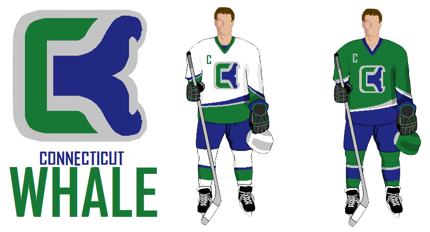
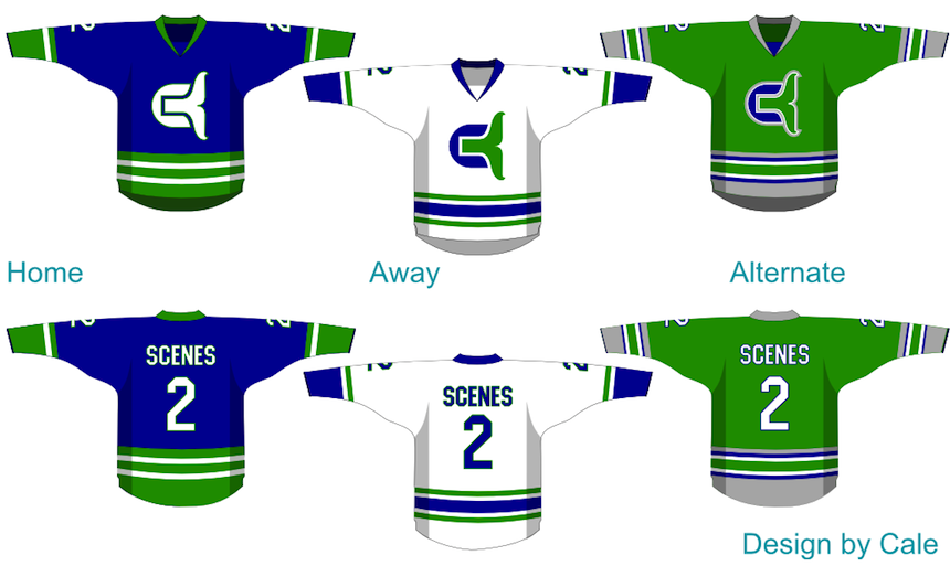 Cale Putnam Cale Putnam
Do you see a pattern forming here? The clearest solution seems to be play on the old Whalers logo. And it's not as though it's never been done. The Binghamton Whalers merely turned the Hartford logo on its side back in the day. But I digress. Cale Putnam brings us a full uniform set with his concept. Perhaps the best part is the Whalers-inspired striping on the green alternate sweater. And overall, I have absolutely nothing to complain about here. |
 Joshua Heckman Joshua Heckman
It appears Joshua Heckman was on the same track as most everyone else. But I can't help but feel like he took a wrong turn in getting there. I understand the use of the Whalers' W, but I'm not sure about the protrusion beneath it. Don't know what that's supposed to be. |
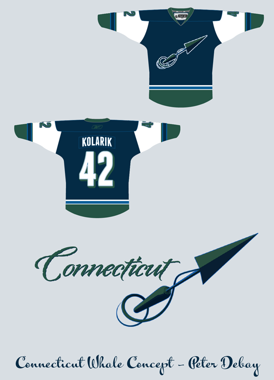
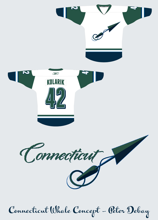 Peter Debay Peter Debay
And finally, for something entirely different, Peter has gone with an entirely new approach that is a little ironic. His symbol for a team called the Whale is a harpoon — the very item used to kill whales. Hmm. Still, it's clear he's taking his inspiration from the old New England team from the WHA, as he points out himself. I'm just not sure it would be received any better than what the team actually used. But I'm often wrong. |
What do the rest of you think? Are any of these the way to go or is the Whale better off with what they have? Weigh in, and if you have a concept of your own, email it in and I'll add it to this post.
 Chris
Chris
Still taking Connecticut Whale concept art if you've got any improvements.
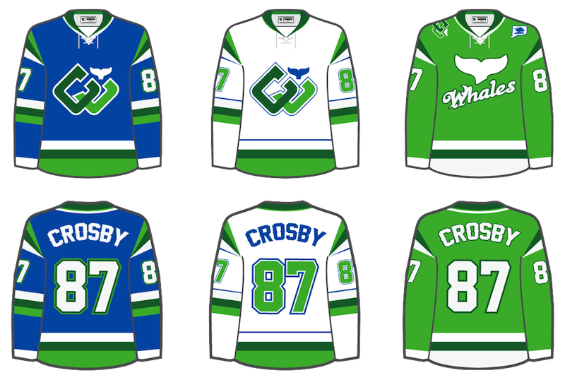 Benoit Lacaille Benoit Lacaille
Benoit sent in his own fix. It's got originality and bright colors. How can hockey fans not like it? He's brought a unique look with an homage to the past, a description that might also apply to the real Whale logo, but the difference is his actually looks good. And the two-tone green jersey? Yes, please! |
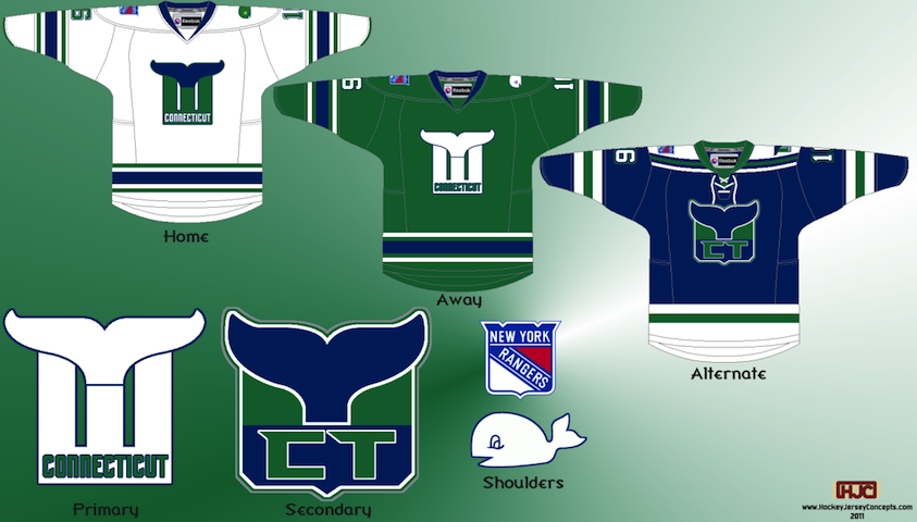 Ryan Haslett Ryan Haslett
Ryan took the Hartford Whalers concept and customized it a big for Connecticut. Then he went a step further by fusing it with the logo of the Whale's NHL affiliate, the New York Rangers. The result is actually pretty cool. Added Jan. 10 at 1:01 AM |
Again, keep the concepts coming. I'll have more posted soon.

Reader Comments (14)
I really like the muted color scheme and wordmark on Peter's concept. Fits the area perfectly. I figured most folks (including myself) would go for an edit of the traditional Whalers logo - a lot of the warm fuzzies about the team are because the logo was so perfect, and it would have made sense for the Whale to use some modification of it.
Maybe someone can make the "C" on a sideways version a little rounder, so it stands out a bit more and looks less like a bracket?
As for Joshua's concept, it's gotta be a "t" for Connecticut (CT). May be a little much, but I like the creativity.
Concepts? Really? NO WAY!!!
Just to let you guys know the NHL requested back in September that they don't like the name Whalers being used as a team hence the "Whale" Also recently with the uniforms the NHL asked that no more green to be used in the color scheme hence why you see baby blue instead of green.
Voting on the Whale... i think they are all better than the crap they have now, but Peter Debay's is by far the greatest logo.
Ed,
I'm intrigued by your post, do you have a source? Why would the NHL care about the color green?
On Benoit's concept, for his third jersey on the shoulder... im guessing that's the state of Connecticut, but whats the blue thing inside of it?
Definitely like his design!!!!
In my opinion, nothing will improve this teams image until they make "Whale" plural.
"Ladies and gentleman, here come your Connecticut Whale"
Thank you team for the new meaning of FAIL Whale.
That secondary jersey and logo from Ryan is really sharp. Nice Work!
I am also interested in where Ed gets his NHL information. Why would the NHL care or have a say about the colour, or a name of the franchise? Maybe I am just naive, but I would appreciate some basis for Ed's claim that somehow the NHL is indirectly responsible for ill fated Whale name and colour scheme.
I'd love to see Ryan's green jersey modified to include Benoit's two-tone green colour scheme
The team was originally supposed to be named the Connecticut Whalers and there are logo's and wordmarks floating around out there. The NHL is trying to continue it's stranglehold on Whalers apparel considering it's the 2nd best selling merchandise in the NHL. If the name was Whalers with familiar colors that could potentially cut into their slice of the Whalers pie. And not to be rude, but all these concepts suck, I'm sorry.
The shoulder patch on Benoit's looks to be the Charter Oak inside the Connecticut shape. Pretty innovative idea there.