


Midwest Modifications
 14 Comments
It's Super Bowl Sunday so that means a super-sized concept post. (Also I haven't put up anything new since Wednesday, so I owe you.) Normally I'd make the big game the theme, but as there are no NHL franchises in Indiana or Louisiana, we'll have to settle for the Central Division.
 Matt Marczel Matt Marczel |
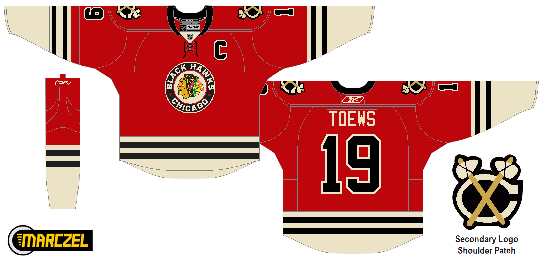
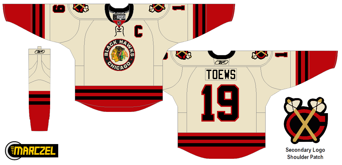
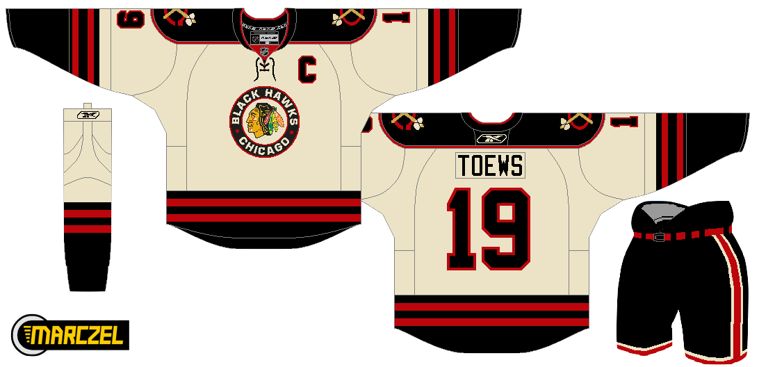
Lately, I've been seeing a lot of great Blackhawks concept art. This one has to be one of my favorites. Matt has ditched white for "vintage white" and it's made all the difference. I love the color combination and the use of color in this uniform set. He's got home/road/third jersey, in that order, and I have to say the third may be the best. If that was ever a real NHL sweater, I'd buy it in a heartbeat. No question. Very nice work here, Matt! |
 Brad McPelican Brad McPelican |
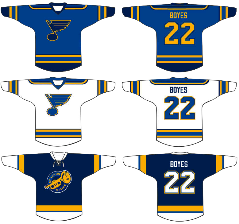
One thing you don't seen an awful lot of in hockey is striped shoulder yokes, the assumption being that it would look terrible. I think this design proves the opposite. I think Brad's design is a winner right up until the third jersey. I just don't think that trumpet logo ever worked for the Blues. Just wasn't meant to be. I think the Blue Note represents the club much better than a literal logo. So what about the third jersey then? |
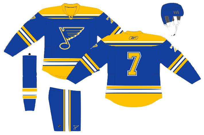 Mike Bell Mike Bell |
Mike has this to offer and I think he hit the nail on the head. Throwbacks work for some teams and not others. For example, it was bad news for the Flyers at the Winter Classic but good news for the Blackhawks at the Winter Classic. The Blues would look great in those vintage colors and stylings. All we need is that nameplate. |
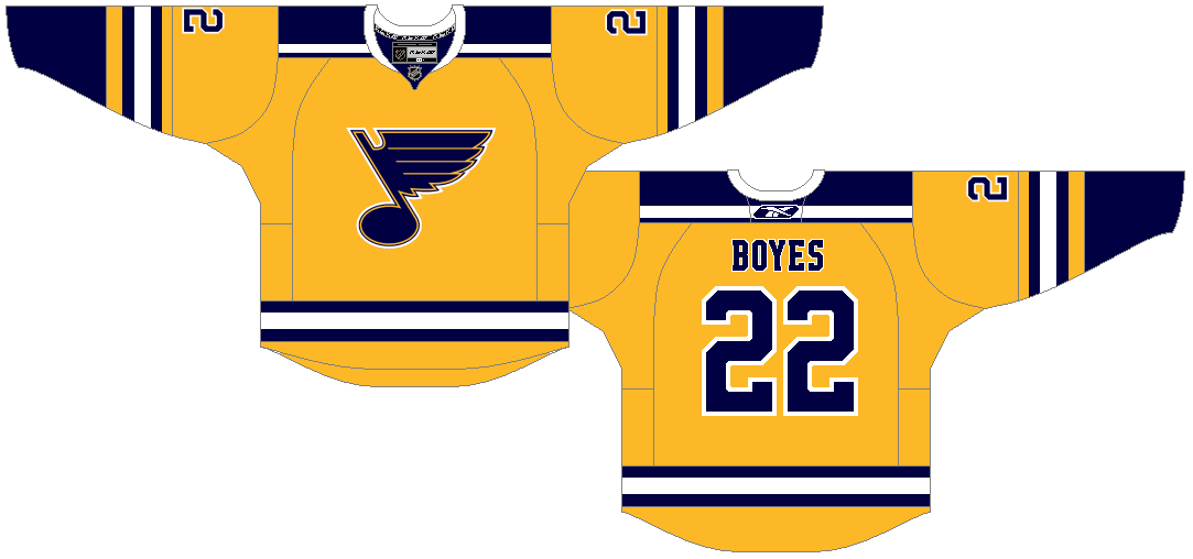 Ryan Haslett Ryan Haslett |
But if your idea of a third jersey is something completely different, Ryan has the answer. I didn't think I'd like a gold Blues jersey. This has changed my mind. Great colors and striping. That is a hockey sweater. |
 Jeff Kennedy Jeff Kennedy |
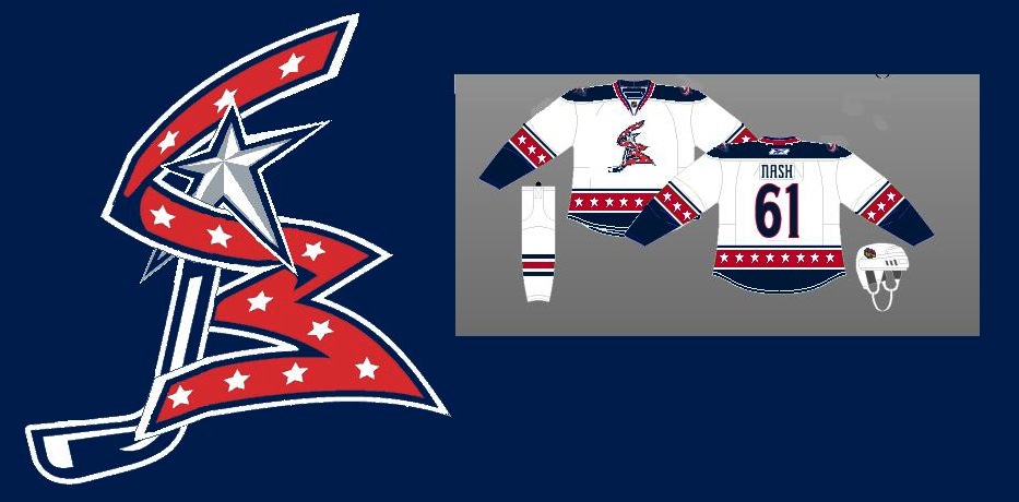
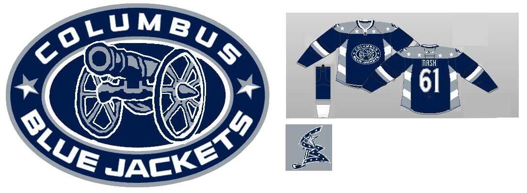
One team that has struggled with their identity for the last decade — no, not the Canucks — is the Blue Jackets. I think they've finally settled on a good solid look. So that's a plus. What they don't have yet is a third jersey, so Jeff has taken it upon himself to put forth a couple ideas. They're certainly unique, but I'm not sure I'm sold on these. |
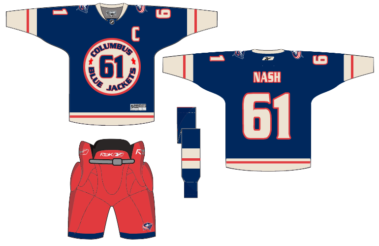 Josh Gagnon Josh Gagnon |
So how about this one? Many of you will say you don't like the sweater number on the front, but it is presented in a unique way. However, I'm not sure the vintage white works with such bright shades of blue and red. Maybe something a bit muted. To be sure, the last thing the Jackets need is to introduce yet another new jersey logo. So we'll just wait and see if 2010-11 is the year the alternate uniform returns to Ohio's capital. |
 Ryan Haslett Ryan Haslett |
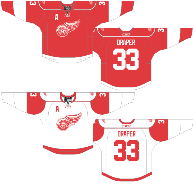
We can't leave out the winningest team in the Central Division. Ryan's made some minor changes to the Red Wings' unis. Not sure about the shoulder piping or the repetition of the winged wheel, but the rest of the striping works. |
 Matt McElroy Matt McElroy |
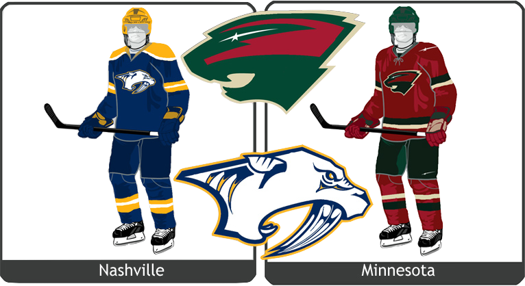
We'll finish off the division with the Predators. Actually, Matt has given us simplified jerseys and primary logos for both the Preds and the Wild. It sort of works for the Wild, but the saber-toothed tiger just looks washed out. And the jerseys may be a little too simple. But let this final graphic today serve as a bit of foreshadowing to the next concept post. |
I'll have new artwork up in a day or two featuring the self-proclaimed State of Hockey.

Reader Comments (14)
I think simplifying the Wild logo takes away from the cleverness of the original. The bear going one way and the forest with the river, trees and night sky the other way is genius.
I agree entirely with Jared, the Wild logo is one of the best in my opinion because of the "Illusion" it presents you, the wilderness scene and the bear. Don't mess with that.
Really really like the yellow Blues alt though.
On the CBJ concepts - the cannon logo setup can probably be saved if you just get rid of the strange stripe pattern down along the sides, and put in the Star And Flag as the shoulder logo. As for the new take on the ribbon... well, it's better than the original, but that doesn't say much. ;)
Also, those St. Louis concepts are sexxeh and beautiful and I want to see them on the ice right now.
The CBJ emblem looks fabulous. Now I wish they would have used that design back in 2000 when the club was born. However, I have to disagree with the stars around the bottom. It looks just like what was applied to Washington (See Strauss rebrand 1). But nicely done reworking the original look, and thank you dearly for not including that god-awful green color or the bug.
Bottom cream and black Hawks treatment is one of the better ones I've seen... I like and have always liked the blackhawks jerseys as is... I'm from Chicago, what do you expect... but these are pretty cool...
Loving the first two CHI concepts, real vintage looking.
Hate the changes to the Minny logo. It's one of my favourite logos, and to see it stripped down to that is rather unfortunate.
If that bottom Hawks jersey was the official "away", the current black 3rd stayed the 3rd and the current red was kept, you'd pretty much have the best set of Blackhawks jerseys ever made.
If any team would benefit from that (what the material people call) "Antique White", it might be the Leafs. There's a good way to add a different colour and evoke feelings of a bygone era (hey, lay off... the Hawks are in the same boat). Despite winning quite recently, it might work for the other two-tone team in the league, the Wings. Take the white jersey above, make it Antique White, slap any C's or A's into a red diamond on the left side, and you're away!
I'm a fan of the stripe around the yoke, too; it really works on the top St. Louis one. The yellow jersey is okay, but I much prefer that beautiful blue on the one above it. Classic jersey. I wish they'd made the 3rd jersey with the dark blue and the cool logo with the arch, but used that striping scheme of the 1967 jerseys. Hmm... enter new project...
I like the "cannon" CBJ 3rd everytime I look at it. The Union Blue + Gunmetal Gray... the stars on the yoke. LOVE IT!
I love the Blue Jackets one with the numbers on the front. Very well done... espeically since I'm not usually a fan of having numbers there. All three Blues alternates are really nice, as well.
the third jersey in the blackhawks concept looks similar to what Ottawa wore when they rejoined the league in the 90s. i like it
One of the best and most solid concept posts in a while! Loved nearly all of it!
they're the Blues....regardless of the meaning of the name having a team called the blues dressed in yellow seems a bit wrong no? but i guess having a team nicknamed the "reds" dressed in black or blue is just as odd looks at liverpool
It's very lazy and boring to simply re-color a jersey and call it something new. I want to see creativity and originality. I could maybe forgive it if it looked remotely good, but it doesn't. It's an awesome and original look for the Bruins, but lazy and bad for the Blues.
I like the Jackets Cannon logo (cleaned up a bit), but I'm not a fan of the re-arranged ribbon, or the number on the front. It looks like Porky Pig is going to bust out of it with a "That's All Folks!"
That Blackhawks concept looks SOOOOO vintage. That's what I love in these throwback unis. Those are off the charts!!!
Blues jersey looks great too. I love the first, and while I love their current jerseys, I think they need more gold.