


Strauss NHL Rebrand VII
 31 Comments
This is the Strauss NHL Rebrand series, Part 7 of 10, in which graphic designer and hockey fan Elliott Strauss gives a makeover to the National Hockey League. If you're new to this series, I highly recommend catching up on the first 18 teams to which he's given new looks.
Now we move on to his latest updates, which include the Senators, Sharks and Islanders. Elliott has provides commentary on his work in bold text.
 Elliott Strauss Elliott Strauss |
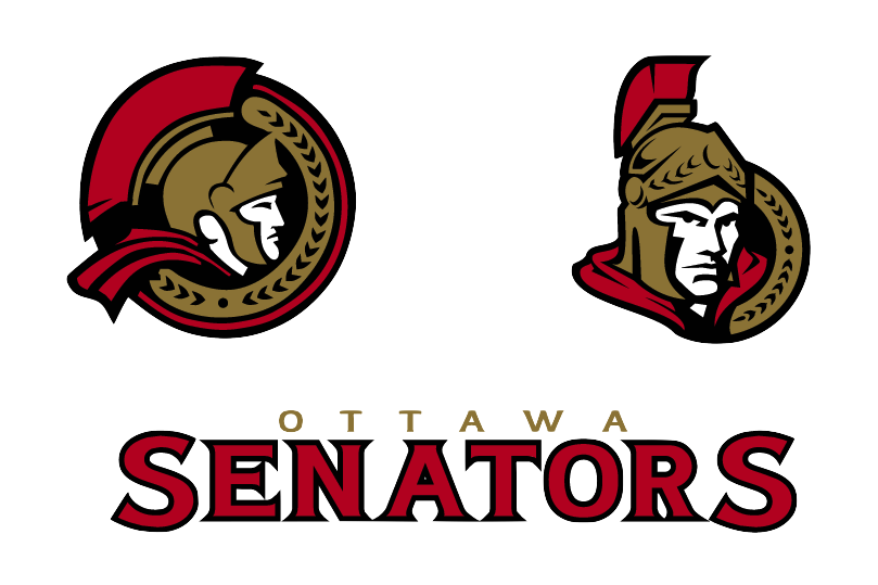
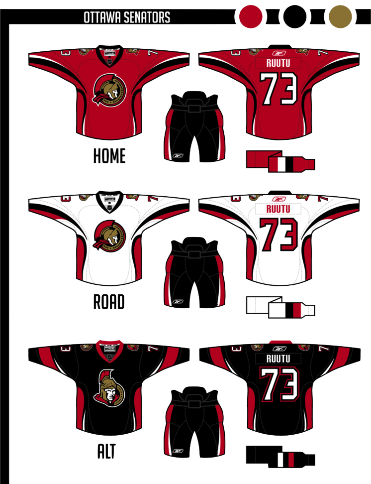
Not much change in the logos here, but the vegas gold returns in favor of yellow. This is one of my most modern uniforms designs. Number font is custom. The alternate keeps the same side/hem design as the home/away, but adds a new arm striping scheme to match, and the pants still match up on the sides. Definitely looking at a unique uniform design here. The striping is unlike anything we've seen ever — in real life or in concept. I'm rather liberal when it comes to concept designs. I like things you don't often see. But personally this strikes me as a tad disjointed, mixing what I'd consider a classic-looking logo with a very non-classic sweater design. That being said I'm a huge fan of this 2D Sens logo and I wish we could see it on a uniform one of these days. I'd even prefer it to the vintage "O" jersey that's been talked about. But that's just my opinion. |
 Elliott Strauss Elliott Strauss |
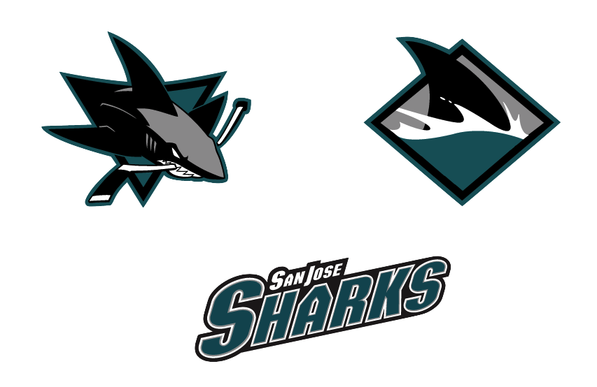
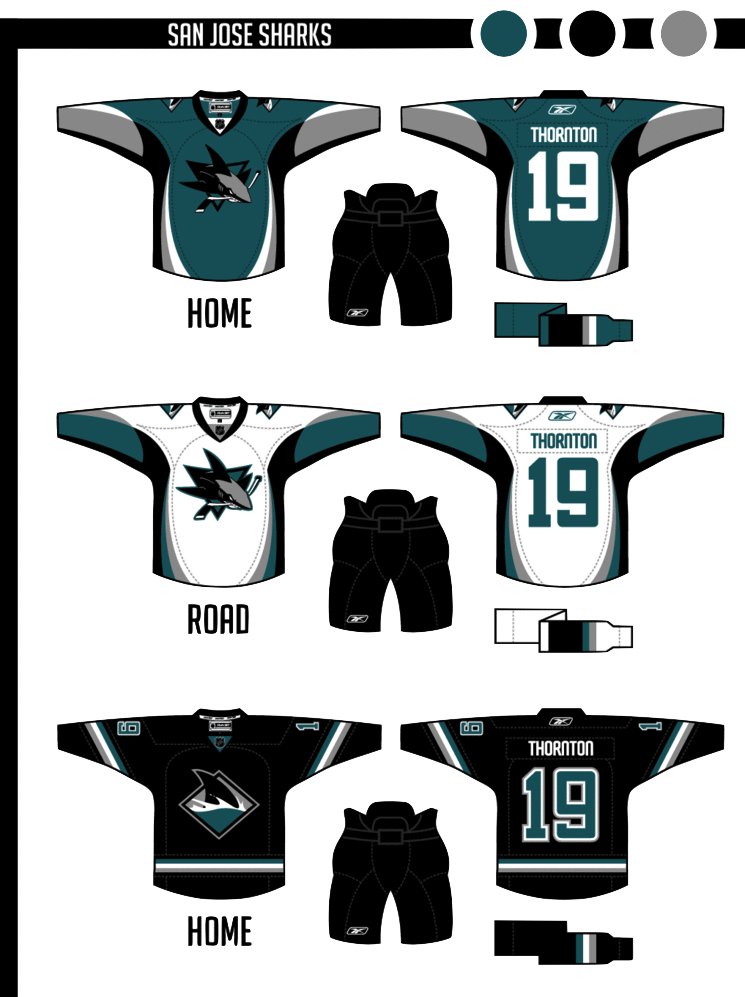
The colors return to teal-black-silver, and orange is out. I modified both primary and secondary logos, simplifying in some places, dropping the fade on the patch logo. The shark fin-based striping pattern on the sleeves is somewhat subtle. The uniforms are modern and busy, but I think they'd look decent on the ice. The alternate is based on the diagonal stripes they use on the black alternate currently. Burnt orange has always been part of the Sharks' color scheme but was introduced as a uniform accent in 2007. While I like that look, Elliott has certainly taken the Sharks' identity to the next level by losing it. And the only the critique I have is that the crest could probably use a white stroke on the home sweater so as to add some contrast. Otherwise, a great update to a team that's always had a distinctive identity. |
 Elliott Strauss Elliott Strauss |
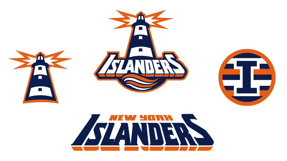
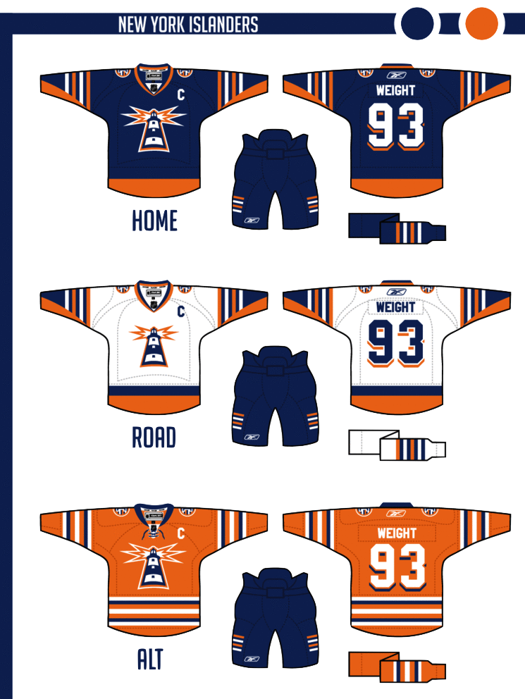
This might be my favorite of the series. I took the fisherman era wordmark and swooshy wave from the primary logo. The lighthouse is original and takes the perspective of the wordmark. The four-stripe motif stays on the patch logo and on the arms of the home and away. The numbers continue the drop-shadow from the wordmark. Finally, an orange alternate uses a more classic stripe scheme. In one of the biggest revamps of the series, Elliott digs into the Isles' past to find an incredible look hidden within one of the most despised designs in sports logo history. He calls this his favorite of the series and I'm inclined to agree. And it's about time for the Isles to ditch their '70s-era logo anyway. |
Working on more concept posts for this week. Tons of great artwork coming in that I can't wait to share with you guys!

Reader Comments (31)
his senators design is probably the best yet. it looks plausible.
i dont think the sweater design is out there at all. both colorado and st.louis had more bizarre jersey designs
the islanders design is out there - although its still one of my more favourite ones done by strauss
the shark looks bad with a grey splotch across his head. dont like it. needs the orange. needs more colour.
actually, i think his version of the thrashers is his best, IMO.
The Isle's numbers looks too much like the Rangers~
Absolutely love the Sens rebrand. Islanders is okay, although not the best Lighthouse rerband of them I've seen.
Not a fan of the Sharks though. I'm a Sharks fan, so I'm probably pickier on this one. The jerseys themselves are good. Better than what they wear currently, but the logos are bad. I think the logos are perfect the way they are in real life. Slap the real logos on those bad boys and we got ourselves a deal.
Oh, except I'm not a fan of the number style on the SJ jerseys. I'd suggest something like what they had pre-lockout.
I yearn for the Sens 2D logo...
Those Islanders are definitely the best he's ever done!
Has he done a canucks jersey yet?
I like the Islanders design - as that's pretty much the only true "rebranding" going on here. The other two just seem to be minor tweaks.
the sens third jersey is sweet. the striping on the sleeves is similar to what they had when they reappeared in the 90's.
Great stuff in this series. I love the modern take on the Senators' logo, the Sharks' going to the dark teal and gray looks so sharp, and nice to see a somewhat new identity of the Islanders.
Talking about the Isle here: yes, their logo is synonymous with "dynasty" and the only true successful years in the franchise's history, similarly to the Oilers with their dynasty. But the logo just plain sucks. Not sure I'd really want to see a lighthouse on the jersey though, although it does make for a better logo.
Ignoring the obvious attempt to copy what the Rangers have had for years and decades, but the Islanders are a team who I think should have the wordmark. Good logo, but doesn't look right on the jersey (at least in this rebrand).
Stripes here, I think, are a bit overkill. Yes, they had four consecutive Cup wins, but you don't have to go around, parading that everywhere you go now. Especially since it's been what, 25 years? Don't think the Blackhawks are still honoring their 1961 Cup victory, or the Kings...... yeah. The stripes on the orange jersey are not only too much, but they don't stand out at all. I'd put a thick dark blue stripe trimmed in a layer of white. It may have been "done before", but it's a bold look.
Don't get the stripes on the primary set, either. Stripes should at least be "consistent", in the sense that... well, not what we have here. Again, do we really need to constantly restate the fact that they won 25 years ago? Not only that, but they just look bizarre.
Sens the best, love those unis
I loooooooove the Sens jerseys. Good job for not changing the logos... they look great already!
i love the orange islanders alternate
the sens look freaking GREAT ! ! ! these should def. be their jerseys, I'm not even a sens fan and i love them, even the third is good. the islander are ugly and stupid looking with the light house, doesn't work color wise on all three, although their current logo isn't a whole lot better, don't know what they should do, but is not this
the diamond/fin sharks logo is one of the worst alternate logo's in the league. so bland and boring, taking out the orange and multi-tone wave only makes it worse. the sharks "black armor" logo (http://product.images.prosportsmemorabilia.com/51-82/51-82654-F.jpg) is so much better and should be adopted as the primary logo. i find these sharks' concepts, specifically the amount of the gray, rather yawn inducing and a step backwards.
the islander's third jersey concept is bold and i like it but might be a little bright for tv screens and eyes to stare at for a whole game. additionally, a predominately orange jersey always makes me think of the flyers which probably wouldn't sit well with isles fans, or flyers.
sens' concept is awesome! the sharks rebranding is nice, but i do miss the orange a bit. and the isles, well, i do really think this concept's horrible.
I quite like all 3 of them personally
I don't like any of them and the isles logo was already redone in other people's concepts with much better execution, so not unique really. Sharks head shadow looks weird in gray, should stay teal and the triangle in the background as well as the stick should be gray, that would at least make that concept solid. It makes sense though to get rid of the orange, I mean nobody even uses wooden sticks anymore so why keep the stick that color. Senators concept I just don't like the jerseys at all, they ruin the good logos that they already had.
This is easily the best of his work. I don't like the grey in the Sharks' logo, grey shouldn't be in a logo, but the rest of the concepts are solid. I really love what he's done with the Senators. It's funny how I didn't like most of his concepts, and then he puts these out. They're fantastic.
Why is it a bad thing that the shark's head is teal?... Sharks are often gray.
"Why is it a bad thing that the shark's head is teal?... Sharks are often gray." The gray doesn't look good in contrast to the dark outline and shadows of the shark, it would look better with the teal unless the gray is darkened a bit then the logo would look less awkward.
I'd like to see that islanders orange alternate with that "I" logo instead of that lighthouse
I like the 4 cups/stripes motif with the Isles blue jersey here. Adding the blue stripes to the sleeves on the white jersey creates much much more than 4. Same with on the orange alternate. They are no doubt great designs, however the consistancy in the striping on the sleeves isn't there.
As a Sharks fan, I may be a bit more picky about this. I like that the orange is gone and the colors are back to teal\black\gray. Not sure if I like the gray on the sharks head, but its not bad. Personally I would like to see he full body shark as he primary logo instead of the shark in the triangle. And like Johnny W stated, the pre RBK Edge numbers would look better. The jersey is a little much, but I welcome it over their current unis.
I would also like to see the Senators primary logo being the O (as shown somewhere in the blogs) and maybe the 2D senator head as the alt logo.
Sens are pretty good. I wouldn't mind seeing a little more white on red jersey, plus i would not have changed the font.
The Sharks logo has far too much grey. Same with the home jersey. Plus the font looks just looks weird and out of place.
The Islanders would look awsome in those jerseys, and with those logos. Great job on those!
Sens: perfect.
Sharks: change the lettering, it would also be perfect.
Islanders: so... much... fail... Way too many stripes makes each jersey and the alternate logo look too busy. 3D numbering copies the Rangers. Sleeves on the white jersey are inconsistent with the design of the rest of the jerseys. Orange should not be a primary color on a jersey without something else there to break it up; to fix both, the orange jersey should probably have blue at the end of the sleeves rather than the white jersey.
Finally! Someone fixed the Sharks uniforms! Great work.
NONE OF THEM ARE NICE !!!
SJ & NYI his by far the ugliest !
the alt sharks jersey is nasty..and the islanders one is an improvement
The Islanders do not need to change their logo, its one of the best in the league.
I love the white & red Senators jerseys with the 2D logo. That logo looks so good. I have seen the New Era Flagship store put that 2D logo on a lot of caps compared to the current 3D one. It looks awesome on merchandise & on a jersey.
As a Sharks fan, I like the silver better than the orange. However a couple of things - As mentioned above burt orange has been always been in the logo, but it wasn't that shade of burnt orange than it is now and the only place it was on the jersey was the color of the stick (Where should have stayed) and the Sharks official colors prior to their updated logo were Teal, Black and gray. Personally, I prefer them to go with a metallic silver color and keep the primary teal and black. The Jersey's look better than what the Sharks wear now, though I prefer the current black thirds.
Islanders and Senators concepts look good though! :D