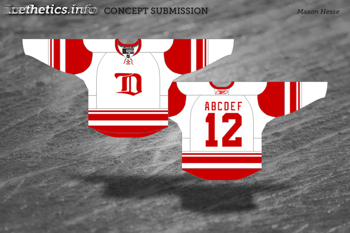
This is the Strauss NHL Rebrand series, Part 7 of 10, in which graphic designer and hockey fan Elliott Strauss gives a makeover to the National Hockey League. If you're new to this series, I highly recommend catching up on the first 18 teams to which he's given new looks.
Now we move on to his latest updates, which include the Senators, Sharks and Islanders. Elliott has provides commentary on his work in bold text.
 Elliott Strauss Elliott Strauss |
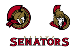
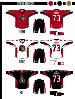
Not much change in the logos here, but the vegas gold returns in favor of yellow. This is one of my most modern uniforms designs. Number font is custom. The alternate keeps the same side/hem design as the home/away, but adds a new arm striping scheme to match, and the pants still match up on the sides.
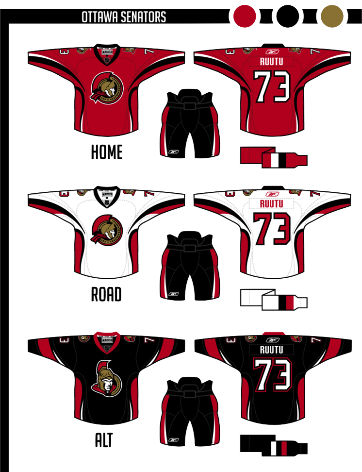
Definitely looking at a unique uniform design here. The striping is unlike anything we've seen ever — in real life or in concept. I'm rather liberal when it comes to concept designs. I like things you don't often see. But personally this strikes me as a tad disjointed, mixing what I'd consider a classic-looking logo with a very non-classic sweater design.
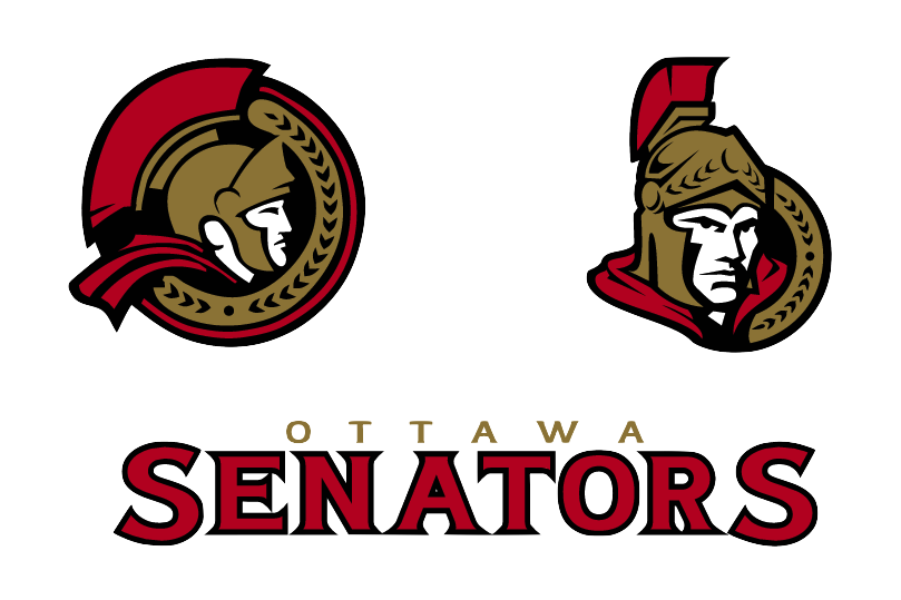
That being said I'm a huge fan of this 2D Sens logo and I wish we could see it on a uniform one of these days. I'd even prefer it to the vintage "O" jersey that's been talked about. But that's just my opinion.
|
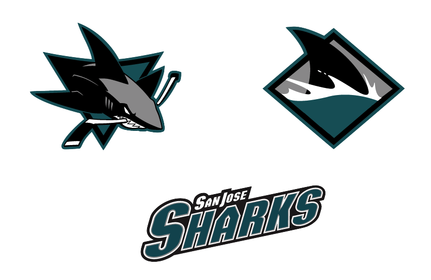
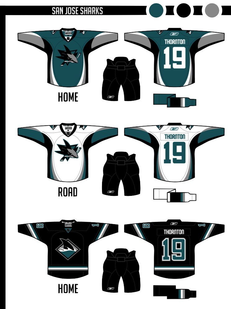
 Elliott Strauss Elliott Strauss |
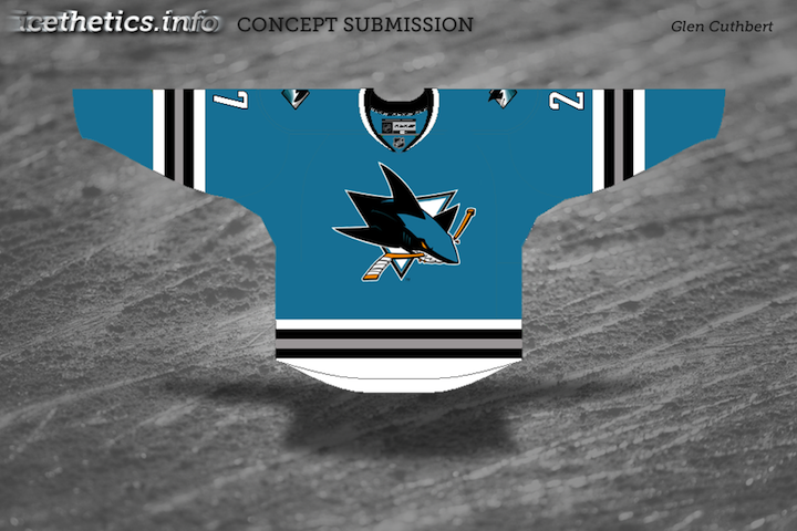
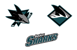
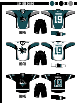
The colors return to teal-black-silver, and orange is out. I modified both primary and secondary logos, simplifying in some places, dropping the fade on the patch logo.
The shark fin-based striping pattern on the sleeves is somewhat subtle. The uniforms are modern and busy, but I think they'd look decent on the ice. The alternate is based on the diagonal stripes they use on the black alternate currently.
Burnt orange has always been part of the Sharks' color scheme but was introduced as a uniform accent in 2007. While I like that look, Elliott has certainly taken the Sharks' identity to the next level by losing it. And the only the critique I have is that the crest could probably use a white stroke on the home sweater so as to add some contrast.
Otherwise, a great update to a team that's always had a distinctive identity.
|
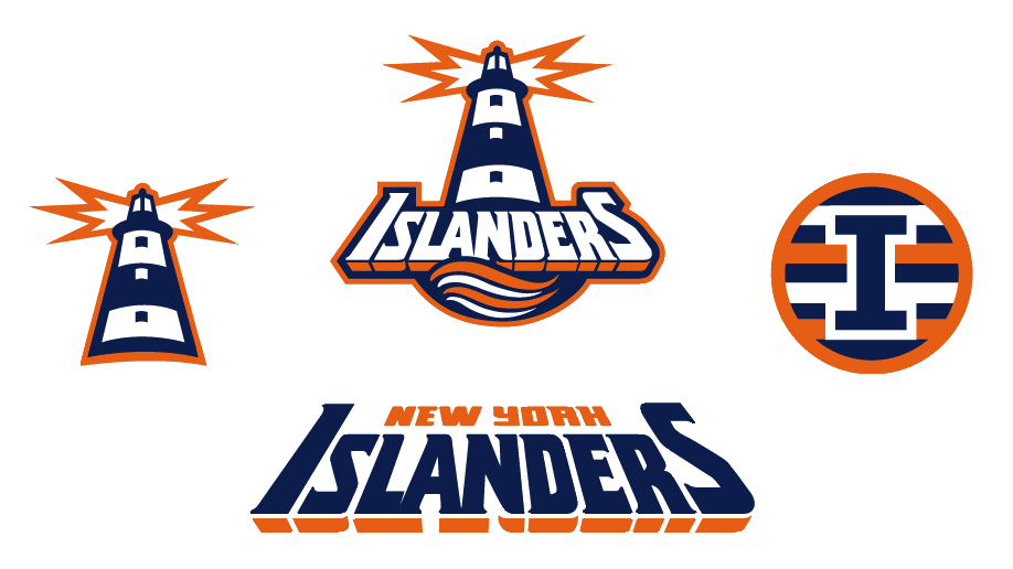
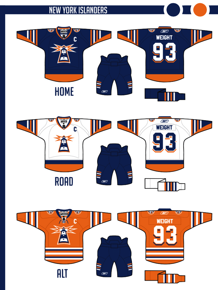
 Elliott Strauss Elliott Strauss |
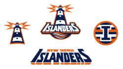
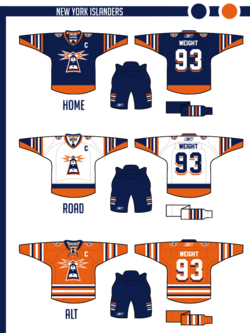
This might be my favorite of the series. I took the fisherman era wordmark and swooshy wave from the primary logo. The lighthouse is original and takes the perspective of the wordmark.
The four-stripe motif stays on the patch logo and on the arms of the home and away. The numbers continue the drop-shadow from the wordmark. Finally, an orange alternate uses a more classic stripe scheme.
In one of the biggest revamps of the series, Elliott digs into the Isles' past to find an incredible look hidden within one of the most despised designs in sports logo history.
He calls this his favorite of the series and I'm inclined to agree. And it's about time for the Isles to ditch their '70s-era logo anyway.
|
Working on more concept posts for this week. Tons of great artwork coming in that I can't wait to share with you guys!


 19 Comments