


Fixing the Whale Fail, Part 2
The Connecticut Whale concepts continue pouring in at a slow but steady pace. I'm starting a new post tonight to share them with you.
 Caleb Fuller Caleb Fuller
We'll begin this set with the only one that's actually made me laugh out loud as I perused my inbox. Caleb took his inspiration of the infamous Twitter fail whale. And the execution is an absolute riot. As if the crest alone weren't enough, he's created the sweater from a combination of elements from some of the worst NHL uniforms in recent history — namely the Sabres and Senators. This may have been a joke and doesn't "fix" anything, but it wins for the laugh factor as far as I'm concerned. |
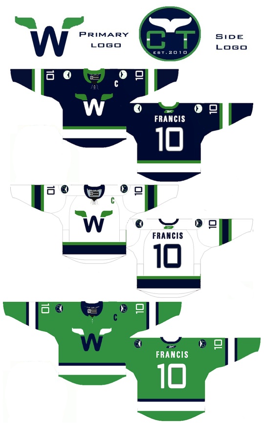
 Brendan Klein Brendan Klein
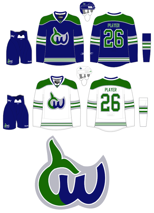
Next, Brendan has gone in a new direction while still keeping the spirit of the old Hartford Whalers. I don't think it needs an explanation as the logo pretty much speaks for itself. But I'm not sure I'm a fan of the white jersey's complete lack of blue. But maybe I'm alone there. |
 Christopher Lewis Christopher Lewis
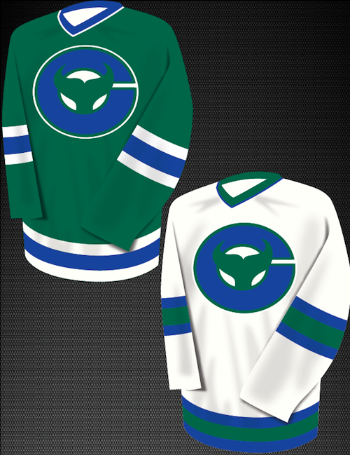
Finally, Christopher came up with a fix that simplifies the idea of a logo built around a C for Connecticut. He shows you don't have to draw a cartoon to do it. And I like that. Still, I can't help but feel like the logo is more of a fusion of the Whalers and New Jersey Devils. The pointy tail just looks a little demonic. |
Later this week I'll have new concepts, including some All-Star designs. I think we've put the Whale subject to bed at this point.
 Chris
Chris
I know I said the last set of Whale concepts would be the last set. But you guys kept emailing in your work. And it would be terrible of me to ignore it. So here's some other artwork that came in this week.
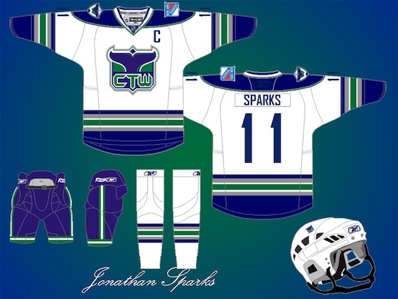
 Jonathan Sparks Jonathan Sparks
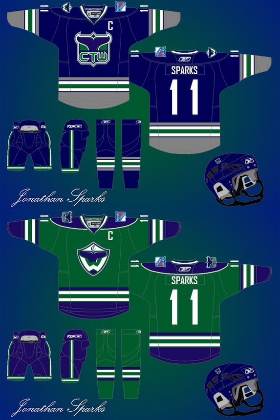
Jonathan put in a great effort with newly designed logos. I particularly like the new primary mark on the dark sweater. It's a great play on the New York Rangers' old Lady Liberty logo. It's the perfect mix between the Whale and their NHL affiliate. Regarding the secondary mark on the green jersey, I'll let Jonathan explain: "I was just looking online for inspiration and came across the Hylian shield from the Legend of Zelda and came up with the secondary logo." He also created a white sweater which is the inverse of the blue one. It's nice to see the Hartford Whalers colors and striping intact on this effort. One of my favorites. |
 Craig Mazuchowski Craig Mazuchowski
Craig may not have the logo design chops of some of our other designers, but it's hard not to like where he's going — simplicity. Often when we talk about a team with a good history, we like to see them in something isn't too complicated. And this fits the bill. Though if it were me, I'd make the establishment date 1972. I know the Connecticut name is new, but why not go all the way back to the WHA and celebrate the spirit of the Whale? |
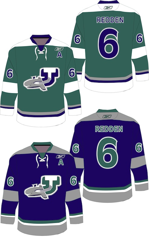 Dallas Hicks Dallas Hicks
Dallas has also gone with a simpler approach, but for me to describe his work wouldn't do it justice. So here's what he says about the jerseys: "It’s one thing for me to say that the Connecticut Whale jerseys are craptacular, but I figured I’d put my money where my mouth is and try to do better. This is close enough to classic Whalers while still different enough to establish a new identity. The green is more of a “sea green” but it’s different and clean. The third jersey uses the navy blue as a primary with the gray taking a bigger role." And regarding the logo, Dallas explains: "The front of the whale forms the C while the tail creates a negative space T. The spout of water is (roughly) in the shape of the state. |
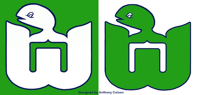 Anthony Colson Anthony Colson
And lastly, Anthony has used good old Pucky and the classic Whalers "W" to create a "C" in the negative space for his logo. I lauded previous designers for simplified work but I think this one is a bit oversimplified. While something like this may have worked in the 1970s, we are now a decade into the 21st century and the kids just don't respond to this. (Nor should they respond to mad, toothy whales carrying hockey sticks.) |
That should wrap things up for real. We'll find a new topic for the next set of concepts.

Reader Comments (6)
the last concept reminds me of the Shawinigan Cataractes jerseys from the late 80s-early 90s.
Wow Jonathan, those are amazing!!! I love the design, its sophisticated yet simple and intimidating. It respects the history while keeping things new and fresh and the green jersey is perfect in my eyes. I really like the Zelda logo, and the lady liberty CTW is perfect. Great great work!! I would buy one in a heartbeat.
...and the Canucks font seems fitting.
I actually like Anthony's logo, however I definitely think that it would be more at home as a shoulder logo.
Jonathan's design is simply brilliant. I would buy that blue jersey in a heartbeat.
Thanks Jonathan, your designs are awesome. I would love to have the home and away jersey. The CTW logo would look good on all promotional clothing and items. Great Work.