


Thursday
Jan202011
Concept Collection 1
 18 Comments
I'm testing out a new format for concept posts. It features a standardized look for all submissions as well and limited commentary from me. Some posts will still have a particular theme, but from now on, most will just be a hodge-podge of whatever's in the Icethetics inbox. Feel free to leave your thoughts in the comments.
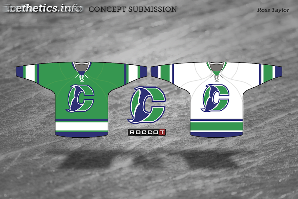
I know I said the last Connecticut Whale concepts would be the last. But Ross' attempt was too good not to share. We always talk about logo simplicity. This is one of those great designs that you can see a kid drawing on his notebook.
Unfortunately, this new format doesn't yet include ratings but I'm sure the artists will appreciate your feedback in the comments. Just added ratings. Enjoy!

Reader Comments (18)
fantastic Whale concept
liking those canadiens ones too
Whale = win
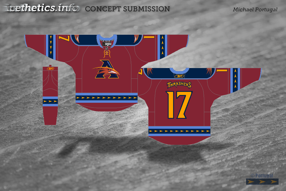
Thrashers concept is so much better than what they've got now too.
Wonderful job on the Whale.
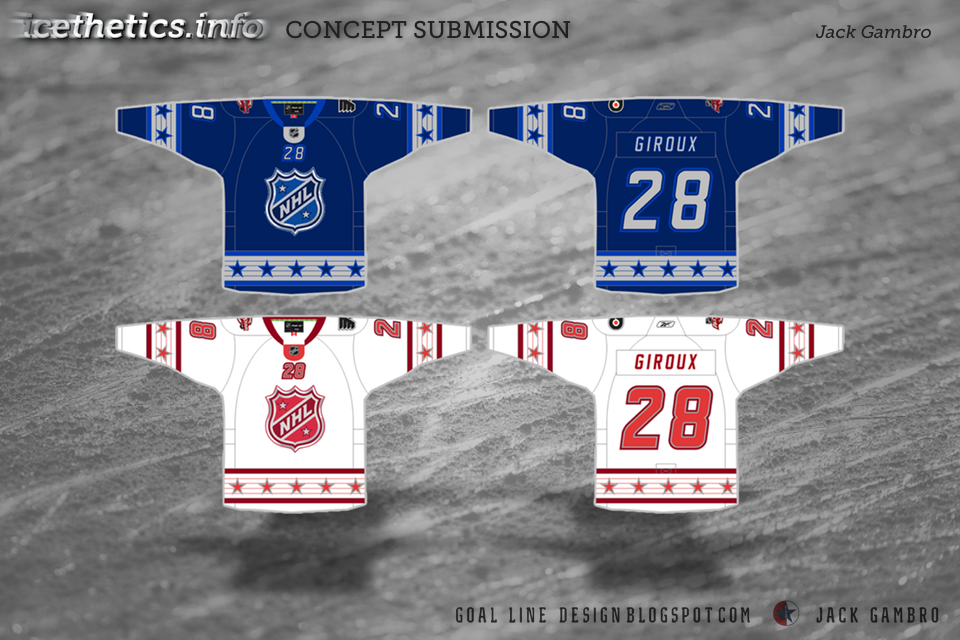
Like Jack's ASG jersey better than real ones.
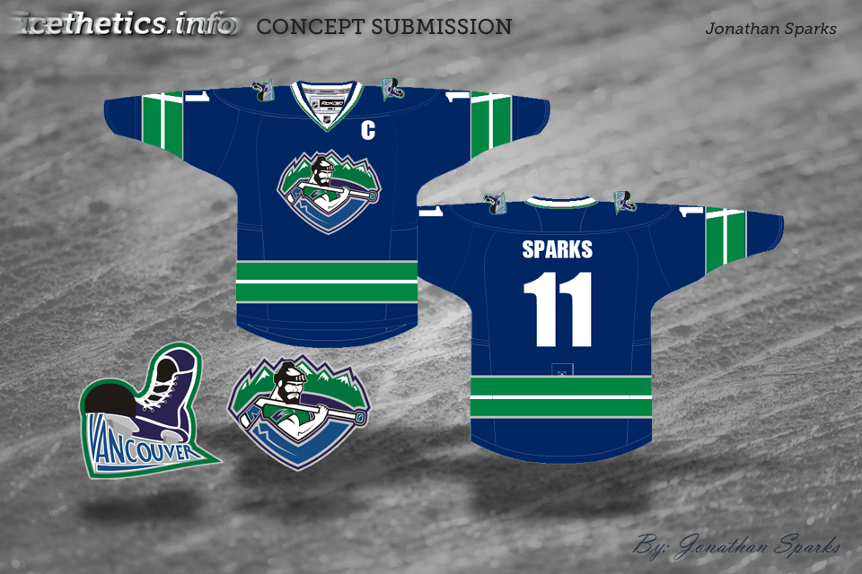
I really love Jonathan's Canucks logo. It would be cool for non-jersey merchandise!
Dare I say, some of these are WAY nicer than some of the actual jerseys. Really, really impressed with the Vancouver concept.
The Whale and Nucks jerseys are pretty beast.
The Nuck logo is just a modified Vancouver Giants logo
The whale concept is by far the best I've seen
Thrashers one is a hell of a lot better than anything they've ever had, especially like the logo, not a huge fan of the jersey color but I guess it's the best you can do considering the logo colors
I'm not a fan of the Canucks concept, looks to cartoony for my taste and Tyler is right, it's very similar to the giants logo.
No strong feelings either way on the habs haha
Canucks logo is way too close to the Giants logo. No good for me...
The Whale one is great, so are the all stars.
good stuff, but I wonder how long it took you to format those concepts onto your background. With all the comments about how few concept posts there are on here, do you really want to make each post more labor-intensive? It's cool, but it's simply not that necessary. Unless, that is, you have that background as an available template and ask everybody to send you stuff on it.
Love the Whalers logo, very well done. The Canucks skate, though a good idea, looks too cartoonish for an NHL logo. Good step in the right direction though. Are those all-star jerseys loosely based on the 67 Penguins/Pens winter classic 11 jerseys?
Haha, some people always have to complain. What about this entire silly website is "necessary" anyway? Believe it or not, this new format makes things quicker for me and more presentable for visitors. Next concept post goes up Saturday.
Hey thanks for the comments people. I appreciate the feedback and the Canucks primary is loosely based on the giants logo cause i think it is an awesome logo. as for the cartoonieness I will take another kick at the can on this thing and do my best to fix the issues.
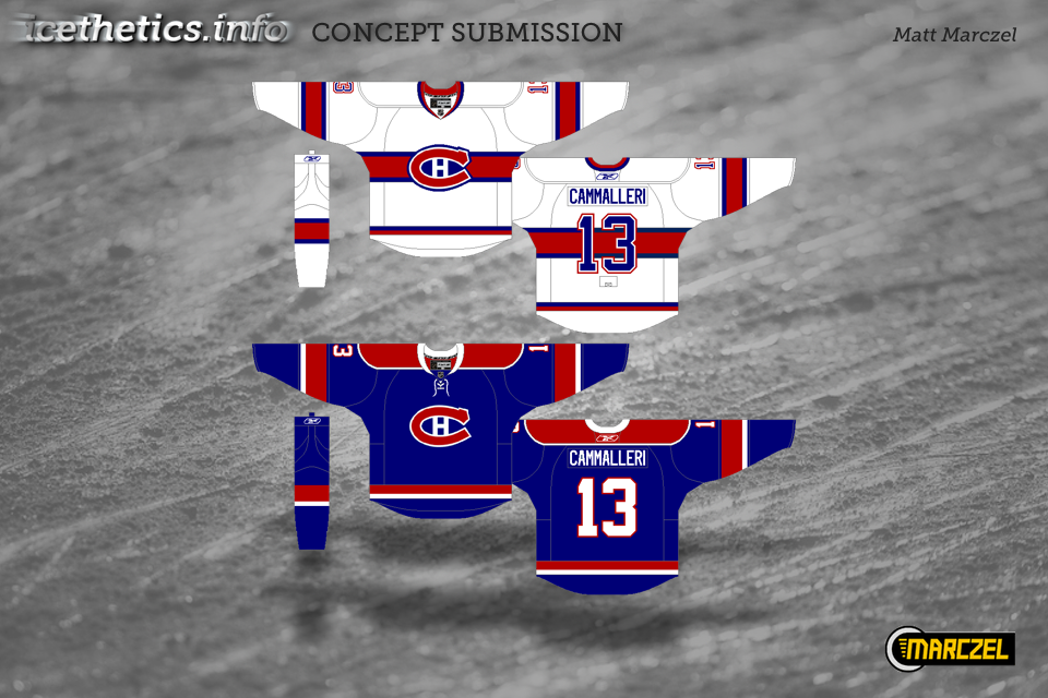
That white Canadiens sweater is sick. They need a third at some point, and that looks like it could fit that role very well. I'm not as sold on the blue one though.
I like that some ones actually making a Canadiens concept and i like the blue but i dont like the striping its not habs like at all and i know that if you used another white stripe it would look to much like a rangers jersey so with that being said i think you should take the arm band's off the blue jersey and keep the bottom stripes like there current away jersey and add the red bar on the sleeves like there current away jersey , Id like to see more Habs concepts , And the Connecticut Whale jersey is perfect .
Wow! ha ha, I have't seen that Canadiens concept in a long time. I think I designed that like way back in 2008, thanks for pasting this Chris. I have alot of backed up concept work I haven't even sent you yet, with a number of them being of the Canadiens variety.
i enjoy hearing more input on your behalf on the concepts. I understand if you don't have the time though.
I love the Habs' white concept - I'd buy that for the collection immediately! The blue one though...not so much.
@ Matt Marczel, and maybe Chris, it'd be awesome to see some of that Canadiens work. Seeing concepts for them is always a pleasure.
Thats a great new look for the Vancouver Giants of the WHL, btw Chris, is it possible for another CHL third jersey fever, don't believe you've covered the all