Collection 18: To the Northeast
 Wednesday · Mar 23 · 2011 | 12:06 PM PDT
  16 Comments
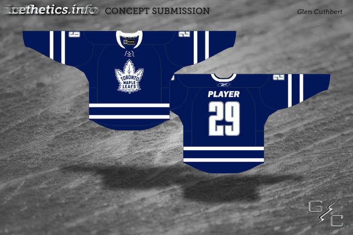
 Today's batch of concept art brings us to the Northeast Division.
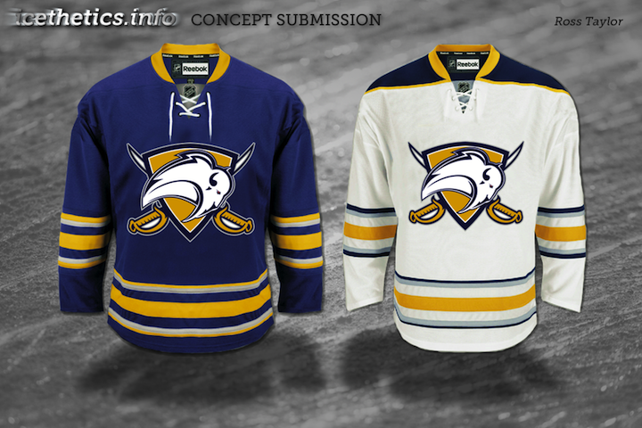
Last month, I re-posted some early sketches from the Sabres' 2006 rebranding on the blog. Here, Ross decided to spruce up one of the sketches and put it on the current uniforms. I get the feeling something like this would've gone over a lot better with fans than the "Buffaslug."
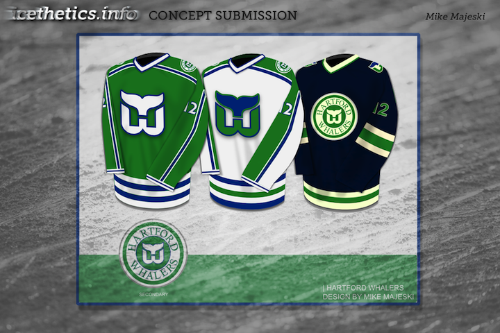
We've gotten Jets and Nordiques concepts on this page recently, and I didn't want to leave the Whalers out. They were part of the Northeast Division back in their day.
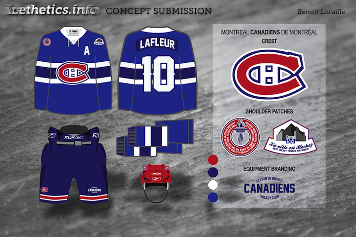
Benoit brings a unique set to the table. A bold choice with the red-free, two-tone blue jerseys for the Habs, but that's why it's interesting to look at.
New concepts are rolling in all the time. If you'd like to submit yours, just send a JPG or PNG file by email.


Reader Comments (16)
i like everything but the sabres one... that is in no way more acceptable than the buffaslug.
I like the HW set, although i probably would have gone a bit darker on the green for the third jersey to match up with the darkening of the blue
all are decent. but the sabres concept is absolutely horrible. the franchise FINALLY got it right and went back to a new version of the original logo. any other logo people try and give the sabres is just a joke and will never be better than what they have now
Wow. I think I sent that Leafs concept to you like 2 years ago. Completely forgot about it!
As a Sabres fan. I've been waiting for a Sabres concept just for fun. But is that honestly the best one that has been submitted. That's worse then the slug. Just a logo planted on the jerseys. That's awful.
Enough with the circular logos. That Hartford 3rd needs to never see the light of day. And Im pretty sure the two-tone blue-- shown in the Habs concept-- has been beaten to death.
I love the Montreal Set, but the red helmet just throws it off for me. Use the Light Blue for the helmet and keep it clean.
I have always thought the Leafs should add a third color to their jerseys. Plain old blue and white is boring and their current jerseys are pathetic IMO.
The Leafs one is perfect other than the number and player font. If the jersey had the simple block font and standard name font, it would be classic. I'm hoping the leafs go with this next year.
the whalers set is sexy, one of the best sets i've seen on here. and although i'm not a huge fan of the canadiens third, one thing i do like about it is the number font
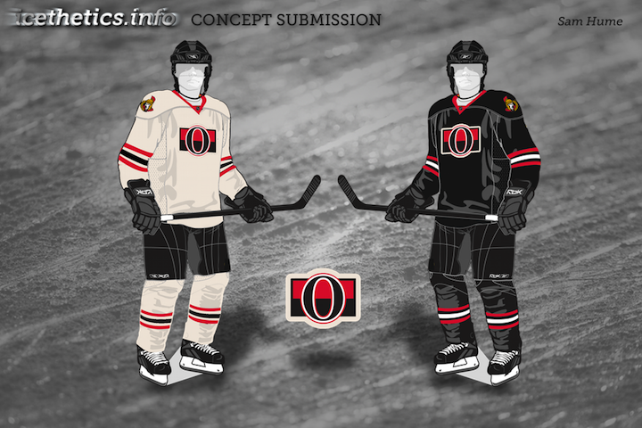
Sabres is a compilation of all the classic Sabre looks... than goodness you got rid of the awful upper chest numbers!. Montreal would look great by adding the blue jersey, excellent idea. Ottawa should use something from the roots, even if its just a 3rd jersey.... Love the Whaler 3rd, reminds me of the WHA look
LOVE the Whalers concepts....especially the 3rd one - its a different shade of blue, and some green thrown in there is great
The Leafs concept is boring. It's the same jersey as their current home, with just a logo change. Not enough about it is unique to be a stand out third jersey. The White and blue needs to be done differently, rather than just two stripes on each sleeve and base.
Feel free to leave the Whalers out. They are never coming back and they don't have the excuse of the Canadian dollar for their death. If you have nothing else to post, then sure post some Whalers stuff, but if a Whalers concept takes the place of a concept for an actual NHL team than leave it.
It's Grandpaslug!!
Buffalo should lose the grey stripe in their uniforms. I don't get why they need or want to use it.