Concept Collection 19
 Friday · Mar 25 · 2011 | 11:22 AM PDT
  20 Comments
 No theme for this collection. Just a nice, varied assortment. But of course we have to start with the Senators' forthcoming Heritage Jersey — which we got a sneak peek of this week.
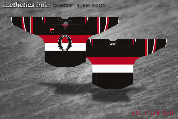
The way the jersey is folded in the photo the Sens provided leaves the design open to interpretation. It's not a bad attempt by Avi, but I think he may have strayed from the target. The shield he's put on the chest appears to be on the shoulder instead. And if it is in fact the "O" on the front, the photo does show that it doesn't have the double-stroke seen here. Otherwise, I'd bet it's pretty close. Anyone else want to take a crack at it?
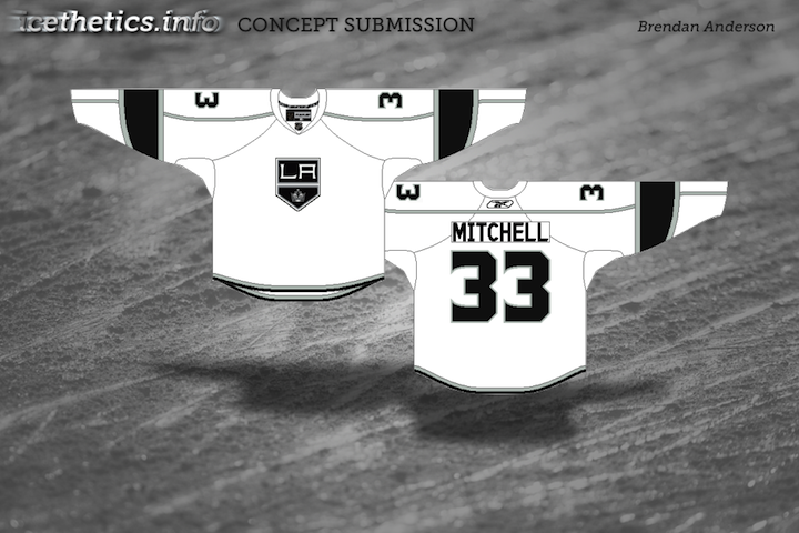
Brendan's design is likely pretty close to the road uniform we'll see from the Kings next season. I'd bet on a black collar and maybe more black on the sleeves to add contrast. Now for the fun stuff...
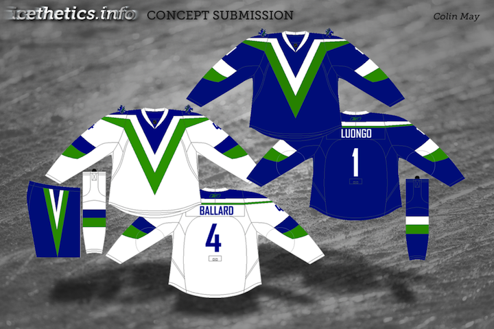
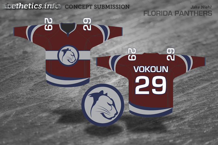
So what do you think of that? I'm particularly fond of Colin's Canucks design!


Reader Comments (20)
I love the Panthers jersey! And oddly enough the Canucks jersey as well, the Flames is a lot lackluster tho.. Good concept but bad coloring
Wonderful Ottawa jersey! It should be their # 1. I'd buy it, and I hate the team. The chest and arm stripes will connect like the Habs jersey and along with the lack of stripes on the lower hem, this will give it a nice, tailored look. And, most importantly, there's no Roman head looking like a bad high school art project. The 'O' is sound and sharp. And it allows a popping three-colour combo, without that cheap yellow. I also like the Panthers jersey concept. Tasteful simplicity, and this cat looks more menacing that that " We slashed our prices! " sale-poster feline.
The Panthers jersey just screams "I SOOOOO want to be a Penn State Nittany Lion"....
I'm not too fond on the Canucks one. It looks very similar to what they wore in the 80's and I cannot stand those jerseys
Sens jersey is solid.
LA concept is good.
Not a fan of the Canucks or Flames concepts.
The Florida jersey is most interesting. I like their current logo and think that the team should retain yellow. That said, this is a really nice jersey and really is unique. The swoosh at the bottom will need to be fixed though, I think, so that on the back it goes in the opposite direction as the front swoosh, to make it look better from the sides.
Despise the Kings and Canucks ones, but otherwise a good set.
I like the Panthers jersey, except for that darn LOGO IN A CIRCLE! Stop the madness already PLEASE. Make the center stripe a little bigger and just throw the cat in there. Actually a leaping cat in that same style across the stripe would be awesome. Everything else about it I love.
Flames jersey is too dark. and that V for Vancouver? STILL makes the eyes bleed.
the florida one looks too much like the avalanche color-wise
Those Canuck jerseys burned my retinas
I will never be the same!
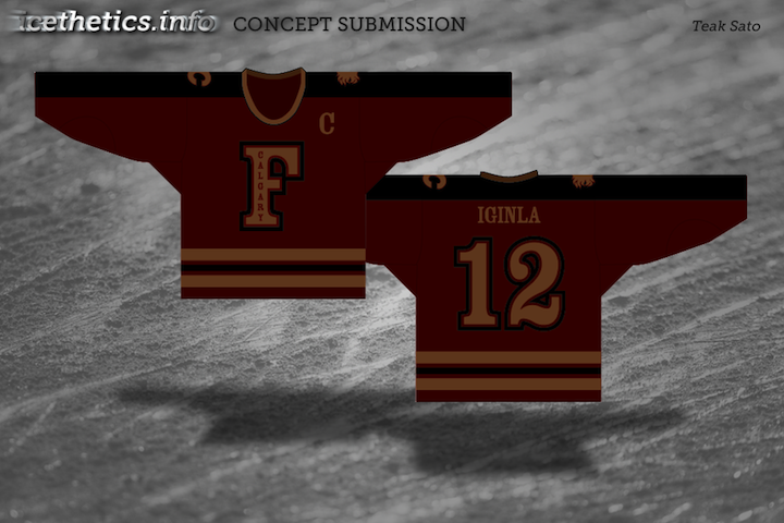
The Flames jerseys look more like something out of the 1880s than a modern NHL team, dipped in five layers of sepia tone. Not too crazy about that.
I've experimented with the Flying-V design myself (nothing I've considered submission-worthy yet, plus this was a few years ago, before Icethetics took off). So it's interesting to see an Edge take.
The Panthers... ehh. Not horrible, not spectacular, but red as the primary is a great step. It just looks a bit too muted, though.
The Kings' look isn't too bad, although I still hate that number font.
The Sens... now that's a sharp looking jersey! And that's a nice nod to the old championship patches they wore back in the 1920s.
The Sens is money, just tweak the shield to be a shoulder patch and I think we're good.
The 'Nucks and flames I not particularly fond of - and the Kings is just... well bland.
The Panthers I like, but it needs to be that bright Florida red, and the gray could be white possibly... maybe even toss in some yellow hints... The swoosh, if done similar to Anaheim's I wouldn't mind, but could work just as a bar stripe. It reminds me of a DEL sweater.
the panthers is pretty ool, very unique, although i think its a little dark and the center stripe is KIND OF canadiens-y
Avi's Senators concept is great, Canucks concept is interesting and the coloring in the Flames concept is waaayyyyy off the beaten path. With different coloring it would be okay.
- That Ottawa jersey is VERY nice!
- Those L.A jerseys would be great if they used the crown! That "L.A Shield" would work better as a shoulder logo.
- The Canucks jersey is a neat concept... But as a CONCEPT ONLY!
- The Flames jersey is just horrid in every way!
- The Panthers concept is interesting. However, I just don't get that "Panthers feel" with this design... Reminds me WAY too much of the Canadiens.
Thundercats HOOOO!! (panthers)
@ Jimbo,
My nucks concept was only ever meant as a concept... by no means do I want to see the flying V back in the NHL, this was strictly a "what if..."
It came out much better than I expected it too (and I think maybe better than the original flying V's, not sure on this though...it is really an instance of choosing the lesser of two awfuls!) but still I would never want the canucks to wear these for real.
@Avi,
I love the concept! the stripes at the end of the shoulder yoke are genius! my one constructive criticism is that none of the striping is consistent (the stripes across the chest behind the logo are even and broad, and have no black stripe. the stripes on the sleeves are uneven (2/3:1/3) without black in between red and white. the shoulder yoke stripes are more even, but have the black stripe in between) I personally would have stuck to the pattern from the shoulder yoke, and transferred that striping to the sleeves. I may be a bit OCD on this, and really it doesn't affect the sweater... it is just personal preference. Great job overall!
@ Colin
I figured as much. I only meant that I hope the flying V would never return is all, lol. But I will agree that it is still heads and shoulders above the original one! These colours look so great together and it certainly holds some appeal to it.
As a Panther fan, I do like the Panthers concept, think it needs a rework on the colors though, too Avalanche-y or Nittany Lions as others mentioned above. Love the lines, the logo is alright. Nice job
so i tried to turn up the brightness on my screen when i got to the calgary concept...but then i realized that it was just a really sucky color palette. You need at least one, even two really poppy colors, if only because these jerseys will in fact be seen on TV, and if it just looks like a bunch of dudes skating around in blah on blah with blah stripes, thats not good. Sweet logo tho.
panthers: try the same logo and jersey template in a different color scheme. I don't know that a scheme that is so iconically Colorado Avalanche, home of snow and the rockies, really works in the sunshine state. Sweet logo tho, and sweet striping. Just shift up the colors.
Canucks sucks. No one likes that V stripe...teams need a logo. this isn't soccer.
Not sure why the Canucks jersey is receiving praise in this post. I've been a fan of Icethetics for years now (even before it was known as 'icethetics') and have have never understood the obsession with the Canuck's poor excuses for concept jerseys. From the viewpoint of a fan of hockey at every level, it seems to me that there hasn't been any original thought put into concept designs for Vancouver for years. In my opinion that most of the hockey fans who frequent this site are mistaking originality and tradition for blandness and a sever lack of creativity. It is clear to any fan that the Canucks are highly invested in their history, but why pollute the web with concepts that are not influencing people to reflect upon the hockey tradition of Vancouver but rather are dumbing-down the general public to believe that when two colors that do not complement each other well (blue and green) are put together in a lame and unimaginative "V" design that that constitutes an effective and creative logo design for a professional and widely-respected hockey club? This may seem biased coming from a Minnesotan (who traditionally loath the Vancouver Canucks), but it seems clear to me that the vast majority of persons who frequent this fine website are being fooled into believing a franchise as established as that in Vancouver would even consider tarnishing the great sport of hockey with such a logo. With the understanding that this was a widely accepted and appreciated logo during Vancouver's glory days, it is clear that with the progression of the leagues' committment to the RBK jerseys it is highly futile to hope that this will someday be one-more the face of the franchise. If this truly is the course of action that Mr. Bettman and the rest of the league officials are promoting in order to generate revenue from their older target-audience then they are gravely mistaken and have lost a true fan of the game. I am in no way opposed to honoring the game of hockey by promoting heritage-inspired jerseys, but as I have stated earlier it would seem that there is little creativity being applied to Vancouver's quest to establish a popular and trendy new logo that would promote interest amongst true fans of the game.