


Wednesday
Apr202011
Collection 25: Playing For It All
 21 Comments
Enjoy these new concepts for a handful of teams competing in the 2011 playoffs. More to come, of course.
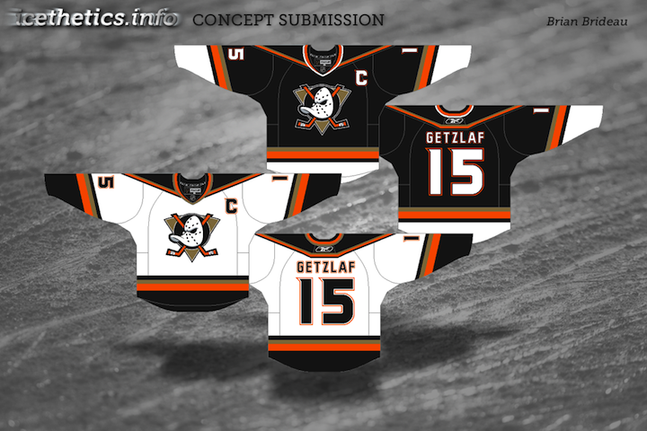
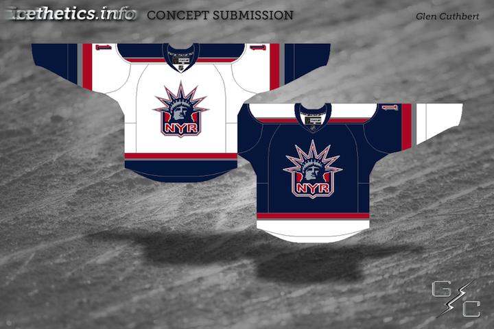
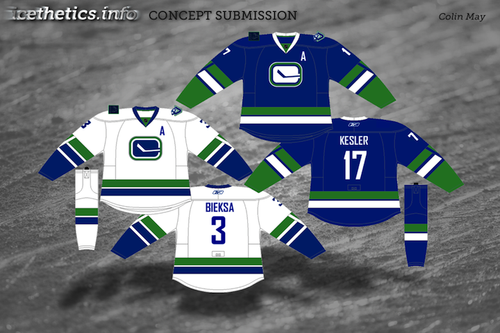
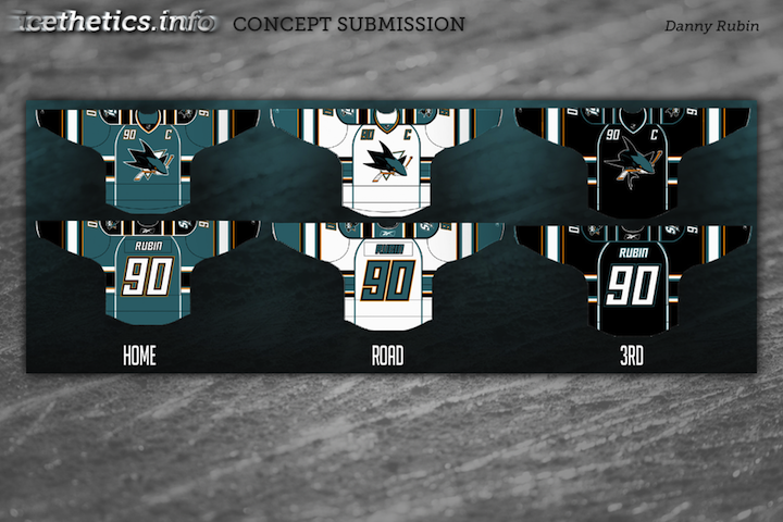
My personal favorites are Brian's Ducks and Glen's Rangers designs at the top. And I do think the Canucks shoulder start moving toward Colin's concept. But I don't see any of those things happening very soon.

Reader Comments (21)
i love the Ducks one, i think.
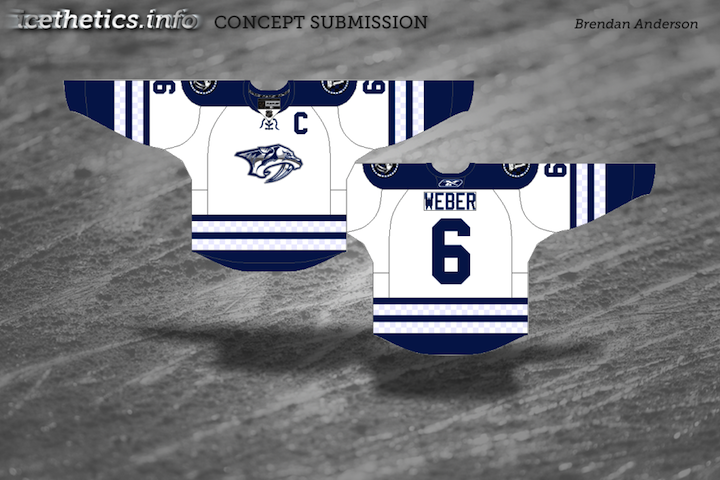
the Preds, well, it's a little too MapleLeaf, in my opinion, but it looks great.
oh. the rangers one is amazing.
That ducks concept is gorgeous, absolutely perfection
I like the White Canucks concept, but the modified stick in the rink w/ white in the middle doesn't work for me.
Really love the Rangers one. The Sharks one is close but needs a little cleaning up.
Ducks - not bad, not bad, arguably a step up from their current gear... but I'm not quite sold on that much white on the black jersey.
Rangers - hey, why not, the Wolfpack isn't around to use that jersey design anymore! (While the Rangers' current jerseys are classics, I wouldn't mind a full-time Liberty set.)
Canucks - interesting choice, Colin, to go with a white stripe below the green, instead of the historical two green stripes. I certainly approve of banning the orca and the radially-arched "VANCOUVER".
Sharks - ... err, yeah. Might be a little bit of striping overkill. The consistent sleeve stripes across the board are nice, but the less than consistent shoulder and underarm elements look to clash a bit. And if you have to incorporate the Bettman-Reebok Vertical Piping™ to make it work... no.
Preds - nice alternate take on a white version of their current third.
I like the use of the classic logo for Anaheim, and I think they should use it more in their current package. I also like the logo on the Canucks home, and the whole set is a nice modernization of their original uniforms.
I don't like the Rangers jerseys though, as they're the exact same as their old AHL affiliate, the Hartford Wolf Pack. I just don't think the Rangers would wear something that was recycled from another team.
The Ducks Rangers and Canucks are PERFECT. Specially the Ducks. im to the point of being speechless on how much i love it. the sharks is too busy. the striping around the waist has to go. once thats gone the concept is good. and like everyone else will say, the preds is WAY too Toronto
Love em all! I LOVE the Canucks jersey. They need to make the 40th anniversary white their jersey and a matching blue to go with it.
But any problems I would have are with the amount of striping on the Sharks and how similar the Preds is to the 3rd jersey of the Leafs. I really love the Rangers concept, but would hate to see the original RANGERS word mark disappear.
But I still think they are great concepts. Very impressed with this batch. Great work to all!
Love all of em xept the sharks one...ducks should use one of those 2 as a 3rd and make their current 3rd the home and make a road version of the current 3rd
Love the Ducks concept!
I like the nashville one, how the artist has kept the checkerboard pattern discrete and subtle. however with the shoulder yoke and the royal blue it looks exactly like the leafs alternate. I think that with out the shoulder yoke and with nashville's colour of blue this would be a very solid look for them.
@Jim- the reason I went with the white stick in the rink is that on the original blue uniforms the logo was predominantly white. It was a huge pet peeve of mine that the current canucks alt has blue on blue... I like a little more contrast. the blue on blue has grown on me since the time i made this jersey up... and in a week I will be the proud owner of a blue canucks alt with Kesler's name and number emblazoned on the back. Just in time for the second round.
@Rob aka...
I tried it with the traditional striping, but I liked it better with the white stripe. I think the double green stripe makes the jersey too dark, and the white stripe between the green stripe and green sleeves makes the green pop.
LOVE the ducks concept. Easily the best i have seen.
Rangers concepts are good, but only as alternates, the wordmark is not going anywhere anytime soon.
sharks jerseys are not my fave. I think the current sharks set is one of the best in the league... they have it all: great color scheme and logos, original, but clean striping... You went overboard on the striping and piping, but I do like that you put contrasting forearms on the jerseys... I would like to see the current sharks set with that addition. I think it could look really good.
Preds jerseys also look sharp. I think if you brought the checkers out a little more they would be spot on. the checkerboard is really unique, and looks good. don't hide it. I think the checker board would look good understated on a white jersey (you were getting at this, but understated it too much) maybe use a steel blue instead of a navy to get that understatement without losing the checkerboard entirely and making them look like the toronshville predaleafs.
Ducks jersey is great.
Why did they change logos again? Yeah, I know it's cartoony and I know they were no longer owned by Disney, but it's a cool, instantly recognizable logo. Even people that haven't ever seen a single NHL game know what the Mighty Ducks logo is. How many non-hockey fans do you think know what their current D logo represents?
Love the Ducks - maybe lose the stuff around the shoulders though for a cleaner look? That logo should return full time.
The ducks one is perfect. add that to their current 3rd and they could be in the discussion for the best jerseys in the NHL
I actually love the Sharks jerseys. Those numbers look great and I like the striping and how it isnt something that has been seen before. Only changes I would make is instead of a black 3rd jersey I think they should try a gray one. Also they need to use the diamond logo with the fin as the main crest on a jersey at some point. Or go retro and use the circle fin logo on the original jerseys
I really wish the ducks would go back to there original logo, keep the colors but go back to the logo. These jerseys would be great!
Just found it humorous that the Ducks' logo was called 'classic' when the franchise is less than 20 years old...
What i love about the ducks jersey is keeping the "new" font for letters and numbers. Maybe lose the striping at the shoulders/collarbone area, but other than that, nicest ducks concept i've seen.
Dave,
I can understand where you are coming from, but I personallyI throw the old Mighty Ducks logo in the "classic" category. I think it really depends on when you grew up. If you were older when the movies came out, you more than likely see the Mighty Ducks logo as ameteurish. I was probably 4 or 5 when the first movie came out, and it is a big reason why I like hockey today. Without the Mighty Ducks, I would never have gotten into hockey.
So when I see that old logo, it reminds me of watching hockey when I was little, and trying to perfect the knuckle-puck with my friends out on the driveway.
Mike M,
Thank you. I wasn't born yet when the first mighty duck movie came out, but i first saw the movies in 1996 when i was 3 and it was the reason i started to play hockey and the reason i am and always will be a ducks fan. It is a classic logo to us, and one that will never be forgotten. Even though the teal and eggplant are gone, i would love to see the logo return front and center, and i'm sure most duck fans (but not all) and a lot of hockey fans would.
Thanks again Mike, Glad to see another mighty ducks supporter on Icethetics!