


Saturday
Apr232011
Collection 26: Long Time No See
 17 Comments
As I was considering themes for today's concept post, I started wondering which teams have gotten the least love on this page. So I took a look back, and as it turns out, there are five teams that have yet to be represented with concept art in 2011. We'll rectify that today.

Now these teams won't have to feel left out. Coming in a future concept post, some phenomenal redesigns for another often overlooked group — the minor leagues.

Reader Comments (17)
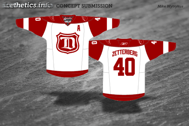
As a Michigander and die-hard Red Wings fan, I like the alternate style, there is a rumor we're hosting the Winter Classic next year. If so we should wear something along these lines. I also like the Oil sweaters also, I do remember how popular that sweater was with the majority of the NHL fans.
The Philadelphia one is basically the WHL Medicine Hat Tigers jersey with a Flyers logo
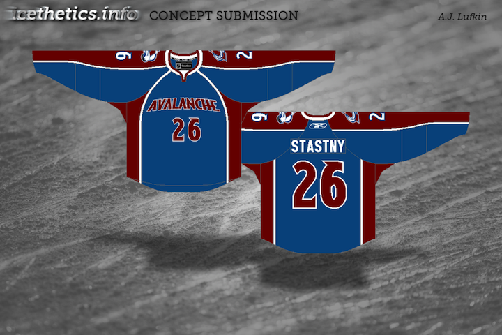
That Avalanche jersey is TERRIBLE. Enough with the football / basketball jerseys.
IDK... I don't like the Flyers one... and I like the medicine Hat jerseys. I think the tigers have more white. I don't like the Flyers in black though.
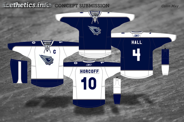
The Oilers should use those as their alternates. For the ones they have now are terrible.
And I would think that a design like that would look good as a Flyers alternate.
Oilers one looks too much like a Leafs jersey!
the oil set is on the right track but it needs some work. Philly's should already be on the ice and the rest almost look rushed no offence
Oilers need orange. Or copper. They never looked right without it in the old alts. I know I'm in the minority on that one, but I will stand up for my principles on that one.
If the flyers never wear black jerseys again, it'll be too soon. Orange is awesome.
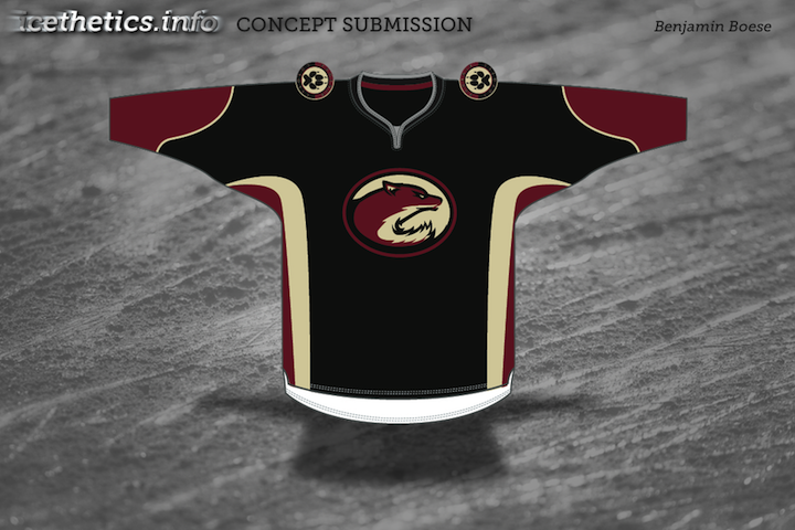
I like that yotes one. I still think a two color black and red would look great on them (search back in the archives for my thoughts at the initial release) and while that logo looks cool on it's own, I would love to see it and the jersey in red and black only. Hell, I'll mock that up and send it in.
Avalanche is just a no. Not the worst, but while the Avs have issues, that's not what needs to be corrected.
Red Wings I'm meh on. I'd probably prefer it with their normal white jersey, which is IMO one of the very few perfectly balanced blank sweaters out there.
@Jeff P
I'll go ahead and mock that up for you on the Coyotes one. I was more playing with the logo than anything when I designed it, but I like where you're thinking.
I think it wuold have been ok to leave these 5 out of the concept section.
I dont really know if the Wings need to go into something like that as a third...my ideal situation would be to obviously keep the main red and white jerseys which are obvously two of the best jerseys in hockey, while adding the 2009 winter classic jersey as a 3rd
First off, another "Colin" on the site... not me that commented earlier... I guess I will go to first and last names now.
Wings. I like it. I think it would look a little cleaner with a white shoulder yoke. that way the shoulder patch would stand out a little better, and the sleeves would look a little more defined, as is the sleeves and shoulders look like a red blotch.
Avs. First off I know I am in the minority, but I think the football/basketball style jersey can look awesome. However I don't think it works on this jersey, especially with awkward RBK EDGE piping on the front of the jersey. The Avs seem to really like alternates featuring a wordmark. I could see them going with a football style alternate in the future. Another EDGE peeve I have is that on the back of jerseys with sleeve stripe, the sleeve stripes do not continue through the RBK vector. it happens on the avs concept here and on the Preds and Panthers jerseys too, and it really bothers me.
Yotes- like the logo a lot. the jersey is nice, but I am not sold on the striping. the one thing I would fix is the collar. why use grey? it is not in the color scheme at all, use the brick or sand instead.
Flyers. awesome job. it looks really sharp, although I do not see Philly going to a black jersey any time soon, the orange is just to cool.
I think if the 'Yotes were to change their third jersey logo, it need not look like a raccoon. As for the Colorado concept, I shudder. No more football style! It's just sickening to look at; it just doesn't work.
I like the Wings concept, would make a nice Winter Classic jersey.
Yeah... the Avs jersey was (in my opinion) the weakest jersey in the post I sent to Chris. I'm actually quite surprised it's on here.
Wow, I had forgotten that I had submitted that particular Red Wings jersey here. I kept working on the design and that is one of my earliest attempts. If anyone wants to see the other versions, I have a post about them on my blog at http://mikewytrykus.blogspot.com/2011/02/concept-evolution-red-wings-third.html