


Thursday
May192011
Collection 30: Still on the Hunt
 19 Comments
The theme for today's concept art is the Conference Finals! Just four teams remain and here are some fan-made jersey revamps for them. (And a bonus.)
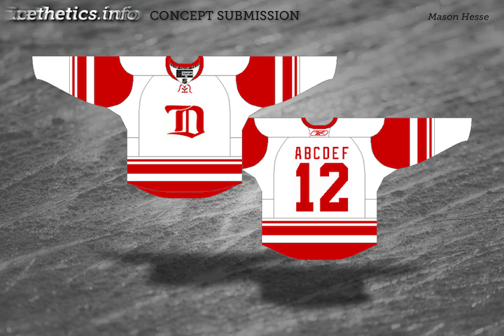
And as a bonus (so I can round out this post with five pieces), here we have the Red Wings, the last team to be eliminated from the playoffs.
Coming soon, we'll take a look at what we might see for the 2012 Winter Classic. Send along your concepts!

Reader Comments (19)
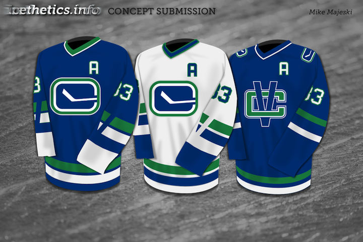
switch out the VC logo for johnny canuck on a green jersey and we got 5 stars!
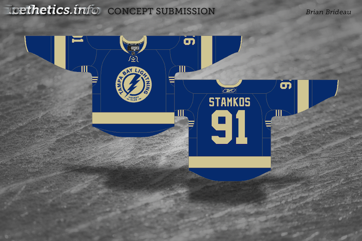
Isn't the pit-stripe on TB jerseys a championship stripe? What's with 6 stripes?
What I noticed most about the Canucks jerseys is that they have Henrik Sedin's number 33 but with an 'A' instead of a 'C'. Very cheeky.
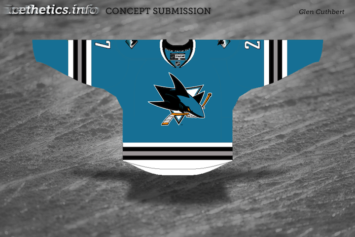
Sharks - 4/5, pretty nice looking.
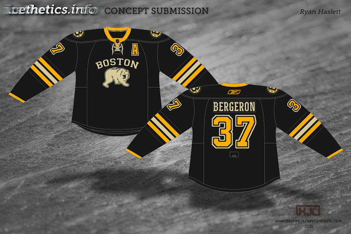
Bruins - 2/5, logo looks bad, everything else is okay.
Nucks (first 2) - 2/5, pretty much a repeat of what we've seen before, with the addition of a V break in the sleeve stripes that doesn't look good at all.
VC Nucks - 4/5 - I don't like the team, but that's actually a pretty cool look.
Bolts - 4/5 - I actually think this is a big step up from what they currently have and what they're going to be wearing next season.
Wings - 3/5 - Eh, nothing to hate, but nothing to really like, either. Interested in seeing what Abcdef is going to do on the ice next season, though. :P
Tampa should ditch the "BOLTS" third and adopt that concept.
The "V" in the stripes on the sleeves of the Van. concepts are excellent. Not really a Canucks fan, but that set is the best I've seen since they went away from the black, yellow, and red.
The six stripes have always been on the Lightning's gussets from the beginning. Normally, they're in blue, gray, and either black or white, depending on the background color of the gusset (neither blue third jersey has used a blue gusset, incidentally). Not sure why they went with six originally.
Anyway...
I love, love, LOVE the Sharks concept. The classic original style, with the modern logos. I especially love the fin logo on the shoulders. I'm also pleased that orange is massively downplayed (as I've never liked it getting promoted to a full team color; you don't see the St. Louis Cardinals breaking out yellow trim on any of their gear just because their crest has yellow on the bat and beaks, right?).
Bruins - eh, it's a relatively minor variation on their existing set, and it really doesn't do anything for me. "Vintage white" only downgrades it further for me.
Canucks - since I really hate their number font, I like the classic numbers used here. I don't have a problem with the modern stick-in-rink, although the blue "V" in the stripes on the blue jersey is a little harder to see (the original 1970 version had a white V over two green stripes). I wouldn't mind seeing a comparison of your concept against the original style just to see how they compare. The third, though... different striping helps, but that "VC" logo just doesn't work for me as a front crest.
Lightning - NO. JUST... NO. They shouldn't be wearing laces on the collars (no team founded after 1980 should be, in my opinion, wearing laces), and they should never, EVER resort to "vintage white".
Red Wings - I can see the different inspirations for the design elements, and I can appreciate that on a certain level, but it just doesn't really do anything for me. Then again, I've never liked that particular "D"; I think I'd like it better with a c.1950s winged wheel on the front (maybe relegate the D to the shoulders, if at all). Not bad, though... and at least there's no "vintage you-know-what"!
I really do wish that the lightning, instead of being blue, were pure black and white. Although I personally like the classy D detroit jersey up there representing a time when the wings weren't the wings but the cougars.
The canucks 3rd jersey is freakin sickkk
The Lightning jersey would be great if the designer used white instead of vintage white/tan/or whatever you want to call it.
How can a team like the lightning have a "fauxback" jersey like that when they weren't even in existence in that era?
Make it blue with white and it would kick butt.
Hey, whats with the white on the lightning jersey?! >:( what happened 2 real white, c'mon guys!
Now that I've been watching the Lightning a little bit in these playoffs I have to admit I'm going to miss their current unis. They're sharp. I think their new duds are a little too simple, but fortunately, as a Canucks fan, I won't have to see them all that much. As for the concepts, I like the idea of San Jose curbing the burnt orange trim as well as getting rid of the number on the front of the jersey.
The Canucks ones are a little too ... stylistic. I think the 'V' in the sleeve only works with a white uniform. That said, I love the road uniform, but the third doesn't do it for me. I'd like to see the Johnny Canuck/Vachon logo on the front, with maybe a little more green.
As for Detroit... you can't beat the winged tire logo. You just can't.
Only good one was the Canucks. The rest I really don't like. The Lightning jersey looks like its stripes are peed on.
I didn't know the Wings had a player hamed Abcdef.
I really really like the Sharks. I'v envisioned that exact concept before when I wondered how the new logo would look on their inaugural teals. excellent, i'd buy it in a heartbeat!
The Bruins has pretty much been done before but i really hate the color of the bear and "Boston" and i dnt even like the way the bear looks either.
As for the canucks i like these alot as well, except like someone else said, the blue "V" on the blue jersey is hard to see, maybe you just make it white or even green. The 3rd i dont like the VC on the front either but i think that would look nice as a shoulder patch with the johnny canuck logo on the front.
Bolts I agree with almost everyone else the vintage white sucks on teams made after the 80s and get rid of the lace up looks stupid. with white that logo would look very nice since im not at all a fan of their new unis except im very happy they added the black outline to their numbers and brought the bolts back to their pants or else they woulda completely killed their identity imo.
As for Detroit thats nothing new but i think would look nice as a 3rd jersey since like someone else said its the "D" used in their days as the cougars.
I'm a flyers fan and love our current broad street bullies look but id like to see a 3rd i guess it'd have to be black or maybe another white with a liberty bell logo on the front with our primary shoulder patches in a circle with script around the circle that says :"Broad Street Bullies Est. 1967" or i was thinking our primary on the front with 2 different patches one thats a liberty bell the other one the circle patch with the script broad street bullies. I'd like to know what people think of that idea im trying to learn photoshop a bit better and would like to upload my idea one of these days.
Those Vancouver jerseys look amazing. It's too bad I can only give them 5 stars.
The Sharks reminds me of their early jerseys which isn't a bad thing
The Bruins is odd for them but still good.
Tampa Bay and Detroit leave somethings to be desired.
I really would love if the Sharks could return to the striping pattern from their original uniforms. The Sharks concept above is simple but absolutely gorgeous.
I really like that blue Canucks' throwback. Dont like that VC logo though. I dont think anyone does. It's pretty redundant.
I love the Sharks design. Just classic. IMO, their current jerseys are a mess.