


Collection 31: In the Future... (If There Is One)
 18 Comments
With all this rapture talk, I thought we might take a look at what the future holds (if there is one) for NHL uniforms next season. These are all based on rumors that have been reported around the web recently.

The first set is based on the rumor that the Flyers will host the Rangers for the 2012 Winter Classic. The inspiration for the Flyers' throwback jersey is the Philadelphia Quakers franchise — which has no relation to the Flyers. Still, I have yet to see a Flyers WC concept not based on that team's uniform design.

Another rumor spreading this spring calls for the Isles to launch a black alternate next season.

Whether or not it's wishful thinking, the prevailing rumors for the Stars is the debut of a green third jersey.

Now this one is a little more outside the box. It assumes the Thrashers are sold and moved to Winnipeg and that True North would retain the Moose branding to some extent while also paying tribute to the Jets.
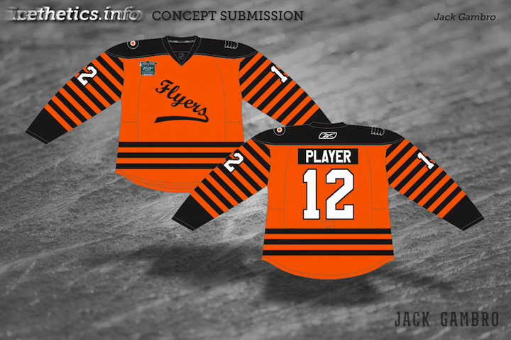
And last here is just one more example of a Quakers concept standing in as a Flyers jersey for the big outdoor game next year. Personally, I don't see it happening. But then the Flames revisited their city's hockey history at their outdoor game this year. I suppose Philly could do the same in 2012.

Reader Comments (18)
Take the thrashers tertiary logo, flip it upside down and BAM. Theres your new Jets logo.
I see Winnipeg keeping the Moose logo and name, but using the Jets as an alternate uniform.
Flyers WC concepts are awesome, love the old-school Dallas 3rds, and the Winnipeg Moose is a masterpiece. The shoulder patch is genius. Only change Id make would be to retain the current Moose color palette of forest green and maroon.
For that Moose concept, I don't hate it (even though I hate the prospect of the team being named Moose). But the away white is too similar to the Oilers' road whites. Fill in the shoulder and outside of the sleeve with blue and you've got something.
That moose concept is pointless cause the Thrashers aren't leaving.
The Sabres third was partially inspired by the Buffalo Bison IIRC
Hi guys. I'm very disappointed to say I've re-enabled comment moderation here on the Concepts page. The nastiness and personal attacks from pathetic bullies were becoming far too prevalent and I'm tired of reading and deleting that garbage. I don't want it on this site anymore. Period.
I recognize there are probably a lot of kids visiting who have yet to learn the meaning of tact, but let's try to set a better example. Not everyone will agree with your opinion. Doesn't require you to bully them. What was it your mom said? If you don't have anything nice to say, don't say anything at all. Yeah, let's go by that.
I would hate it if the Winnipeg team went with the Moose name, but I like that concept alot. The logo with the Moose and the Jet cracks me up.
Rangers WC jersey is too similar to the current whites, except for the "new york" instead of "rangers." I love the Flyers/Quakers jersey idea. Dallas is split for me. I hate that logo, but it is better than just the word "dallas" and a number. Also, the North Stars themed jersey is fantastic. I hate the Islanders concept. Mannitoba/Winnipeg is great if they indeed retain the moose, but I hate the name and honestly dont see them retaining the Mannitoba Moose moniker. The Jets/Moose sleve logo is fine the way it is. By adding color, you look too much like the Wilds logo. All in all, there are some great ideas and some not so great ideas.
If Winnipeg gets the Thrashers and the owners decide to go with Winnipeg Jets name I would like to see them use 1970's era WHA Jets uniforms but with Moose color scheme. That would look awesome, somebody do one up!.
The stars one is fckin sickkkkk
The Flyers WC jerseys look great, hope they go with a quakers throwback!!!
That Stars concept is gorgeous. I would be even happier if that became their primary home jersey.
The 'angry animal' logo is a very AHL sort of thing, and if the Thrashers become the Moose I hope they don't go in that direction. It was interesting in the 90s, but I think it's become old. The Wild or Coyotes could have gone with an angsty raging cartoon animal, but their logos are far more clever. Let's hope we get a better Moose logo.
One thing to appreciate from the Moose concept is the marriage of past and present in the secondary logo.
The Minnesota Wild are an excellent example of this, incorporating a subtle star within the Bear/Forestry logo.
A word of caution; if such a design does emerge, that would make two such concepts within the NW division.
First post I love the Rangers concept, it's awesome. Simple and beautiful. Flyers is a little weird
I hope the Flyers either go with the 80s/90s orange or the Quakers with the handwritten script and maybe a liberty bell patch on one shoulder and the primary logo on the other, or just both patches be the primary logo and the winter classic logo be the liberty bell like many have used on a concept (and maybe subtract some stripes so that its not overwhelming however i dnt have too much of a prob with it, but i know alof of fans may not love it). Anway im jut happy theyre havin it in my hometown in my fav park, i wana go so bad but tic prices will prob be redic!
That Rangers WC concept is basically a white version of the current throwback/heritage/third jersey. That's the point when it's "similar to the regular whites", the heritage is similar to the regular blue jersey as well but has its differences. I'm kinda hoping they do some sort of jersey for the game, whether it be combining multiple things from different generations or creating a new one. I know the jerseys have been untouched and unchanged majorly for the most part, but to wear the regular jersey for a game like the outdoor wc just seems too bland and blah