Friday
Aug192011
Concept Collection 48
 10 Comments
Today's set of new concept art is just a random collection. Enjoy!


Lots of creative ideas in this group. Keep them coming!


Today's set of new concept art is just a random collection. Enjoy!
Lots of creative ideas in this group. Keep them coming!

Reader Comments (10)
beck - avalanche: have the sleeve striping mimic the waist striping and you have yourself a solid concept. The incomplete striping, put it just above the cuff, but big enough to be noticed, and then throw a little more of the blue in the piping or something...then you have a solid sweater. As it stands, not exactly congruent all the way through.
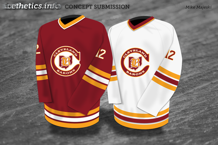
i really like the barons concept. and the rangers one would be really cool AS LONG AS IT WAS ONE NIGHT ONLY FOR THE WINTER CLASSIC
Jets- Very good concept but the colors need to be consistent 8/10
Rangers- Extremely creative except the logo makes no sense but i give it effort points 8/10
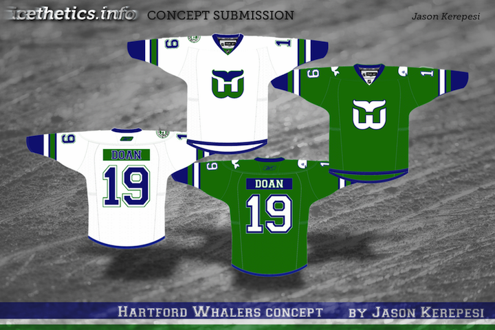
Whalers- ENOUGH WITH NAMEPLATES. I dont know when people felt name plates looked so good, for original six teams in a few from the late 60's fine. The Sabres is ok also but it is getting to the point people are just putting name plates on there just because. The jersey itself looses some of it crispness and edge because of the nameplate otherwise good concept. 5/10
Av's- Kinda of steals the pattern from the Sabres 06-07 unis but still looks good. 9/10
Barons- Very clean vintage look on this jersey. Like the nameplate though the logo is part of this trend where everyone has to have the team name in a circle around the logo. 9/10
Craig, the logo on the Rangers jersey is supposed to like the logo of the old Brooklyn Americans, and the jersey looks like it is supposed to based off of the Americans old jerseys too.
That Barons logo is also supposed to look like the old Cleveland Barons logo just recolored, Craig.
The Barons dark jersey looks too much like Calgary's red throwback. Still pretty nice though. The rest...not so much. Don't mind the Rangers play on the Americans.
The Rangers sweater is creative, but it is modeled out of the old New York Americans sweater. If you're going to do that then the Rangers might as well play the Winter Classic in NJ Devils sweaters. Interesting note, when they moved the Rockies to NJ, one of the proposed names for the team was the "New Jersey Americans."
I like the Avs sweaters, nothing too fancy, but I like the way they remodeled the purple which I have always thought was a bit out of place.
The Barons sweaters rock.
You guys don't realize that if the Rangers were to wear an Americans style jersey, it would be like them wearing an Islanders style jersey if they were defunct (which just might happen). I also find it interesting how Jason used Doan on the whalers jesey.
There have been some really cool Jets concepts, I hope the organization doesn't bomb out. I like the Ranger concept, but it is a NY/Brooklyn Americans throwback. The Rangers jersey past has had minimal changes so a Winter Classic Sweater will have to incorporate new ideas and you have to keep the classic jersey numbers, but maybe change the colors of them. Same for the Flyers. I think those contrasting color name plates are hideous
I think Mike Majeski's Cleveland Barons concept is awesome. Can you do some socks and striped pants to go with the sweaters?