Entries in panthers (13)

Sunday
Jan032010

Next Winter Classic: Revisited

The Winter Classic at Fenway Park was nothing short of classic. It's such an awesome tradition and there's no shortage of opinions on who should play in future outdoor games. Since the last concept post, a few other artists have submitted some interesting ideas. I have a pair here I thought worth sharing before we move on to a new concept topic.


Brad McPelican

Brad writes in with an idea for a New Year's Day game not in 2011 but in 2014. He calls it the Canadian Classic. It would feature the Ottawa Senators and Vancouver Canucks (playing as the Millionaires) at Frank Clair Stadium in Ontario.

It may seem a bit unusual, so I'll let him explain. He wrote a very long proposal which I have actually edited way down for your convenience. All the key details are intact.

There was a time when the Stanley Cup was a challenge cup exclusively for Canadian clubs and in the Canadian Classic, I would like to relive that era.

The contest I find would be the best is one between Ottawa and Vancouver. Both cities currently are home to NHL franchises who have never won the Stanley Cup but, in hockey's early days, had taken home the prize as two of the nation's finest teams.

What makes this game even more special is that — 100 years earlier, in 1914-15 — the Vancouver Millionaires played in a best-of-five series in Vancouver and won the Cup. It was the last time the Stanley Cup would be exclusive to the best Canadian team — with the Portland Rosebuds joining the PCHA. This series was the last truly Canadian challenge for the Stanley Cup, which I think is pretty special.

As for the jerseys and event logo, I tried to make them as classic and as true to their time as possible. The logo was designed to look like the old team championship pictures and features vintage colors. The jerseys, on the other hand, are almost exactly what they wore — refitted for Reebok Edge jerseys of course — with Ottawa wearing brown pants and Vancouver wearing white ones. You might notice as well that their are no names on the back of the jerseys. This is to be true to the times, not a mistake.

If that game doesn't satisfy traditionalists, nothing could. By the way, just wanted to point out (because I know someone will) that the nameplates on NHL jerseys are currently part of NHL regulations and would probably require an Act of Bettman to sidestep. And he hates Canada.

John B

Obviously this one is just meant to be for fun. You could call it Winter Classic Freak Out. While my little corner of Florida has been atypically cold the last couple of days, there's clearly no way it could sustain a sheet of ice outdoors.

But as a Lightning fan, this was a fun concept to look at and muse on. As long as the Winter Classic is around, I don't ever imagine the Bolts or Panthers getting a shot at it. It will forever be reserved for teams who play where outdoor ice is a viable option.

John does have some interesting artwork here but I'm just not sure these "classic" jersey designs really work. Tampa hockey club? An F with cat ears and a tail? I'll pass.

The icing on the cake probably has to be the Winter Classic-themed surfboard design.

Thanks to John for giving us a laugh.

Thanks to all the artists who sent in their ideas for future Winter Classics.

Friday
Dec252009

Fixing the Cats' Thirds

Hope you're enjoying your morning. I've got some new concept art for you as part of the re-launch of the Icethetics concept format. From now on, I expect to have more frequent posts with fewer items.

Today, three artists take a look at what the Florida Panthers' probably should've done with their new third jersey this season. Dark blue has been done. And just because you add a new color to your arsenal doesn't make it acceptable.


Peter Cabral

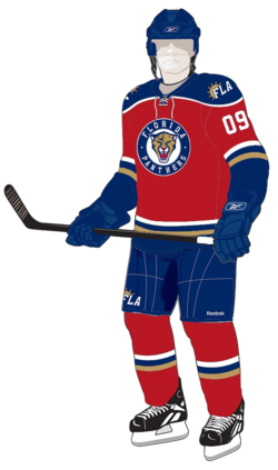
This is probably closest to what the Panthers should've done — and it's the closest to what they actually did. It keeps the rounded shoulder yoke intact as well as the new logos. The only major change is to the color of the sweater itself — and they need to bring back the red.

One other neat change is the gold. It works really well with those shades of blue and red. But you may prefer the current yellow. For an idea of what that might look like, look no further...

Chris Fraterrigo

That's the true Panthers gold. But personally, I think either way you go, red is definitely the winner here. The point of the alternate uniform is to show off some colors your home crowd isn't used to seeing. They skirted that with the powder blue splashed about.

I'm not saying Florida has a bad third jersey, because that couldn't be farther from the truth. I just feel like they missed an opportunity to return to their roots a little. The Cats wore red for years. As a matter of fact, their first blue sweater was a third.

Glen Cuthbert

This last one may be the best version. While it's differences are slight, they are significant in their simplicity. First, drop the gold. Just because it's a third sweater doesn't mean it requires a third color. Red and blue work perfectly and separate the sweater from the home and road jerseys.

Second, the circle around the new panther head is not important and while to some it may elicit the feel of old-time hockey, all it really does is paint itself as a Penguins/Wild/Blues copycat. Still, it may need a white stroke to help it stand out a bit more on its own.

Everything else works. The striping is great as well as the shoulder yoke and new logos. There's nothing else I'd change.

And that wraps up the first edition of the new concept format. Hope you enjoyed it and I hope you enjoyed all your awesome Christmas presents this morning!

Monday
Nov092009

Strauss NHL Rebrand I

We're kicking off a new concept series today here at Icethetics. Designer Elliott Strauss has been on a mission to rebrand the NHL for the better. Some teams need sweeping changes, others not so much. For the 10-part series, Elliott set out with the following goals:

  • Get rid of Reebok EDGE motifs like useless piping (Panthers), piping that randomly stops (Flames), unmatching home/away templates (Wild/Thrashers), awful-looking templates (Sens third), and teams with the same template.
  • Come up with some brand new modern designs and make sure every team has a distinct identity.
  • Pay attention to detail with fluid identities that feature striping that both makes sense and is consistent.
  • Keep tradition when necessary.

I think Elliott is on the right track, for the most part here (though I may disagree with the need to make home and roads always match). Distinct identities, attention to detail and tradition are all important aspects to NHL uniforms. Let's see how they stack up!

All bold text in this post is in Elliott's own words. Artwork MAY NOT be reproduced without permission.
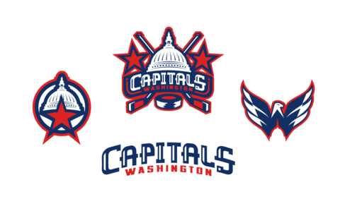
Washington Capitals

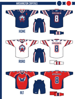
The colors stay the same, but the logo is new as I took the U.S. Capitol dome and combined it with a red star and circle — my version of the pre-Ovechkin primary.

Uniforms are a little top heavy but pants stripes help balance it out. The alternate is somewhat similar to the Capitals' current home, thought I thought the Weagle logo made a better crest.

A great start to this series. The only change I would make is to swap the home and third jerseys. To me, the Caps will always be red despite their late-90s identity crisis.

That Weagle as a crest is an incredible look that Washington needs to take advantage of one of these days.
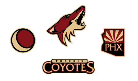
Phoenix Coyotes

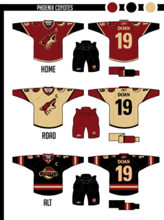
The sand color is darker here throughout the Coyotes identity.

With the jerseys, I wanted to move away from the extreme traditional look a little. Notice that the stripe on the bottom of the hem forms the same design between the jersey base and the pants as is on the arms. For that reason, the pants color had to change.

The road uniform is sand — just something different.  The crest of the alternate is based on an old patch they had when they still wore purple and green.

Another inspired concept here. I think the only missed opportunity was the sweater numbers. The rest of the design really works — even the non-white road sweater.
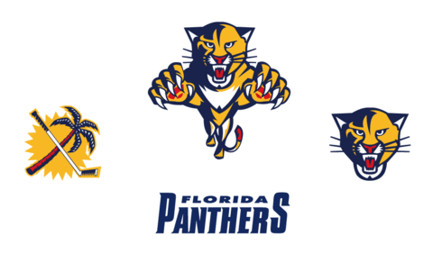
Florida Panthers

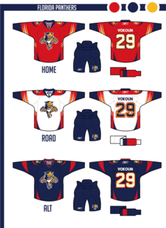
I took the Panthers' logos and updated them to be smoother and more intense.

The uniforms play heavily on the claw motif — even slight claw marks on the numbers.

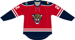
The alternate relies on the contrast between navy and red.

The Panthers have had great uniforms since their inception in 1993 — at least until the Age of Reebok. What Elliott's done brings them back into the 21st century.

The jerseys are sharp and so are the logos. Very nice work as we wrap up this series debut.

Elliott Strauss is a talented artist whose work has been seen previously as finalists for both the USF Ice Bulls and KractIce logo projects here at Icethetics.

We'll certainly see more from him over the next several weeks.

In next week's edition of the Strauss NHL Rebrand, prepare for teh Oilers, Red Wings and Thrashers.