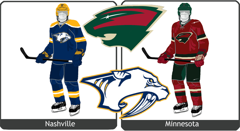
Entries in wild (8)

Wednesday
Feb102010

The State of Hockey

The Minnesota Wild are the subject of the newest Icethetics concept post. Our artists have come up with a slew of unique designs for Wild jerseys — all of which are worth a look.


Brian Brideau

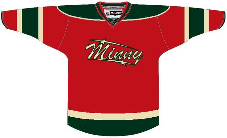
First up, how could the Wild look better on the road? After all, they are 9-19-2 right now. Brian may not be able to offer any legitimate tips on improving play, but maybe a new away jersey instead.

He's put the Wild's wheat color to good use by creating a reversal of the red home jersey. Is it better than what they have now? I don't know.
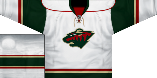
Adam L'Italien

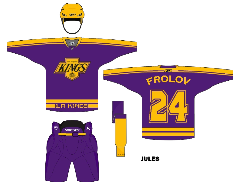
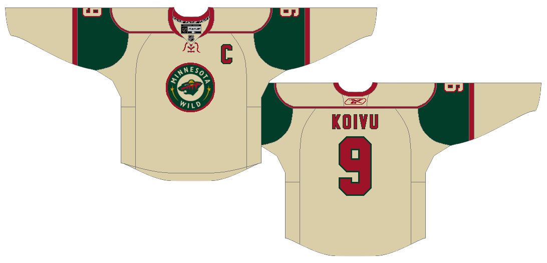
Adam has a different idea. He's keeping the white and the primary logo but making it look more like that red jersey. It's a good jersey and it's been copied a lot but do we really want to oversaturate it? I liked it better when it was an alternate sweater.
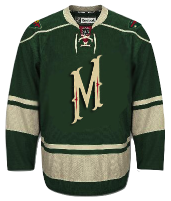
Glen Cuthbert

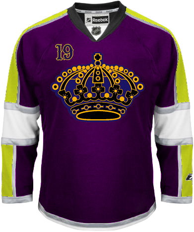
So speaking of third jerseys, can we improve upon their current one? Glen liked the M but not much else. He stripped down the text-based crest and added the primary logo to the shoulders. For better or worse?
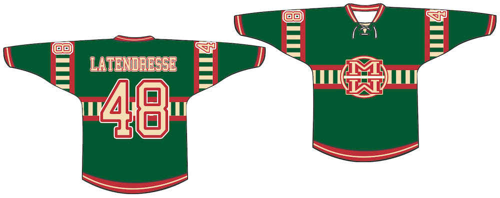
Jake Slavik

Jake's got a little off the beaten path, both in jersey design and customization. Probably the only time you'll see a Guillaume Latendresse jersey on these pages.

But it's the funky striping that really gives me pause. It's just so... strange. Notice I didn't say "horrible."
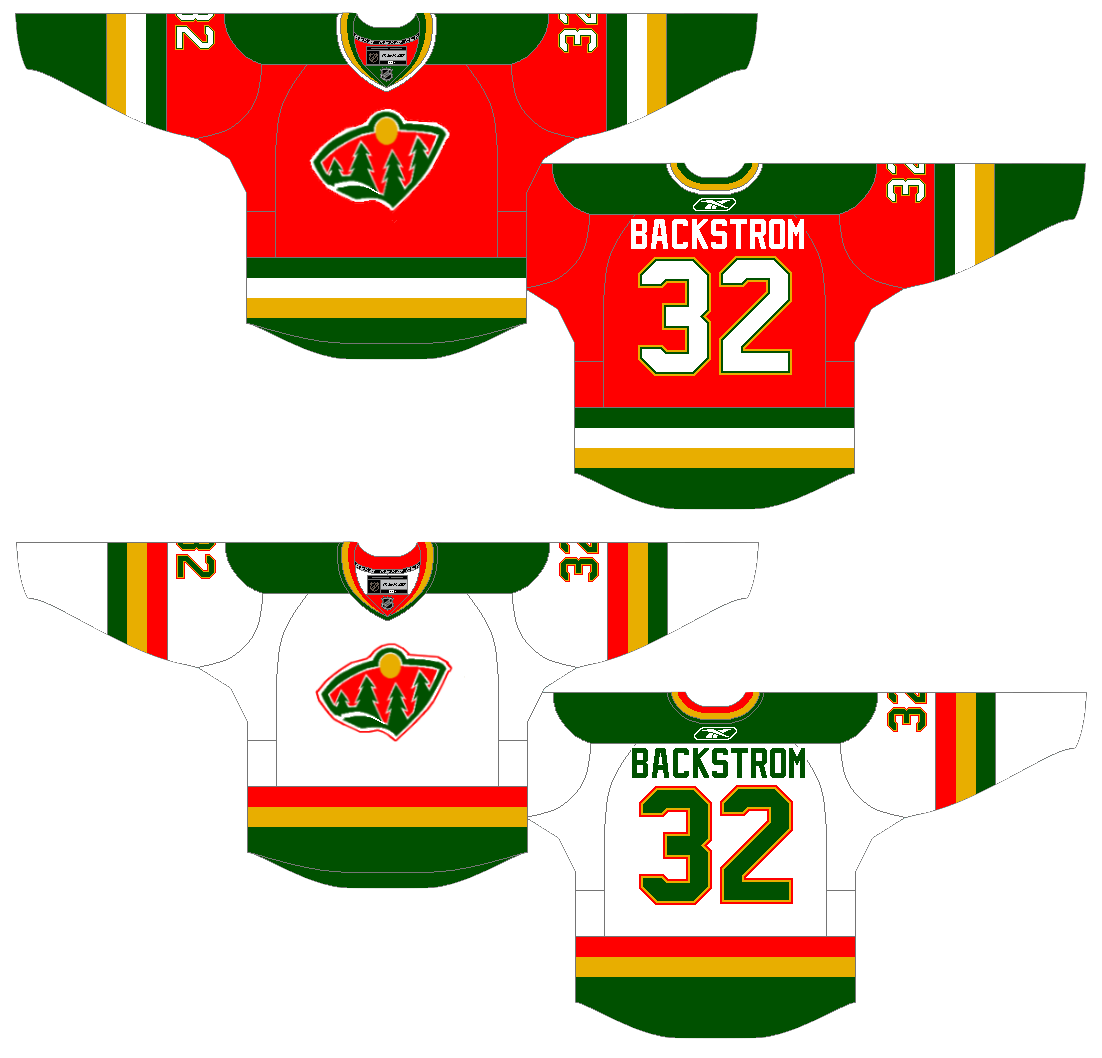
Brian Brideau

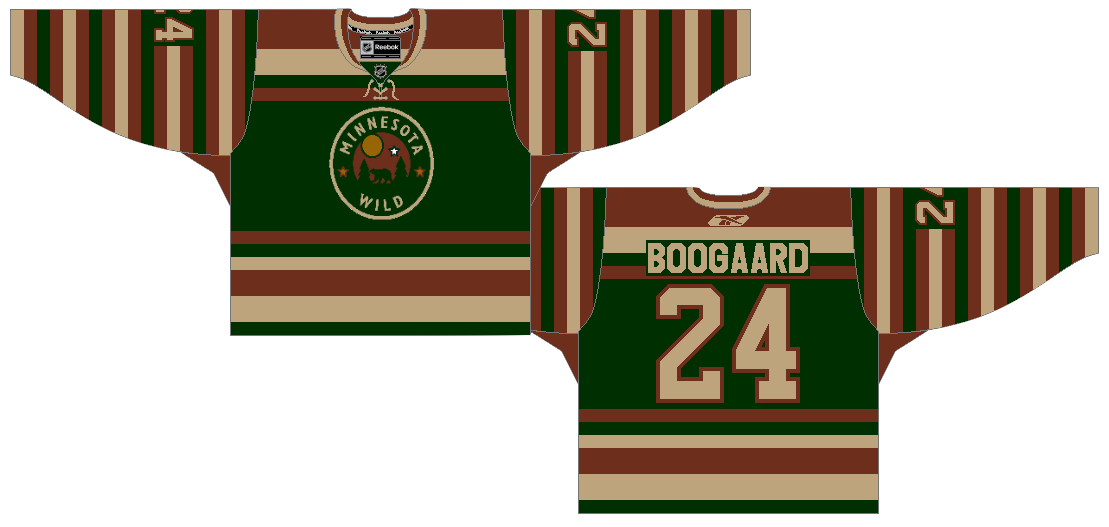
Now we switch gears and pretend to go back into the past. The Wild played their first game in 2000. But imagine if they existed in the 1980s. Brian thinks they'd be a lot more brightly colored — and that somehow they'd still have a goalie named Backstrom.

Even better, what if the Wild were around in hockey's early days along with the Montreal Canadiens. Would a 1910s Wild sweater look like this? Would Derek Boogaard's great grandfather be a member of the club? For sure, the color saturation would be much less than in the 80s.

Very creative. This is the sort of stuff I love to see.

Matt Marczel

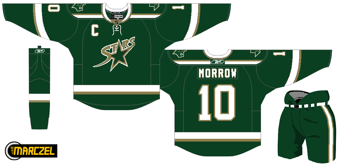
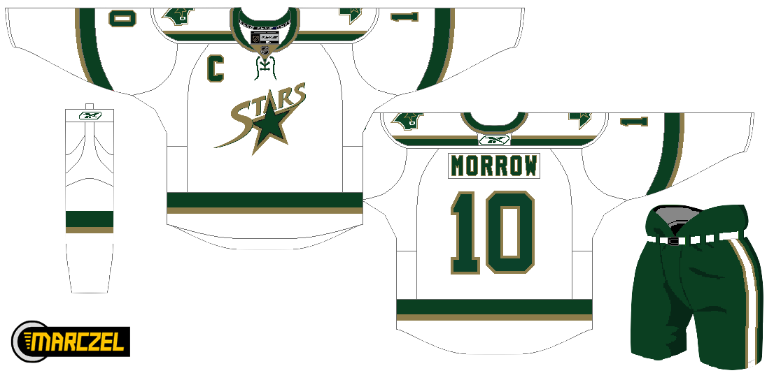
And as a bonus, let's go back into legitimate Minnesota hockey history — but in present day. Confused? Just look at these concepts for the team formerly known as the North Stars.

Matt's taken the AHL's Iowa Stars logo and given it a shot on the Dallas uniform. While I love the heavy-handed green and total lack of black, I'm not sure it's an improvement. Thoughts?

Ryan Haslett

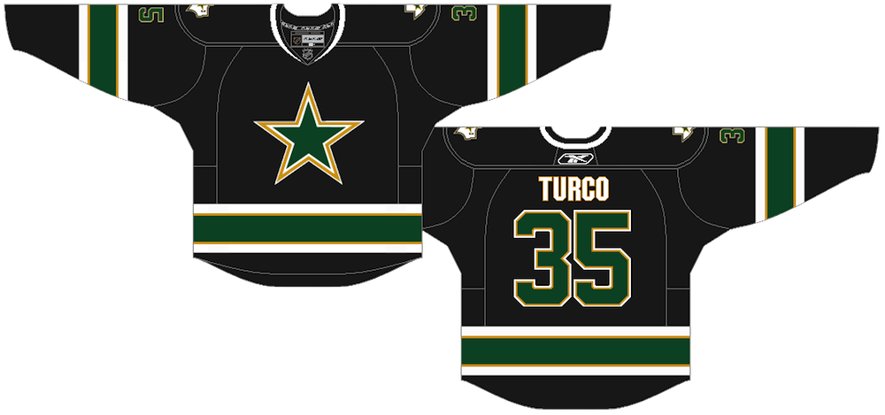
Lastly, Ryan has come up with a simple black jersey that calls back to the Stars' earliest days in Dallas. Unfortunately that's the Dallas Cowboys' logo painted green and gold. The stripes are great, though.

Hoping to not wait so long to get the next batch of concepts up. Been hard at work on new jersey galleries. Almost time to start getting the home and road sweaters on there.

By the way, Elliott Strauss' NHL Rebrand series will be picking up soon with the last half of the league. Stay tuned for that.

Sunday
Feb072010

Midwest Modifications

It's Super Bowl Sunday so that means a super-sized concept post. (Also I haven't put up anything new since Wednesday, so I owe you.) Normally I'd make the big game the theme, but as there are no NHL franchises in Indiana or Louisiana, we'll have to settle for the Central Division.


Matt Marczel

Lately, I've been seeing a lot of great Blackhawks concept art. This one has to be one of my favorites. Matt has ditched white for "vintage white" and it's made all the difference. I love the color combination and the use of color in this uniform set.

He's got home/road/third jersey, in that order, and I have to say the third may be the best. If that was ever a real NHL sweater, I'd buy it in a heartbeat. No question. Very nice work here, Matt!

Brad McPelican

One thing you don't seen an awful lot of in hockey is striped shoulder yokes, the assumption being that it would look terrible. I think this design proves the opposite.

I think Brad's design is a winner right up until the third jersey. I just don't think that trumpet logo ever worked for the Blues. Just wasn't meant to be. I think the Blue Note represents the club much better than a literal logo.

So what about the third jersey then?

Mike Bell

Mike has this to offer and I think he hit the nail on the head. Throwbacks work for some teams and not others. For example, it was bad news for the Flyers at the Winter Classic but good news for the Blackhawks at the Winter Classic.

The Blues would look great in those vintage colors and stylings. All we need is that nameplate.

Ryan Haslett

But if your idea of a third jersey is something completely different, Ryan has the answer. I didn't think I'd like a gold Blues jersey. This has changed my mind. Great colors and striping. That is a hockey sweater.

Jeff Kennedy

One team that has struggled with their identity for the last decade — no, not the Canucks — is the Blue Jackets. I think they've finally settled on a good solid look. So that's a plus.

What they don't have yet is a third jersey, so Jeff has taken it upon himself to put forth a couple ideas. They're certainly unique, but I'm not sure I'm sold on these.

Josh Gagnon

So how about this one? Many of you will say you don't like the sweater number on the front, but it is presented in a unique way. However, I'm not sure the vintage white works with such bright shades of blue and red. Maybe something a bit muted.

To be sure, the last thing the Jackets need is to introduce yet another new jersey logo. So we'll just wait and see if 2010-11 is the year the alternate uniform returns to Ohio's capital.

Ryan Haslett

We can't leave out the winningest team in the Central Division. Ryan's made some minor changes to the Red Wings' unis. Not sure about the shoulder piping or the repetition of the winged wheel, but the rest of the striping works.

Matt McElroy

We'll finish off the division with the Predators. Actually, Matt has given us simplified jerseys and primary logos for both the Preds and the Wild. It sort of works for the Wild, but the saber-toothed tiger just looks washed out. And the jerseys may be a little too simple.

But let this final graphic today serve as a bit of foreshadowing to the next concept post.

I'll have new artwork up in a day or two featuring the self-proclaimed State of Hockey.

Friday
Jan082010

Freak Out Friday XLIV

Happy Friday, all! Right now, I'm on an airplane bound for Las Vegas. This is the first of five auto-posts that should keep you guys occupied with new concept art while I'm off getting married. I've scheduled one for every day that I'm away and each one has its own theme.

Today's theme is an Icethetics fan favorite: Freak Out Friday! For new readers, this was a very popular regular feature of the site when I used to get loads of concept art sent in. Sometimes it would miss the mark — meaning we would never want to actually see it on the ice. Here's what I mean...


John B

The last time the Coyotes put a cactus on their jersey, it came to us in the form of one incredibly unpopular green third jersey in the late '90s. Unfortunately, this makes no improvements on that.

The designer is obviously trying to take a bad page out of the Lightning and Senators' books by running the nickname across the front. Yotes works about as well as Bolts and Sens. And while the sand and brick colors are still used today in the Phoenix color scheme, the purple and green are not.

John B

While we're on the subject of colloquialism failures on jerseys, let's add Minny to the list. I think Wild fans would agree there's just no call for it.

I don't want to dismiss this design out of hand, though. The striping is pretty nice, if not based somewhat off of Minnesota's current home and former third jersey. The red and beige color combo is one of the best looks in hockey right now.

Jules

Some of you may not necessarily be freaked out by this idea of a Kings third jersey, but I sure am. It may not be a popular notion, but I think one of the best uniform overhauls in NHL history was when the Kings switched to silver and black. Then they improved upon it by adding the purple back. But at no point do I want to see them wearing yellow on a regular basis again.

The only way I could excuse it is for a special night with historical significance as a one-off jersey. But now that I've said my peace, I'm curious what the rest of you think of a return to the '60s color scheme. At least at that time the NHL wasn't overrun with only two colors. Variety is good.

Matt McElroy

But hopefully we can all agree that such a variety of color on a single jersey is not a plus. A deep purple sweater with neon yellow sleeves and silver accents is in the dictionary next to "ugly."

That was harsh, but look, even the purple in the logo doesn't match the purple of the jersey itself. Same with the gold. And that numbering style is not a saving grace either.

This jersey design needs to be buried. Deep.

So while I'm enjoying myself in Vegas, I hope this post freaked you out sufficiently. As I mentioned earlier, there will be new concept art posted right here automatically every day until Tuesday.