Saturday
Jan222011

Concept Collection 2

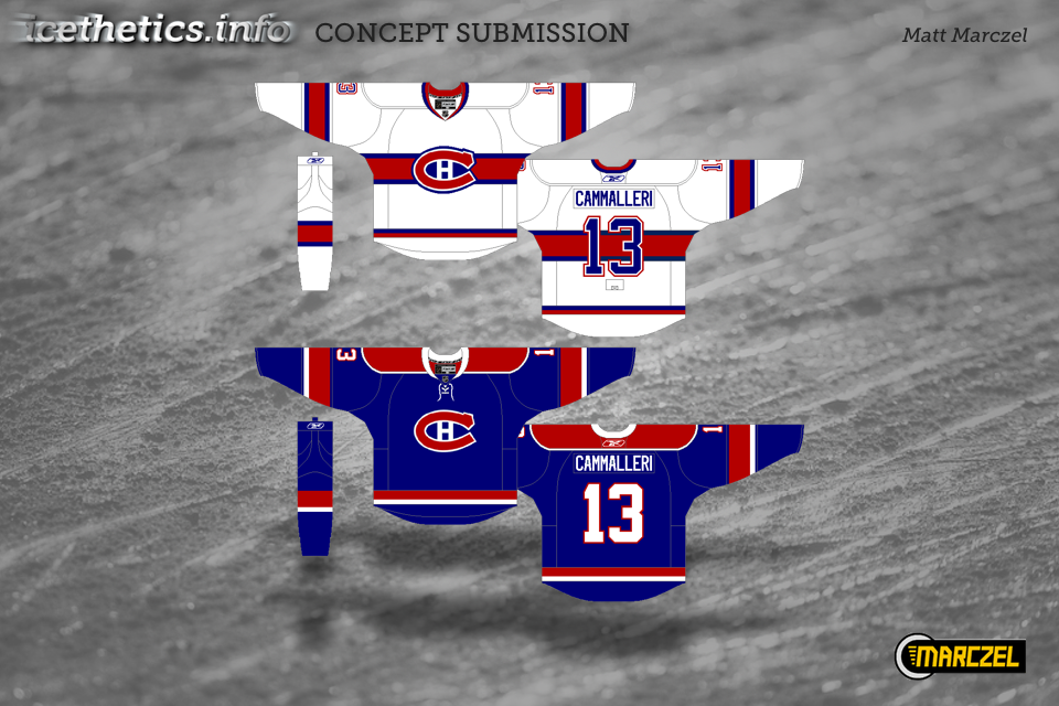
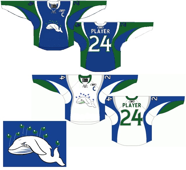
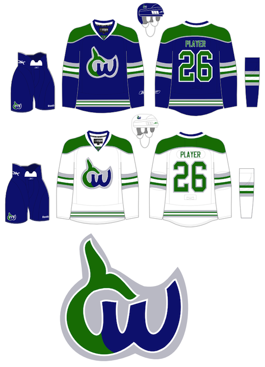
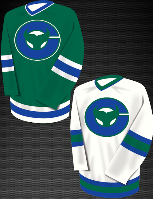
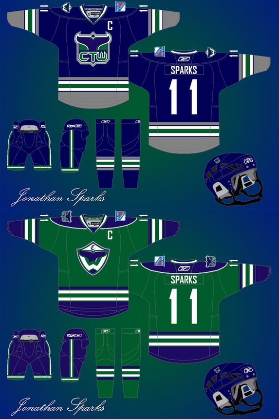
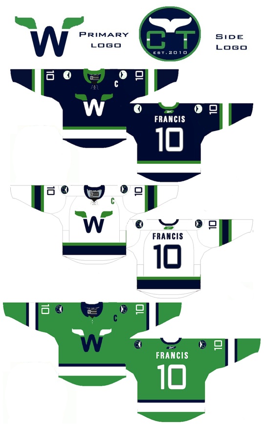
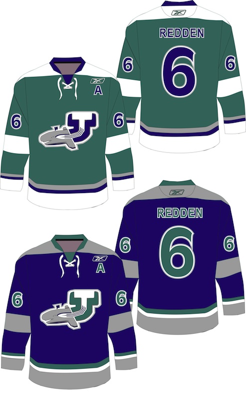
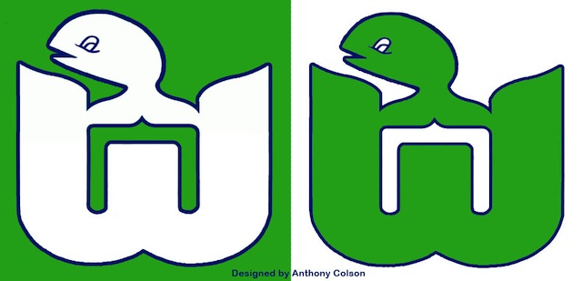
Continuing with the new concept art format. Seems to be getting good reviews. Today brings a handful of great designs by some Icethetics regulars.

If you recognize the logo in Ryan's Capitals concept, you're not alone. It's not an original design. In fact, it's a logo commissioned by the Capitals years ago but never used. It was included in a post a couple years ago about lost logos registered with the patent office but later abandoned.

Thursday
Jan202011

Concept Collection 1

I'm testing out a new format for concept posts. It features a standardized look for all submissions as well and limited commentary from me. Some posts will still have a particular theme, but from now on, most will just be a hodge-podge of whatever's in the Icethetics inbox. Feel free to leave your thoughts in the comments.

I know I said the last Connecticut Whale concepts would be the last. But Ross' attempt was too good not to share. We always talk about logo simplicity. This is one of those great designs that you can see a kid drawing on his notebook.

Unfortunately, this new format doesn't yet include ratings but I'm sure the artists will appreciate your feedback in the comments. Just added ratings. Enjoy!

Monday
Jan102011

Fixing the Whale Fail, Part 2

The Connecticut Whale concepts continue pouring in at a slow but steady pace. I'm starting a new post tonight to share them with you.


Caleb Fuller

We'll begin this set with the only one that's actually made me laugh out loud as I perused my inbox. Caleb took his inspiration of the infamous Twitter fail whale. And the execution is an absolute riot.

As if the crest alone weren't enough, he's created the sweater from a combination of elements from some of the worst NHL uniforms in recent history — namely the Sabres and Senators. This may have been a joke and doesn't "fix" anything, but it wins for the laugh factor as far as I'm concerned.

Brendan Klein

Next, Brendan has gone in a new direction while still keeping the spirit of the old Hartford Whalers. I don't think it needs an explanation as the logo pretty much speaks for itself. But I'm not sure I'm a fan of the white jersey's complete lack of blue. But maybe I'm alone there.

Christopher Lewis

Finally, Christopher came up with a fix that simplifies the idea of a logo built around a C for Connecticut. He shows you don't have to draw a cartoon to do it. And I like that. Still, I can't help but feel like the logo is more of a fusion of the Whalers and New Jersey Devils. The pointy tail just looks a little demonic.

Later this week I'll have new concepts, including some All-Star designs. I think we've put the Whale subject to bed at this point.