


0656: Yankee Stadium Sketches I
 5 Comments
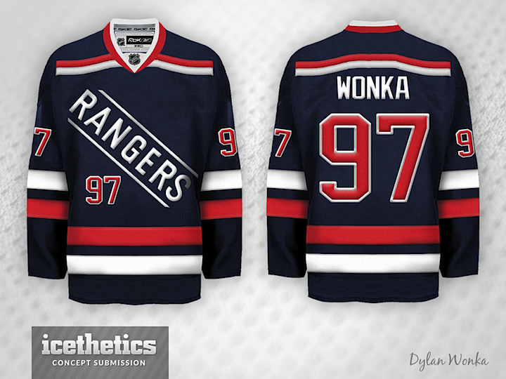
It's Stadium Series Week on the Concepts page and Dylan Wonka gets us over the hump with three jerseys for the Yankee Stadium games. His take on the Rangers is unique but likely not accurate. The team will wear white with NEW YORK across the chest. Still, it's a clever use of an element of the Rangers' shield logo.
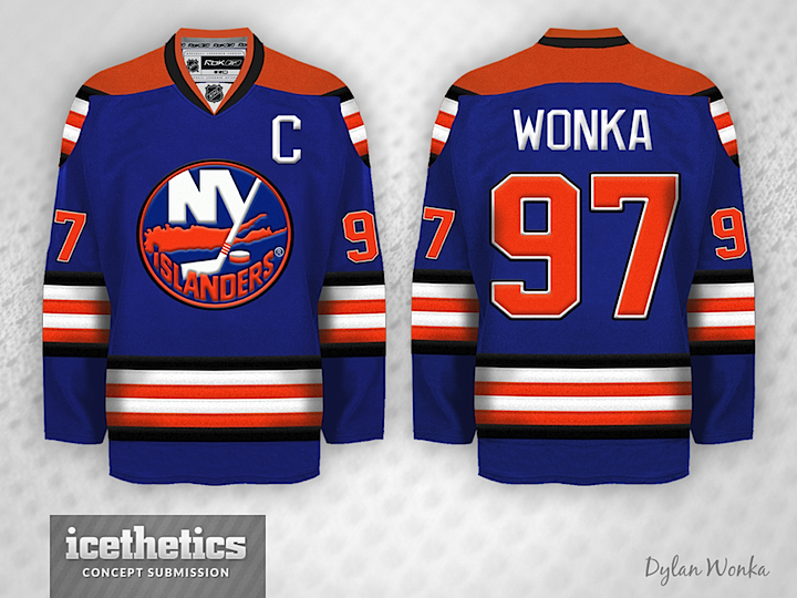
Next up is an Islanders proposal. I'm intrigued by the use of black striping on the primarily blue and orange sweater. But I have a feeling Long Island fans wouldn't warm to it.
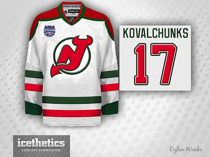
And lastly, we have the Devils. So far we've been hearing the Devils will go with a throwback unlike the rest of the participating teams. However, they'll be wearing red instead of white. Look for them to sport the red and green number they've worn on St. Patrick's Day in recent years.
Meantime, what do you think of Dylan's designs? Any you'd like to see in action at some point?

Reader Comments (5)
I like the Islanders one, I think the black is subtle enough but still works and I can see the Islanders doing something like that, even though it may not be realistic for the future. New Jersey concept is solid, pretty simple but obviously that's what New Jersey is all about. Interesting concept for the Rangers, can't say I've seen that idea before. Probably not practical, but still a neat concept.
not digging the Ranger concept at all. Nice colours though. Devils and islanders are top notch and more conservative
I really really really like the Devils look. I also wish the Devils would go back to this color scheme full time. The Islanders one is OK but looks too much like the Oilers IMO. I think the Rangers one is a great idea. I never have liked the script look but that uni looks really cool.
Love the Rangers one. Playing house league for the "Rangers" I would have loved that in the 90s. Very cool with the framing lines around the word.
I love both of these new york sweaters. I would pay money for either of these and I'm not even a fan of either team. 5 stars all around, fellas...the nod to the rangers shield is fantastic and the touch of black works really well for the Isles (and falls into line branding-wise with the Mets and Knicks). Very well done.