Friday
Feb082013
0356: All Out Arizona
 Friday · Feb 8 · 2013 | 9:00 AM PST
  14 Comments

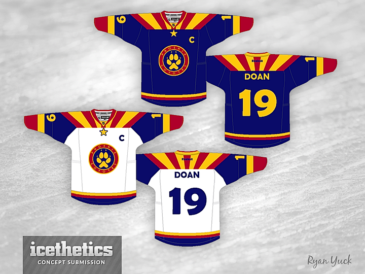
If the Phoenix Coyotes spend another season in the desert, Glendale wants the team to change its name — to the Arizona Coyotes. So Ryan Yuck figures, why not go a step further and drape them in the state flag? Forget an homage on the shoulder patch, go all out Arizona!
By the way, Ryan asked me to point out that his surname is pronounced "YOOK." So before you start in with your "very clever" yuck puns... don't. It's a Freak Out Friday. Live with it.
Update on Monday · Feb 11 · 2013 | 1:08 AM PST by
 Chris
Chris
 Chris
Chris

Ryan read your feedback made some revisions to his Coyotes concept.
Designed by  Ryan Yuck
 Ryan Yuck


Reader Comments (14)
I like it actually! not sure how I feel about the paw
I like it. An upgrade over their current unforms for sure.
I like it a lot! It's obviously a giant departure, but it totally works. Reminiscent of the old Rockies a bit. Wonderful job.
i hate it for what it is and i love it for what it isn't. i just can't decide which way to go.
i guess that makes it a perfect freakout friday entry.
So the panthers moved to Phoenix?
I agree with Donnie, It's something new & different, & certainly not boring! Do it up!!
I'm remarkably impressed with this design! Really well put together... Good show, Mr. Yuck.
And yet it says Phoenix in the circle in the logo...
It's not terrible, the blue-yellow-red color scheme has virtually disappeared from hockey (the ones I can remember are the Scouts and Rockies), and this is a creative way to bring it back. The one thing I dislike is the font on the names and numbers. Other than that, it's pretty good.
i like the idea behind it but the colors aren't working for me. yes, i understand that it's freak out friday and it's the state flag but from a point of making it a usable sweater if the colors were to move toward the coyotes colors it could be very different and still look sharp. if if was more brick red (instead of the bright red) and the yellow shifted toward the 'yotes sand/beige and then the blue was changed to something less saturated that would look nice with the brick red and tan i think it was be a very attractive design that still echoed the state flag.
i really like the sun beams fanning out on the shoulders
also the lettering and numbering has to change! these are killing me.
Finally, a colourful jersey design. I LOVE this. I've been saying for years the NHL needs more colourful jerseys. I would change the front crest to say Arizona instead of Pheonix though. Maybe a howling coyote for the logo and the paw for a secondary logo. I really like this though.
I like for an Arizona team, but not for a team named the Coyotes. It would be great if the Phoenix Suns were a hockey team.
Yoo-kan do better then that
This could actually be a the next Yates jersey cause there changing the name to Arizona coyotes so they can make the jersey relate tot the state more kinda like the Rockeis in Colorado