0282: Oilers Hockey Re-Imagined
The Edmonton Oilers have been feeling a little left out on the Concepts page lately. So here's a unique one from Joseph Loretz. What if the Oilers' primary color wasn't royal blue?
|
The Edmonton Oilers have been feeling a little left out on the Concepts page lately. So here's a unique one from Joseph Loretz. What if the Oilers' primary color wasn't royal blue?
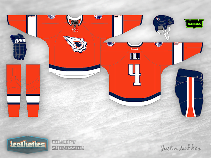
Anyone else think an orange Oilers jersey is long overdue? Justin Nahhas mixes that notion with the Oilers' first-ever third jersey design from the '90s. I miss that one, by the way.
After reading through some of the comments, Justin made some revisions.
We're giving Ross a bit of a break after his epic Freak Out Friday series. Today, Kalin Szoke offers up this very unusual design for the Edmonton Oilers. I'll say this about it... I don't think you can possibly make the logo any bigger. Kalin tells me it was a first attempt at creating a concept jersey. It's certainly out there, but the real question is this: Would you want one hanging in your closet?
Earlier this month we got a look at what certain minor league teams would look like if they were modeled after their NHL affiliate. Today is kind of the reverse of that. What if the Edmonton Oilers looked a little more like the AHL's Oklahoma City Barons? Tim Pearce provides the answer.