Saturday
May212011

Collection 31: In the Future... (If There Is One)

With all this rapture talk, I thought we might take a look at what the future holds (if there is one) for NHL uniforms next season. These are all based on rumors that have been reported around the web recently.

The first set is based on the rumor that the Flyers will host the Rangers for the 2012 Winter Classic. The inspiration for the Flyers' throwback jersey is the Philadelphia Quakers franchise — which has no relation to the Flyers. Still, I have yet to see a Flyers WC concept not based on that team's uniform design.

Another rumor spreading this spring calls for the Isles to launch a black alternate next season.

Whether or not it's wishful thinking, the prevailing rumors for the Stars is the debut of a green third jersey.

Now this one is a little more outside the box. It assumes the Thrashers are sold and moved to Winnipeg and that True North would retain the Moose branding to some extent while also paying tribute to the Jets.

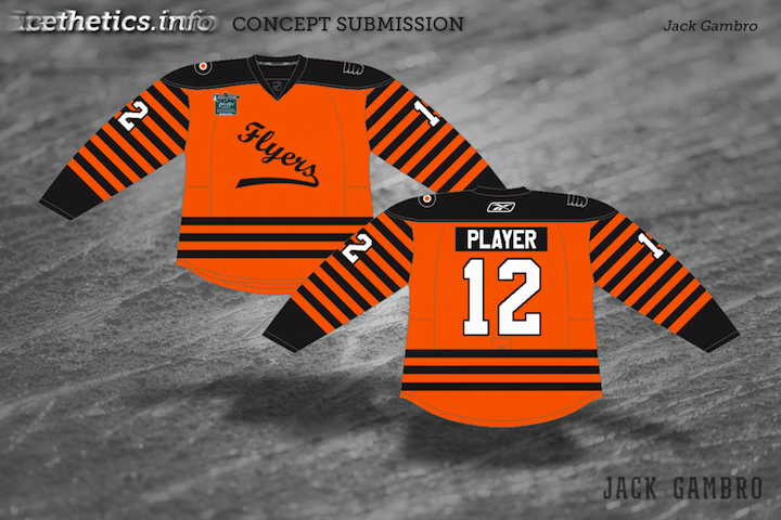
And last here is just one more example of a Quakers concept standing in as a Flyers jersey for the big outdoor game next year. Personally, I don't see it happening. But then the Flames revisited their city's hockey history at their outdoor game this year. I suppose Philly could do the same in 2012.

Thursday
May192011

Collection 30: Still on the Hunt

The theme for today's concept art is the Conference Finals! Just four teams remain and here are some fan-made jersey revamps for them. (And a bonus.)

And as a bonus (so I can round out this post with five pieces), here we have the Red Wings, the last team to be eliminated from the playoffs.

Coming soon, we'll take a look at what we might see for the 2012 Winter Classic. Send along your concepts!

Thursday
May122011

Collection 29: Just a Minor Thing

One group that's often overlooked on the Concept page are the minor leagues. Plenty of teams could use a bit of rebranding work. Here's what some of our talented designers have come up with.

First up is my favorite. John's idea was to rebrand the AHL's Norfolk Admirals based on their NHL affiliate — the Tampa Bay Lightning. The color scheme has been cut down to blue and white and the logo has been simplified. And just like Tampa Bay's new uniforms, the road jersey bears the city's name. It's a brilliant concept and one I've been wanting to share for some time.

Mike was headed down a similar path, rebranding the Lake Erie Monsters to sync up with their fellow Ohio team, the Columbus Blue Jackets. Only Mike has used the Jackets' new alternate sweater as a base.

Jake's design is for the ECHL's Wheeling Nailers, an affiliate of the Pittsburgh Penguins — on which his design is obviously inspired. It's actually pretty clever.

Ryan, here, hasn't rebranded the Manitoba Moose so much as he's applied the existing brand to the Phoenix Coyotes. We now know that the Coyotes aren't an option for Winnipeg anymore, at least not in 2011 — but also that if the Coyotes were to move back to Manitoba, they would likely retake the Winnipeg Jets name. Still, a nice effort anyway.

And yes, I know this isn't technically a minor league design. But let's be honest, it was such a minor league design. Glen has Edge-ified the much-maligned jerseys of the New York Islanders from the mid-1990s by adding the fisherman logo to the Ducks' Edge template.

Sorry you had to see that.

Page 1 ... 6 7 8 9 10 ... 38 Next 3 Entries »