Entries in rangers (12)

Friday
Aug202010

Third Jersey Theories

Today's batch of concept art deals with a handful of teams with new sweater designs on the way. While we wait for official unveilings, our concept artists get to work on some predictions of their own.


Alex Valvo

The Sabres will unveil their new third jersey on Sept. 18. All right, technically these aren't third jersey concepts, but the expectation is that the Sabres will promote their current third jersey to home status — while adding a white version for the road. That's the concept Alex is offering up today.
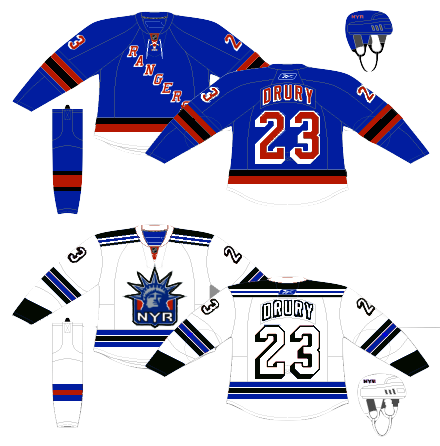
Jekabs Elerts

We keep hoping for the Lady Liberty logo to return when the Rangers unveil their new third jersey in November. That's what Jekabs has for us — though he likes to work with the Nike Swift jersey template, as opposed to the Reebok Edge standard. Regardless, it's a solid sweater design.

Jekabs Elerts

The Penguins will use the 2011 Winter Classic to launch their new third jersey. Jekabs's guess is that they're going with this 1967 replica. But since they're the home team, it probably won't be a white jersey — but you never know. The Sabres wore white when they hosted in 2008.
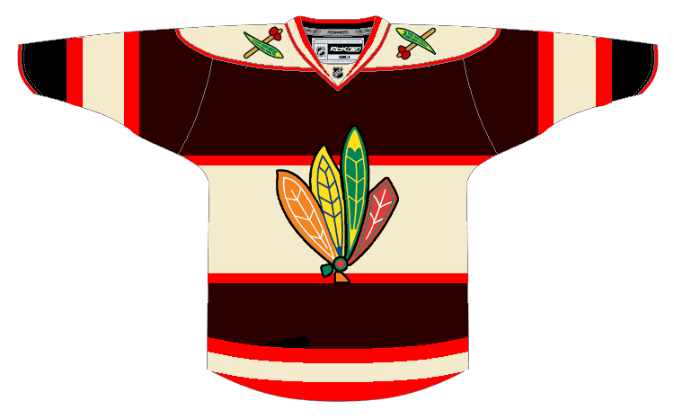
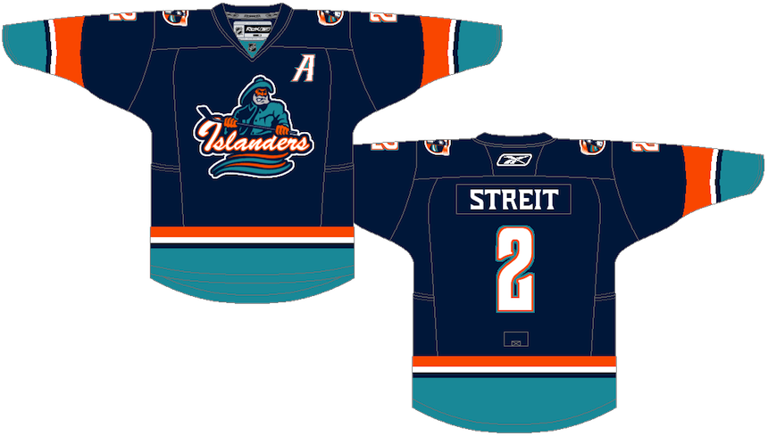
Ryan Haslett

I'm a big fan of this one. Ryan, a prolific concept artist, has put a unique spin the much-maligned Islanders jersey from the mid-90s. Not a bad treatment if you ask me. Perhaps if the Isles had done something a little less radical and a little more like this, fans wouldn't have rioted so much. I like that font, by the way!
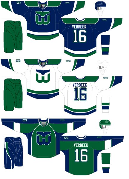
Connor Hanley

The Whaler talk these days has been intense. More on that in an upcoming blog post. In the meantime, Connor joins Howard Baldwin in hoping for the NHL's return to Hartford. Such a great logo. And solid uniforms all around.

Jack Martineau

And finally, while the Canucks aren't actually planning a new third jersey — that we know of — I decided to toss Jacks' concept into this post as a bonus. The logo used on the jersey just won the NHL secondary logo tournament here on Icethetics.

As always, feel free to email in concepts. I'm working on adding a bunch more to the Facebook page this weekend.

Sunday
May022010

Strauss NHL Rebrand X

Time for the big finale. Here is the final installment in Elliott Strauss' NHL rebrand series. His descriptions appear in bold text.


Elliott Strauss

I think this is one of the more interesting concepts of the series because it gives a fairly drastic change to an untouchable team. I updated the familiar shield and brought back the Lady Liberty logo. The diagonal stripe on the uniforms has the same angle as the wordmark and is meant to match the diagonal sash on the primary logo.

The wordmark/numbers contrast the sleeve stripe order on the home and away jersey. The alternate is almost an exact replica of the pre edge alts, but the silver is dropped in favor of royal blue.

Definitely a shock at first glance — in a good way. All the key elements are still there. They just don't look the way we're accustomed to seeing them. This is one of my favorites of the entire series.

Elliott Strauss

Originally I had left some gray in here, but considering the nickname represents the Union army, I found the color gray pointless, as this is what the Confederates wore. I think these uniforms are inspired by the original jerseys for the franchise.

The red pants stay and a blue insert with star on the pants match up with the panel that you can see on the road jersey. I created no alternate because a red jersey would go against the nickname and another blue jersey would be redundant.

Straight after one my favorites is my least favorite of Elliott's series. I'm not here to put down anyone's work but this set feels lazy. Gray was never one of Columbus' colors. It's always been silver. It's an important distinction. Without the silver, the star in the logo looks out of place. And the Blue Jackets made a second blue jersey work in 2003. Just a little creativity is required.

Now with that out of the way, I love the jersey design! The sleeves are cool and so are the stars under the arms. It's a little like the stripes on the armpits of the Lightning's jerseys. Adds an interesting visual element when the players raise their arms to celebrate a goal.

Elliott Strauss

I feel that the Johnny Canuck V logo is the best they have, so it becomes the main crest in my design. The orca stays, just modified, and has a much less prominent role. Green and blue also stay, as I like this unique scheme. I've always wondered what a green alternate would look like, I think this simple striping pattern would make the blue stand out on the green.

Here I applaud Elliott's use of an existing logo because the Canucks have never had a more uniquely identifiable logo in their arsenal. It's just a shame they haven't put it to good use yet. And for what it's worth, the whale doesn't look half bad on green.

There it is. All 30 teams as envisioned by Icethetics concept artist Elliott Strauss. Do you think you have what it takes to rebrand the NHL? Send in your concepts and show us you can think outside the box when it comes to branding pro hockey!

Thursday
Jan282010

Freak Out Friday XLV

Friday is here again and you know what that means. Time to freak out!

I'm really trying to get back into the habit of having a Freak Out Friday for you guys every now and then. Of course it relies primarily on your submissions. So keep them coming!

This week's theme is Original Six. Just how horrible can we make these most legendary of teams look? The answers to that question ensue.


John B

I don't mean to always be picking on the Blackhawks, but I think we can all agree that gravity-defying feathers are not the way to go. Not by a long shot.

Even the colors have me a little concerned. Maybe we should just move on.

Charles Cadieux

Nope, shouldn't have moved on. Adding black to the Rangers color scheme. Now that's something I never thought I'd see. And obviously I hope I never have to. Hockey fans everywhere would revolt!

But since it is only fake, we can all rest easy. The tricky part will be removing it from your memory.

Randy Dudek

The Maple Leafs were the focus of the previous concept post and we had a lot of really nice artwork. Now it all goes out the window because this just beats everything. I mean, it's a Maple Leafs jersey covered in actual maple leaves!

Wonder why we've never seen a third jersey that looks like that.

In closing, all I'll say is I hope you are not bleeding from the eyes. More concept art (the good stuff) this weekend.