Entries in stars (13)

Thursday
Feb032011

Concept Collection 6

No theme today, just another random assortment of concept art here.

Up first, Mike Ivall provides his take on a 2012 Winter Classic possibility. Rumors have suggested the game could be played in Philadelphia or New York next year.

Dallas Stars concept removed at artist's request

By the way, the Lightning concepts just keep streaming in, so I imagine that'll require another post or two in the near future. That's all for now.

Monday
Jan242011

Mike Ivall is Back!

Long time concept contributor and friend of Icethetics, Mike Ivall has caught the creativity bug, eager to express himself with jersey artwork. And I think that's something we're all happy to hear. Over the last few days he's immersed himself in the following designs.

After the St. Pete Times shared some new details on what the Lightning may be planning for their upcoming uniform redesign, Mike took a stab with some familiar elements. The lack of any black or silver does squarely put the look in Maple Leafs territory, which I'm not wild about. But you never know what Stevie Y has up his sleeve (i.e.: Dwayne Roloson).

I don't know what it is about this color combination but I absolutely love it. I saw Mike's concept and it's made me want to completely redesign Icethetics again — in these colors. The two-tone blue is all right if not overused these days, but add the red and suddenly it's completely unique. Anybody else with me on this?

How can Ottawa improve upon this? It's simple. They can't. Do this and the Senators will never need another jersey for the next century.

As usual, Mr. Ivall's work is outstanding and worthy of a post all to himself. And I can assure you there is more coming not only from Mike but many other talented artists as well.

Wednesday
Feb102010

The State of Hockey

The Minnesota Wild are the subject of the newest Icethetics concept post. Our artists have come up with a slew of unique designs for Wild jerseys — all of which are worth a look.


Brian Brideau

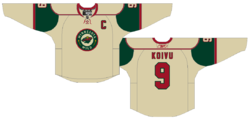
First up, how could the Wild look better on the road? After all, they are 9-19-2 right now. Brian may not be able to offer any legitimate tips on improving play, but maybe a new away jersey instead.

He's put the Wild's wheat color to good use by creating a reversal of the red home jersey. Is it better than what they have now? I don't know.

Adam L'Italien

Adam has a different idea. He's keeping the white and the primary logo but making it look more like that red jersey. It's a good jersey and it's been copied a lot but do we really want to oversaturate it? I liked it better when it was an alternate sweater.

Glen Cuthbert

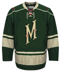
So speaking of third jerseys, can we improve upon their current one? Glen liked the M but not much else. He stripped down the text-based crest and added the primary logo to the shoulders. For better or worse?

Jake Slavik

Jake's got a little off the beaten path, both in jersey design and customization. Probably the only time you'll see a Guillaume Latendresse jersey on these pages.

But it's the funky striping that really gives me pause. It's just so... strange. Notice I didn't say "horrible."

Brian Brideau

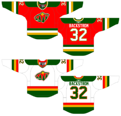
Now we switch gears and pretend to go back into the past. The Wild played their first game in 2000. But imagine if they existed in the 1980s. Brian thinks they'd be a lot more brightly colored — and that somehow they'd still have a goalie named Backstrom.

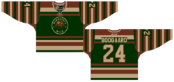
Even better, what if the Wild were around in hockey's early days along with the Montreal Canadiens. Would a 1910s Wild sweater look like this? Would Derek Boogaard's great grandfather be a member of the club? For sure, the color saturation would be much less than in the 80s.

Very creative. This is the sort of stuff I love to see.

Matt Marczel

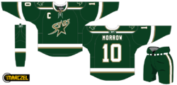
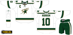
And as a bonus, let's go back into legitimate Minnesota hockey history — but in present day. Confused? Just look at these concepts for the team formerly known as the North Stars.

Matt's taken the AHL's Iowa Stars logo and given it a shot on the Dallas uniform. While I love the heavy-handed green and total lack of black, I'm not sure it's an improvement. Thoughts?

Ryan Haslett

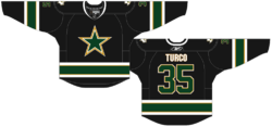
Lastly, Ryan has come up with a simple black jersey that calls back to the Stars' earliest days in Dallas. Unfortunately that's the Dallas Cowboys' logo painted green and gold. The stripes are great, though.

Hoping to not wait so long to get the next batch of concepts up. Been hard at work on new jersey galleries. Almost time to start getting the home and road sweaters on there.

By the way, Elliott Strauss' NHL Rebrand series will be picking up soon with the last half of the league. Stay tuned for that.