0296: The Sens' Perfect Collection


Wow! I think Justin Cox just solved the Ottawa Senators' uniforms for good. As far as I'm concerned, they would never need another jersey if they ever went with these. Outstanding work here.

|
Wow! I think Justin Cox just solved the Ottawa Senators' uniforms for good. As far as I'm concerned, they would never need another jersey if they ever went with these. Outstanding work here.
This is one of those outstanding concepts that you look at and wonder why the team isn't already using it. I wish I had an answer. All I know is that Justin Cox always submits top-notch work and I'm almost never disappointed by a green jersey. Win-win right there. One nice thing about this set is that for as much as the Wild get knocked for their "Christmas colors," this design really doesn't feel that way. Have to say, I'm a big fan.
On this University Sunday, we get two different concepts for the same school — Arizona State University – from two of our regular contributors. Matt McElroy and Justin Cox put together a couple of unique looks for the Sun Devils. Which do you prefer?
By the way, the response was great last week to my request for more college concepts. We'll be able to keep this series going for some time to come.
Here's a Freak Out Friday for you as we wrap up our week of non-hockey hockey jerseys. Who wouldn't want to wear this one by Justin Cox?
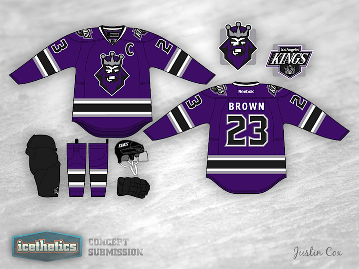
The last time this logo graced a hockey jersey was 1996. But 16 years on, concept artists keep trying out because there's just something about it. Today, Justin Cox has a purple and black Kings sweater that's never been tried before and it's a beauty. Of course that's just one opinion of it. What's yours?
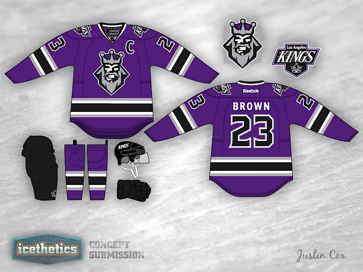
Justin read some of your feedback and offers up this revised version of his Kings jersey.
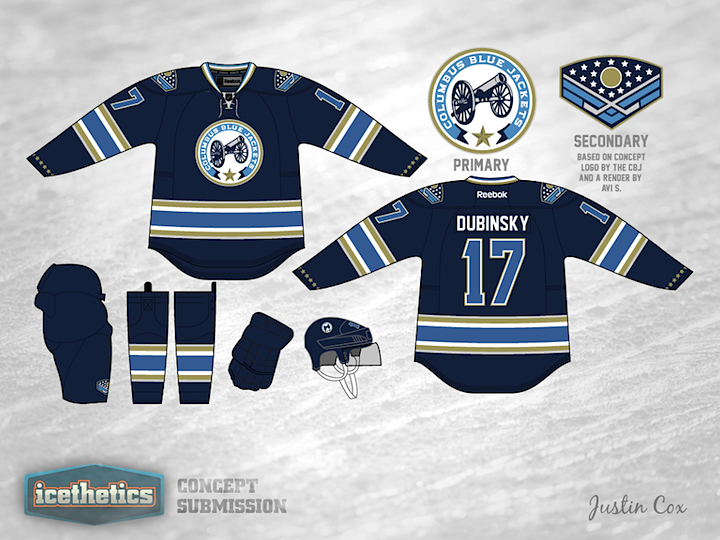
This week seems to be all about changing the color palettes of existing teams. So why not give it a shot in Columbus? If the Stars were to switch to red, white and blue, maybe the Blue Jackets could switch away from it. Justin Cox infuses some gold into a design inspired by the club's alternate jersey. It's a pretty sharp look and would certainly be unique in the NHL.
Ever since the Lightning unveiled their new logo, I've seen countless concepts that attempt to "fix" it by adding back the black and silver in some way. Usually, the attempts are terrible. But this one by Justin Cox really made me take a second look. Granted, it's a little more cartoonish-looking than Tampa Bay's primary mark, but it could certainly work. What do you guys think of this set? As a Lightning fan, I like it a lot.