Sunday
Sep022012

0197: San Francisco Sunday, The Finale

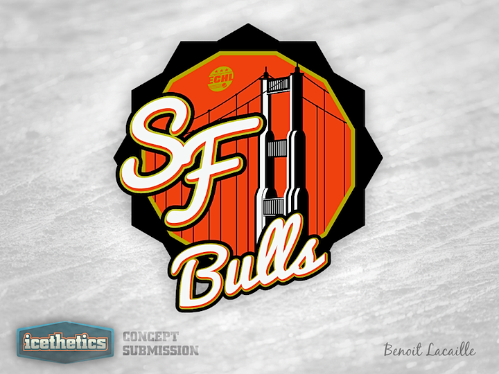
Today brings the last of five San Francisco Sundays in which we get a look at logos that were submitted to the ECHL's new Bay Area expansion team, the Bulls, for use as a secondary mark. Though technically that doesn't apply to today's set. Benoit Lacaille just sent me these in the last few weeks so they weren't proposed to the team.
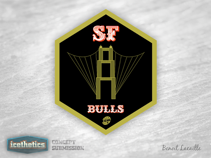
Hey, that hexagon looks familiar!
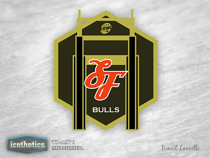
It was a neat series but I think we're done with San Francisco Bulls logos for a while.

Saturday
Sep012012

0196: Meeting Up at The Big House

Believe it or not, this Winter Classic Weekend post was scheduled long before yesterday's unveiling of the official new Winter Classic logo. But because of that, it couldn't be coming at a better time. Matt McElroy has assembled a beautiful set of uniforms here as well as a great logo. Now that we've seen the real logo, I can't wait to see the real uniforms as well!

Friday
Aug312012

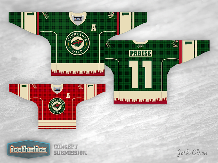
0195: Minnesota Freak Out

I really don't think I need to say anything about this one. Josh Olson has created the ideal Freak Out Friday concept for the Minnesota Wild.

Thursday
Aug302012

0194: Avalanche Re-Bourne

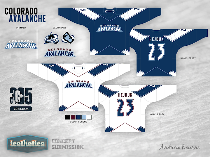
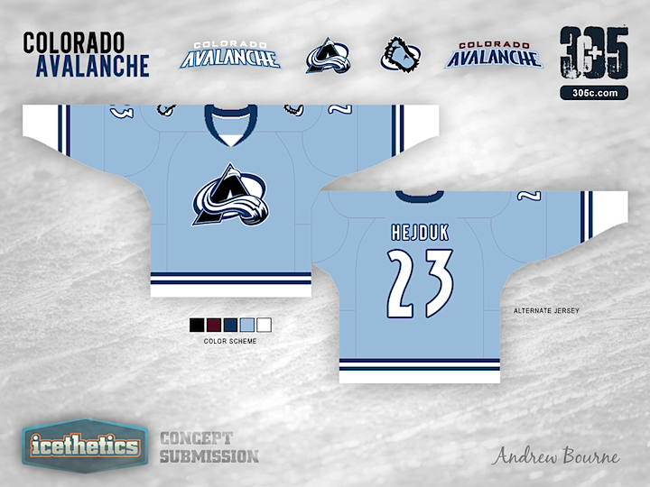
Andrew Bourne continues his NHL makeover series today with a look at the Avalanche.

For the most part, Colorado's color scheme is right on the money. Their black, blue, burgundy, white and silver really remind me of Colorado. Cold and mountainous is the way to go. Having said that, I wanted to tweak those colors to give you more of a feel for the mountains and the snow.

Even though The Avalanche have the two best logos in the entire league, I decided to use them in the secondary role. The very modern look of the home and away jersey designs just didn't work with the rotated and angular A logo or the circular Sasquatch logo.

I also wanted to pay tribute to the Nordiques somehow in the third jersey. So, I took their simplistic style and added two stripes to symbolize, you guessed it, their two championships. The jersey is reminiscent of the Nordiques but still has a style that Colorado can call its own.

Wednesday
Aug292012

0193: No Escaping Black and Silver

Ever since the Lightning unveiled their new logo, I've seen countless concepts that attempt to "fix" it by adding back the black and silver in some way. Usually, the attempts are terrible. But this one by Justin Cox really made me take a second look. Granted, it's a little more cartoonish-looking than Tampa Bay's primary mark, but it could certainly work. What do you guys think of this set? As a Lightning fan, I like it a lot.

Tuesday
Aug282012

0192: Another RCAF Third for the Jets

Today we get a couple of RCAF-inspired alternate jersey for the Winnipeg Jets jerseys from Jeff Ingalls. Definitely could see the Jets in these someday soon.

Monday
Aug272012

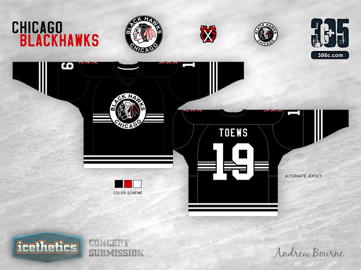
0191: Blackhawks Re-Bourne

It's been a while since we last saw an entry into the Re-Bourne series by Andrew Bourne. We pick it up with a very stripped-down set of jerseys for the Chicago Blackhawks. Thoughts?

Ask any hockey fan to name the top five best jerseys in the league. I bet Chicago will be on every list. Chicago has a classic style and is the class of the league. It is very hard to even try to improve their style, but I took a whack at it with a giant stick called, 'history'.