Midwest Modifications
 14 Comments
It's Super Bowl Sunday so that means a super-sized concept post. (Also I haven't put up anything new since Wednesday, so I owe you.) Normally I'd make the big game the theme, but as there are no NHL franchises in Indiana or Louisiana, we'll have to settle for the Central Division.
;)
;)
;) Matt Marczel Matt Marczel |
Lately, I've been seeing a lot of great Blackhawks concept art. This one has to be one of my favorites. Matt has ditched white for "vintage white" and it's made all the difference. I love the color combination and the use of color in this uniform set. He's got home/road/third jersey, in that order, and I have to say the third may be the best. If that was ever a real NHL sweater, I'd buy it in a heartbeat. No question. Very nice work here, Matt! |
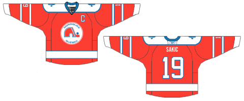
;) Brad McPelican Brad McPelican |
One thing you don't seen an awful lot of in hockey is striped shoulder yokes, the assumption being that it would look terrible. I think this design proves the opposite. I think Brad's design is a winner right up until the third jersey. I just don't think that trumpet logo ever worked for the Blues. Just wasn't meant to be. I think the Blue Note represents the club much better than a literal logo. So what about the third jersey then? |
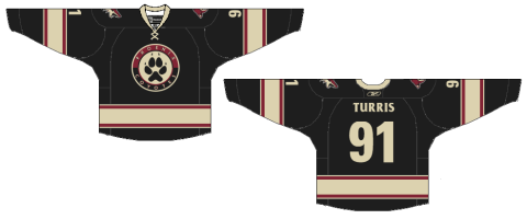
;) Mike Bell Mike Bell |
Mike has this to offer and I think he hit the nail on the head. Throwbacks work for some teams and not others. For example, it was bad news for the Flyers at the Winter Classic but good news for the Blackhawks at the Winter Classic. The Blues would look great in those vintage colors and stylings. All we need is that nameplate. |
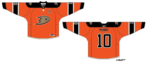
;) Ryan Haslett Ryan Haslett |
But if your idea of a third jersey is something completely different, Ryan has the answer. I didn't think I'd like a gold Blues jersey. This has changed my mind. Great colors and striping. That is a hockey sweater. |
;)
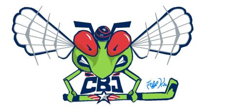
;) Jeff Kennedy Jeff Kennedy |
One team that has struggled with their identity for the last decade — no, not the Canucks — is the Blue Jackets. I think they've finally settled on a good solid look. So that's a plus. What they don't have yet is a third jersey, so Jeff has taken it upon himself to put forth a couple ideas. They're certainly unique, but I'm not sure I'm sold on these. |
;) Josh Gagnon Josh Gagnon |
So how about this one? Many of you will say you don't like the sweater number on the front, but it is presented in a unique way. However, I'm not sure the vintage white works with such bright shades of blue and red. Maybe something a bit muted. To be sure, the last thing the Jackets need is to introduce yet another new jersey logo. So we'll just wait and see if 2010-11 is the year the alternate uniform returns to Ohio's capital. |
;) Ryan Haslett Ryan Haslett |
We can't leave out the winningest team in the Central Division. Ryan's made some minor changes to the Red Wings' unis. Not sure about the shoulder piping or the repetition of the winged wheel, but the rest of the striping works. |
;) Matt McElroy Matt McElroy |
We'll finish off the division with the Predators. Actually, Matt has given us simplified jerseys and primary logos for both the Preds and the Wild. It sort of works for the Wild, but the saber-toothed tiger just looks washed out. And the jerseys may be a little too simple. But let this final graphic today serve as a bit of foreshadowing to the next concept post. |
I'll have new artwork up in a day or two featuring the self-proclaimed State of Hockey.
;)