Entries in flames (9)

Wednesday
Mar102010

Winter Winding Down

As the winter winds down, there's been a lot of talk about next year's Winter Classic. Rumor has it the Washington Capitals will get to host. And by far, the most popular opponent among Icethetics readers seems to be the Ottawa Senators. That's our theme for today's post.


Tyler Allen

There's no question in my mind that the Senators need to wear something like this when they eventually get selected for the outdoor game. Tyler's done a great job with this concept.

But his Capitals jersey is more of a Frankenstein creation than anything else. It seems he's literally taken element from every past Caps uniform and injected the Weagle. It's not terrible, but I think the stars are a bit distracting. Might be different on the ice.

Drew Krause

If it's simplicity the Sens would like in a Winter Classic sweater, Tyler's may be the right look. But if it's true vintage they want, look no further than Drew's concept. I didn't like the crazy stripes when Montreal did it, but that might've been because the blue threw it off. Maybe the Sens could do it better in black.

Drew also threw in a couple of logos, including a simplified version of the old primary mark along with a new heritage mark to go with that jersey.

Mike Bell

The Caps' owner may have recently nixed plans for an actual third jersey, but that doesn't mean concept versions can't live on here at Icethetics. Rather than incorporating the Weagle, which many have done (because of its awesomeness), Mike opted for a simple color reversal. Blue jersey, red logo. Not sure about the number being on the front though. We have enough to read there as it is.

Brad McPelican

Brad went the more traditional route with his third, but the key in this concept are the home and road jerseys. Check out the stars on the shoulders! That jersey belongs on a bit marquee sign, rather than a hockey player.

And if that logo looks familiar to you, it comes from the Capitals' old primary logo from the late '90s.

Ryan Haslett

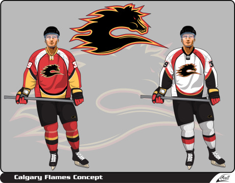
And lest we leave Canada out of the Winter Classic one more time, Ryan Haslett has put together this 2011 concept for a match-up between the Flames and Canucks in Calgary. You don't get any more classic with a Flames jersey.

However, I'm not sure it's the best idea to go with a Canucks jersey from the era in which they wore the same colors as Calgary. For the Canucks, there'd be no choice but to go back to the 1970s and the classic stick-in-rink log.

By the way, I do have a few more Olympic concepts to share. I'll try to get those posted before the weekend.

Sunday
Dec272009

Strauss NHL Rebrand IV

It's time for another installment of the concept series by artist Elliott Strauss. In this edition he takes on the Buffalo Sabres, Tampa Bay Lightning and Calgary Flames. The artist's descriptions appear in bold text next to each set.


Elliott Strauss

Buffalo Sabres

I updated the logos, taking the B from the shoulders, changing the shape, and crossing the swords that are also on the shoulder logo on top of a circle.  The jersey plays on the theme of their Winter Classic jerseys: striping that switches its direction from hem to arms. The alternate is a retro design.

The Sabres have long been a staple of Icethetics concept art. The problem is that ever since 1996 when they ditched the blue and gold, fans have been unhappy. Fourteen years later, the message finally seems to be getting through to team management, but we'll see how that goes.

Elliott has a great concept here, mixing the old with the new and keeping the classic logo alive on the alternate sweater. Personally I always loved the logo on the red third jerseys and this harkens back to that.

Elliott Strauss

Tampa Bay Lightning

Hopefully here you see an obvious throwback to their pre-Edge uniforms with the simple two solid stripes at the base. The shoulder designs get a little more abstract. A very miniscule amount of silver is found in all three unis. The primary logo is slightly tweaked and the new wordmark I tried to make very jagged to match the nickname.

As a Lightning fan, I have my own thoughts on this one, which I'll try to keep to a minimum. First, I think the current secondary should be the primary mark. It doesn't need the text if you ask me, tweaked or otherwise. And for that matter, the wordmark needs some adjustment. This isn't a criticism of Elliott so much as the team itself. Not the best choice, if you ask me.

Regarding the jerseys, I like the striping, but the font isn't quite suited — or perhaps it would just require some getting used to. Mainly, though, I'm glad to see the lightning bolt sill on the pants.

Elliott Strauss

Calgary Flames

Black is dropped here as I wanted to get a more retro feel the jersey. But the design has some modern influences in the angled patterns — reminiscent of the old Pens jerseys.

The Flames are a team with an established visual identity that is difficult to improve upon. The Flaming C will last longer than a lot of other NHL logos which is likely why Elliott saw no point in changing it.

He mixed elements of Calgary's pre-Edge uniforms and I think it really works. However, I'm not sure there's any way to beat the classic '80s jerseys that the Flames pulled out as a 30th anniversary tribute this season.

In Part 5, Mr. Strauss tackles — you guessed it — the Blackhawks, among others. In the meantime, check back for new concept art. I plan to have new posts here several times a week.

Tuesday
Aug182009

It's Back!

Since my return to Icethetics, it seems like I've brought back every feature but one. Arguably, your favorite one! I get emails all the time asking where the concept art went. Well it went to Twitter, but many of you have said that you want it back on the blog.

It's time to revitalize this stagnant Concepts section here at Icethetics. My goal is to get at least one new post a week on this page and ramp it up as more artwork comes in. Let's start with one of our most prolific contributors, Mike Ivall.

Calgary Flames concept by Ivall

It's a kind of merging of the Flames' old third jersey logo and the classic Flaming C. The jersey designs are very interesting as well, almost evoking a sense of fire and flames — though I don't want to make too much of a case in favor of the Edge design.

Wild fans, this one's for you. Untvar has come up with several different ideas for the forthcoming alternate sweater. Take a look and tell us what you think. Each one is labeled.

Minnesota Wild alternate concepts by Untvar

Personally I prefer the shade of green in A but I'm also partial to the striping on E. Not caring much for the North Stars-inspired designs but to each his own.

That's what I've got for now. I'm going to comb through my inbox and try to find some artwork I haven't yet posted — including all those Ducks concepts I asked for a few weeks ago! In addition, the Ice Bulls will be announcing their final decision on their new logo tomorrow so I'll be posting all of the submissions I received that didn't make the cut.

It'll all be right here in the newly reinvigorated Concepts section!

Page 1 2 3