Entries in hurricanes (5)

Saturday
Mar272010

Strauss NHL Rebrand VI

It's been about six weeks since the last edition of Elliott Strauss' NHL rebranding series. And just when you almost forgot about it, it's time to finish it up!

If this is new to you, catch up here. In a nutshell, Elliott set out with some specific goals in mind when he began this series back in November: lose the uglier elements of the Reebok Edge jerseys, create some new modern designs and make sure every team has a distinct identity, and keep in line with tradition when appropriate.

Having said that, let's kick off the second half of the Strauss NHL Rebrand series, as promised, with the Colorado Avalanche. Elliott's own descriptions appear in bold text.


Elliott Strauss

I dropped a color, added a color, and darkened a color here, as the scheme moves from maroon/medium blue/black/silver to maroon/navy/light blue/silver. I simplified the primary logo and changed some colors, and while it's not too different when at first glance, compare it to the current logo.

On the uniforms, I tried for a modern yet somewhat chaotic look with movement that the nickname implies. The alternate is a darker, less contrasting uniform with a new take on the familiar diagonal wordmark.

One of the best things about these uniforms is the number style. And the striping isn't bad either. He's given the Avs an incredible look without really changing much.

Elliott Strauss

The logo is tweaked to modernize the classic Blue Note. I rearranged the colors a bit to make the yellow pop a lot more. The navy logo on blue and blue logo on white does not change, but the numbers now match this theme.

The yellow slashes on the home/away and pants mimic the Gateway Arch, a motif which is featured on the shoulders and alternate crest. I brought back the music staff with accents of yellow on the sleeves.

Another great set with a couple of minor flaws. I think the Blue Note under the Arch looks fantastic. Unfortunately, within the logo itself, that sharp point toward the bottom just sticks out in the worst way. Clean things up in there and you have a concept waiting for NHL approval.

Elliott Strauss

I put my own spin on the current primary, simplifying and making it more symmetrical. One thing that is bothersome about their identity is the lack of a double flag flying on the secondary to indicate a hurricane as opposed to tropical storm. Here we see that on the CH logo.

These unis ended up being some of my least favorite in the series and I had another more classic jersey design but I scrapped it at the last second for this. The font is custom and the alternate is pretty simple.

Gut reaction: Elliott knocked this one out of the park. He says he's unsure of the uniforms, but I'm impressed. They take some of the best elements from the Hurricanes' present look and improve upon the rest. And the new logos are just amazing.

Based on this, I'd say the second half of Elliott's NHL rebrand series looks quite promising. Next edition in about a week. In the meantime, we should have some concepts coming based on some of what's in my JerseyWatch post from the blog.

Sunday
Aug302009

Concept Collection VI

That post featuring all the non-winning entries from the USF Ice Bulls logo contest is and probably will continue to stand as the LONGEST concept post in the history of Icethetics. Now it's time to get some new stuff posted.

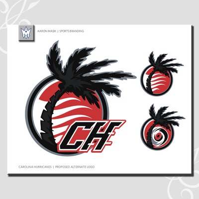
One of my favorite artists, who I haven't heard from in a while, is Aaron Masik. He came up with these alternate logo designs for the Carolina Hurricanes.

Carolina Hurricanes concept logos by Aaron Masik

Ask any Southeasterner, myself included. That windblown palm tree is the classic hurricane image.

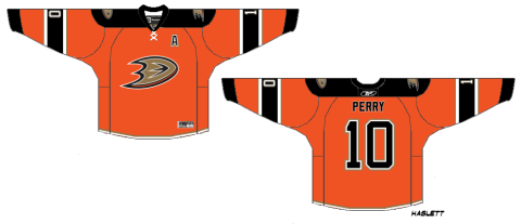
Ryan Haslett sent in a handful of jersey redesigns. He's put the Ducks in orange and managed to keep them from looking anything like the Flyers. How? No white and more modern striping.

Anaheim Ducks concept jersey by Ryan Haslett

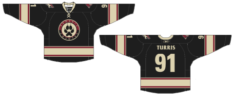
He's also given the Coyotes a little something to improve their alternates. I think the lack of that brick color helps make it more different to the home and road sweaters.

Phoenix Coyotes concept jersey by Ryan Haslett

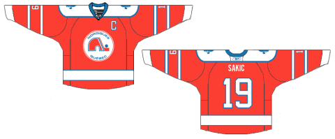
This next one starts taking us into the realm of the weird. Imagine the Nordiques lived to see the days of third jerseys. Could they have gone with red or would that simply have given the good folks in Quebec another reason to revolt?

Quebec Nordiques concept jersey by Ryan Haslett

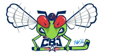
Since we're here, we might as well go full on freak out. Jeff Kennedy considers a re-envisioning of that ridiculous bug from a decade ago.

Columbus Blue Jackets concept logo by Jeff Kennedy

Keep the concept art coming in — even if especially if its freaky. I'd like to be able to offer up new concept posts every few days. Email your work in at icethetics@gmail.com and don't forget to include your name so you can be credited! (By the way, this is just for fun so you don't have to give up any rights or anything like that. Just a way to share interesting ideas with fellow design nuts.)

Page 1 2