Entries in dallas stars (38)

Friday
Nov022012

0258: Big D Freak Out

Our Freak Out Friday series brings us back to the Dallas Stars today. Andy Petzold imagines what might happen if the team's new look were strongly inspired their city's NFL franchise.

Friday
Oct122012

0237: Dallas Freak Out

I can't even begin to describe Cale Putnam's Dallas Stars concept. So I'll let him.

...and now for something completely different.

I think logical assumption is that the NHL is mere seasons away from some form of jersey advertising, probably in a form like the small patch AHL teams use on either side on the upper chest. As the Detroit Red Wings Presented by Amway have already proven, owners will test boundaries, so the idea here is that, as part of the ad deal, an owner might let a sponsor redesign the team brand and jerseys.

What you see here is the result of a chance doodling of NHL logos while I also had my new R/C truck on my mind. Traxxas is a metro Dallas based company that makes R/C vehicles, most popularly the T-Maxx, but also the Revo, Stampede, and what I bought, the Slash. I figured that the Stars, who we all agree could use a redesign, would be cool with whatever Traxxas came up with, so I re-did the primary with lettering more like their corporate logo, used an image of a Revo in the secondary, and designed the jerseys in the same vein as the graphic designs on their cars and trucks.

People are going to hate this, both for the looks and the advertising, but I can honestly see a future for this type of marketing, especially if it makes the owners money. If there's a good response I might try it for other teams.

Wednesday
Sep262012

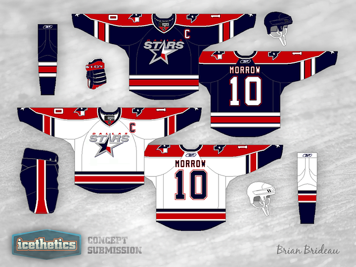
0221: Stars of Texas

Don't expect the Dallas Stars concepts to slow down anytime soon. It's almost all I'm seeing. With a rebrand in the works for 2013, everyone's throwing their hat in the ring. Here, Brian Brideau suggests a color palette more in line with that of the team's home state of Texas. Is red, white and blue the way to go? Or do we already have too much of it in the NHL?

Monday
Sep102012

0205: Silver is What the Stars Need

The Dallas Stars are in need of new uniforms. There's no question about that. And the concepts abound from Icethetics readers. But rarely have I come across one I like as much as this. Victor You has incorporated some cool striping effects and swapped out the gold for silver. For whatever reason, it changes entirely the way I think about this team's brand... for the better! Is it just me?

Thursday
Sep062012

0201: Stars Re-Bourne

The next installment of Andrew Bourne's series of NHL makeovers features the Dallas Stars without a touch of green or gold in sight.

Dallas has one of the worst jersey sets in the NHL. The jersey is very plain and actually seems to try and mimic the jerseys of the main sport in Dallas, football. Although I understand that it is hard to get people to watch an unconventional sport in a warm city, there are other ways to grab a Texan's attention.

I wanted to utilize the Texas state flag (red, white & blue). Trying not to make a political team, I adjusted the red to a bit of a more deep red and the blue to be a bit darker than that of the blue on the US flag. I added yellow to the color scheme to try and have a feeling of a star. After all, the team is called the Stars. The yellow definitely gives the whole scheme a unique feeling and sets it apart from another patriotic color palette.

Tuesday
Jul102012

0143: Big D Green

We never tire of green NHL concepts around here. Alan John Herbert is all to happy to help us out with his creation for the Dallas Stars.

Thursday
Jun142012

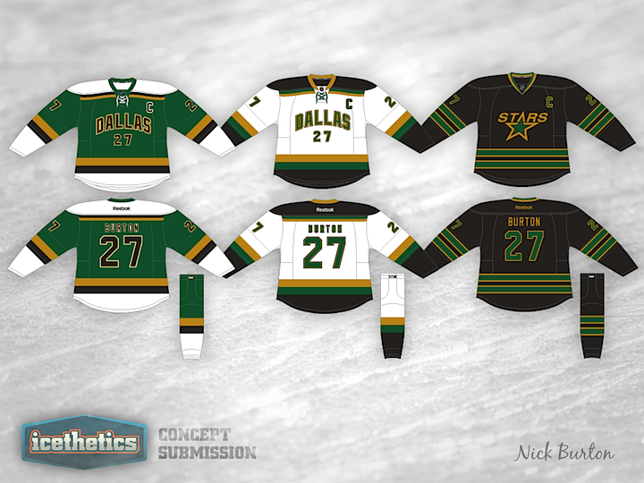
0117: The Stars of Dallas

The Dallas Stars are the obvious final stop for Stars Week. Nick Burton's redesign is very much inspired by the old Minnesota North Stars. Seriously, is there anyone here that doesn't like this one? Great work!