Entries in iceborn (19)

Saturday
Nov162013

0638: Outdoors in the Windy City 

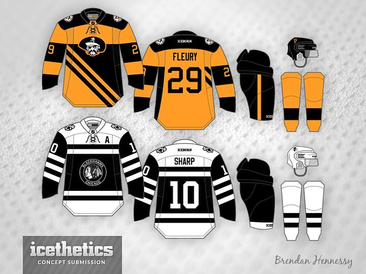
I always get a kick out of seeing to different artists come up with unusual yet remarkably similar ideas independently. That's what we have for this Outdoor Saturday post. Newcomers Brendan Hennessy (above) and David Parkinson (below) saw the same old photograph depicting the Pittsburgh Pirates and Chicago Black Hawks. It got them thinking about how the Soldier Field Stadium Series game could look.
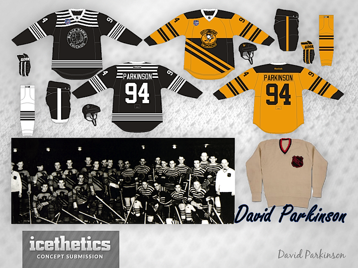
So who do you think pulled it off better? Or do you like half of each? Both are very well done and could easily work for the big game if you ask me.

Wednesday
Oct302013

0621: Fixing Anaheim... Again

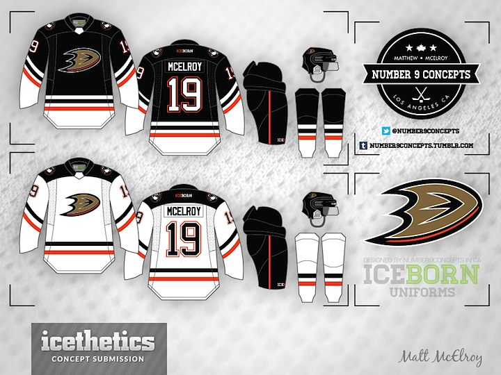
The Ducks looked great earlier this month bringing back the "Mighty" look, but I understand why they won't go back to it full time. So instead, how about moving forward the existing branding by knocking out that awful wordmark? Matt McElroy's concept does just that — even if the striping is a little reminiscent of the Stars' new uniforms.

Monday
Sep092013

0569: Fixing the Ducks

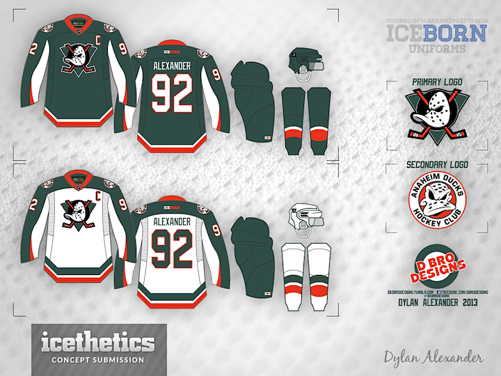
Dylan Alexander may have the cure for what ails the Anaheim Ducks. This green and orange number would certainly set them apart from the rest of the league — and do it in a way that didn't involve the heavy overuse of black.

By the way, Dylan is using the new IceBorn jersey template by Matt McElroy, now featured on Icethetics' new Templates page. Download a copy and give it a whirl.

Sunday
Sep082013

0568: Seattle Thunderbirds Go Pro

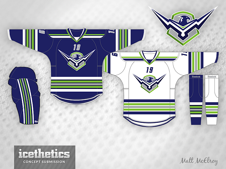
Seattle Sunday is back this week with Matt McElroy's idea for a re-imagined Thunderbirds team. Currently, the T-Birds play in the WHL, but what if they gave up their name to a future NHL club?

Sunday
Sep012013

0561: Nevermind the Early Release

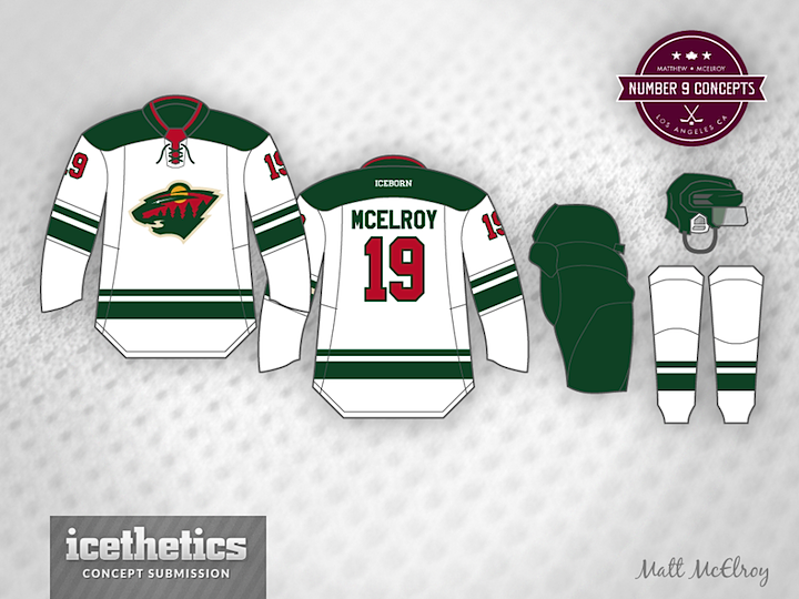
Well, we're not going to let some early release rain on our parade, are we? The Wild's new road jersey showed up in official photos on their website late last night, but that won't keep me from showing some concepts anyway. Like this one from Matt McElroy, who came the closest to getting it right. Nobody planned for the squared off shoulder yoke though.

Brian Brideau has a habit of being right about these things and he too came pretty darn close. I like his take on the unlayered, solid color numbers. Gives the jersey that old-timey feel.

And Michael Baumann, well he's been here before. He submitted a concept back in January awfully similar to this. Talk about psychic, right? All three of these concepts were submitted prior to last night's reveal so they're all legitimate guesses.

No offense to these talented guys, but I'm mighty impressed with what Minnesota actually came out with. I don't think it needs to be improved upon. You?

Page 1 2 3