Monday
Oct012012
0226: Tampa Bay's Past and Present
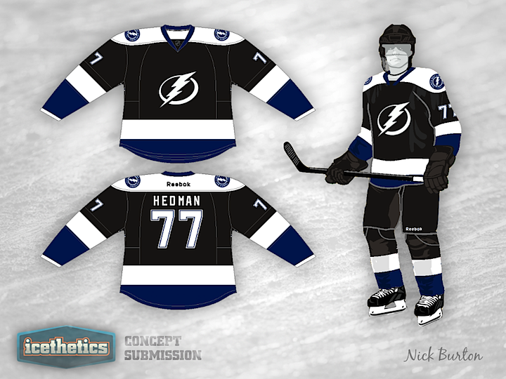
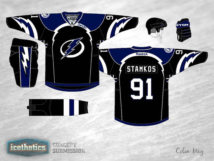
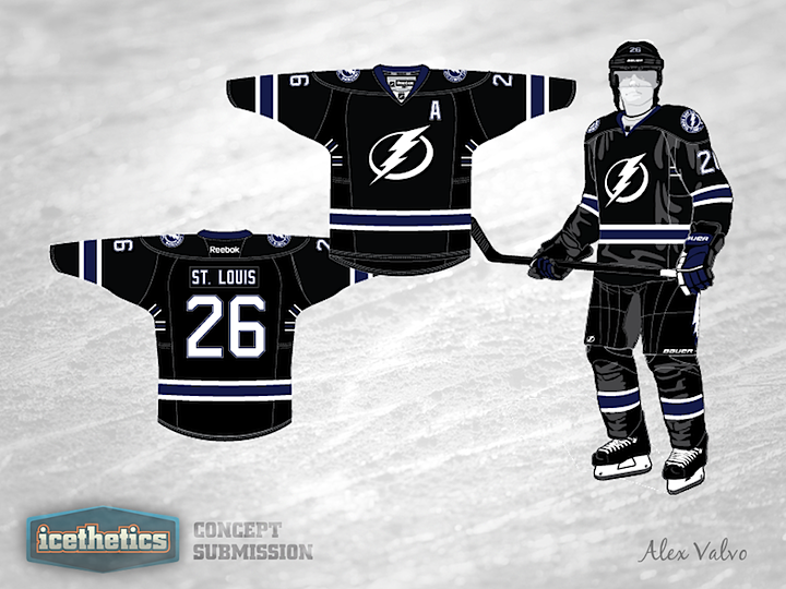
Still hoping for that black Tampa Bay Lightning jersey to return? Today, Nick Burton tries the simplest tactic — putting the current logos on the original jersey.
Designed by  Nick Burton
Nick Burton