Sunday
Apr082012

0050: Winter in New York

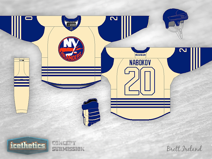
This half of the Winter Classic Weekend is focusing on New York. It's fair to say there are a good number of fans hoping to see the Rangers and Islanders face off in the elements. We've seen lots of examples for the Rangers, but what about the Isles? Brett Ireland provides us with a very simplistic yet intriguing solution. The only thing that probably wouldn't work — since this is a TV event, after all — is the lack of contrast on the back numbers. And while the design doesn't exactly scream Islanders, it would probably fit the Winter Classic theme.

Saturday
Apr072012

0049: A Classic Midwest Match-up

It's Saturday and that means the start of another Winter Classic Weekend, doesn't it? For the moment we'll all pretty Toronto-ed and Detroit-ed out. So let's look beyond 2013? I bet the Chicago Blackhawks and St. Louis Blues would make good partners for an outdoor extravaganza — especially, now that the Blues are playing like a good hockey team again. And these two jerseys by frequent IceHL contributor Chance Waddell look fantastic to me. In fact, why do we even need to wait for a Winter Classic to see them? Let's get them on the ice as alternates now!

Friday
Apr062012

0048: The Atlanta-Hartford Freak Out

Ross Taylor takes his NHL brand blending series to a new level by giving us two teams at once in this concept. On the left, it's the Atlanta Thrashers and Flames being combined. If Ross' goal is to use the best aspects from each design, you can see how he feels about these two teams. There's hardly a whiff of Thrasher at all. Speaking of which, if we have Wild Stars and Rockalanche, what would you call this hybrid? The Flashers? The Flamers? Yikes. Of course, there's always Firebirds, which I'm partial to.

On the right, we have a merging of the Hartford Whalers and Carolina Hurricanes — though, let's be honest, it's more Whale than Canes. The Hartolina Whalicanes? The Caroford Hurrilers? Probably should stop doing the names at this point. Regardless, I'm still impressed by what Ross is showing us with his hybrid redesigns. Even if this one fits the Freak Out bill better than all of his previous efforts combined.

Thursday
Apr052012

0047: Solar Bears Prelude

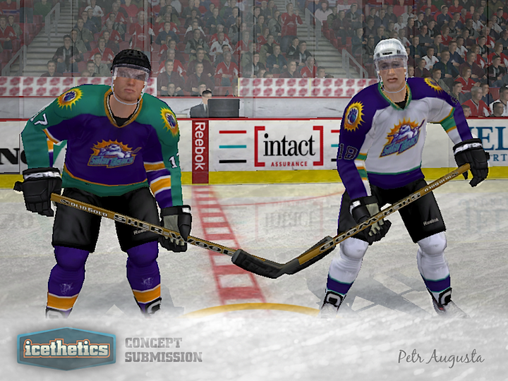
We wrap up Minor League Week with the team that's next in line to unveil their new uniforms in the real world. In five days, the Orlando Solar Bears jerseys will be officially released. Until then, we have Petr Augusta's take on what we might expect to see. There's seriously no mistaking those colors for any locale other than Florida.

Hope you guys enjoyed Minor League Week; we'll do it again soon. Tomorrow, Ross Taylor continues his domination of the Freak Out Friday with a couple of new NHL sets.

Wednesday
Apr042012

0046: Admirals With a Dash of Lightning

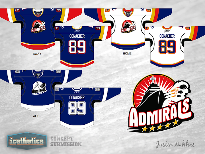
The Norfolk Admirals are in the midst of a record run, an insane winning streak. It's not just breaking AHL records, it's breaking records of other sports leagues. So while the Ads continue to mop up anyone who would be dumb enough to face them, how about a couple of concepts? It is Minor League Week, after all. Justin Nahhas has created a set of Admirals uniforms based off the third jersey of their NHL affiliate, the Tampa Bay Lightning.

But that's not all for today. I want to revisit a classic.


This is one of my all-time favorite concept designs. John Quincy King overhauled the Admirals' look to match new Lightning's new look. It was first posted on Icethetics last May, and since we were talking about Norfolk, I thought a reprise was in order.

Tuesday
Apr032012

0045: Remaking Rochester in Buffalo's Image

Minor League Week proceeds with another AHL franchise, one not so much in need of a rebrand. The Rochester Americans were hit hard by their league's switch the Reebok Edge uniforms, but it wasn't long before the problems were rectified. So that's not what this concept is about. Instead, Chris Wright demonstrates what the Amerks might look like if they wanted to look more like their NHL parent club, the Sabres, with which they were recently reunited. It's probably more of a lateral move than anything, but it's an interesting notion. Anyone else want to take a stab at redesigning AHL team sweaters to match their NHL affiliates?

Monday
Apr022012

0044: Redeeming the Whale

Yesterday, we got a little taste. Today, the full meal. This morning's double-feature marks the start of Minor League Week. For the next few days we'll be enjoying concepts for minor pro teams, which often tend to get overshadowed by the NHL on this page.

As you can see, we're kicking things off with the Connecticut Whale, one of the teams most in need of a complete redesign. Their current look is an absolute joke and I cannot say it enough. And as jokes go, you realize just how not-funny it is when you see what Mike Ivall has come up with. His identity is the perfect mix between the old Hartford Whalers and the Whale's previous identity — the Wolf Pack. Overall, this is one of my all-time favorite concepts.


Now, then. I'm an adult and I realize it's unreasonable to think the Whale would simply scrap entirely the new brand they're trying to establish. Maybe something a little less dramatic would get the job done. To that end, may I recommend Ryan Haslett's concept? I can't say I'm a fan of the logo or the striping, but at least it aspires to better days in Hartford.