Sunday
Apr012012

0043: A Fool for the Moose

Taking a break from Winter Classic Weekends to celebrate April Fool's Day! Last year when we found out the Atlanta Thrashers were headed to Winnipeg, the rumors flew. We'd heard from Mark Chipman that he had no desire to resurrect the Jets and, in fact, every intention to carry on the successful branding of his AHL team, the Manitoba Moose. But we were fooled. On Draft Day, it was confirmed the franchise would be named the Jets. Still, Tyler Rodgers has sent in what may have been a great upgrade to the Moose brand. Shame we'll never see it go beyond this page.

Saturday
Mar312012

0042: An Ohio Classic

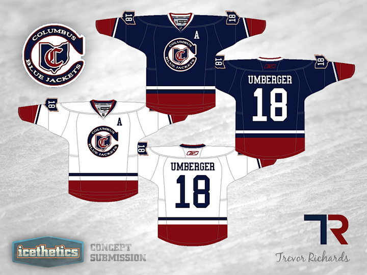
Before the Columbus Blue Jackets ever turn up in a Winter Classic, they need to get a lot better. But I think they'll make it eventually. Ohio is a great place for outdoor hockey. And when the time comes, perhaps the team could honor its in-state predecessor. That's what Trevor Richards has for us — a Blue Jackets uniform with all the marks of the old Cleveland Barons.

Friday
Mar302012

0041: The Identity Crisis Islanders

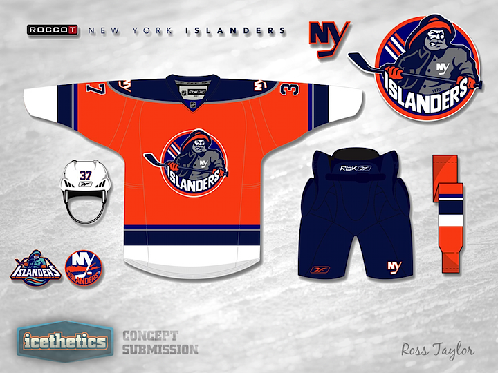
On this Freak Out Friday, we continue a neat series by Ross Taylor. Over the last couple of weeks, he's merged identities of teams from different eras but tied to one city. For this one, it's one team with multiple identities rolled in to one. I have to be honest, I don't hate it. But then I never hated the fisherman as much as other people did. It was really just the wavy striping that got me. Very amateur. The rest of the uniform was pretty solid.

As it turns out, this series won't be ending here. It was originally planned for three weeks, but Ross has since provided a lot more examples of his brand blending. So I'm sure we'll see more next week. But I won't give anything away yet.

Meantime, if what you want has more of an Ohio flavor — say, a combination of the Columbus Blue Jackets and Cleveland Barons — then you're in luck with tomorrow's Winter Classic concept. Don't miss it.

Thursday
Mar292012

0040: Marooned

This one's just for fun, today. Exactly no one is looking to add a second NHL team in Montreal. And even fewer are eager to rename or rebrand the Canadiens — one of the world's most recognizable brands. But as a flight of fancy, what if the Montreal Maroons ever came back to the NHL? Nick Burton offers his take for our enjoyment. It's cool. And maroon.

Wednesday
Mar282012

0039: A Throwback Third for the Jets

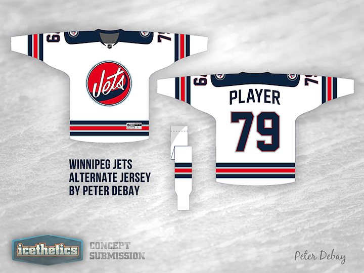
A lot of us are hoping the Winnipeg Jets are considering a third jersey for 2012, if for no other reason than it would mean we'd get to see a new jersey in the NHL this fall. But if it happens, what should it look like? Peter Debay recommends a bit of a throwback. Personally, I like the old logo but I'm worried the striping is too reminiscent of the Rangers. Maybe something close?

Tuesday
Mar272012

0038: Dreaming of Electric Stripes

We haven't looked at the Tampa Bay Lightning in a while. (A month to the day, actually.) Hermilo Munoz sent in this concept and speaking as a lifelong Bolts backer, I'm immensely impressed. If someone said they were going to make stripes out of lightning bolts, we'd all surely imagine something very minor league in nature. Yet somehow, this manages to look awfully professional in its simplicity. I would snatch up this jersey in a heartbeat. And if I voted on these concepts, I'd try to give this one six stars. Some of you are sure to disagree with me, but I think this is incredibly well done!

Monday
Mar262012

0037: A Possible Fix for Pittsburgh?

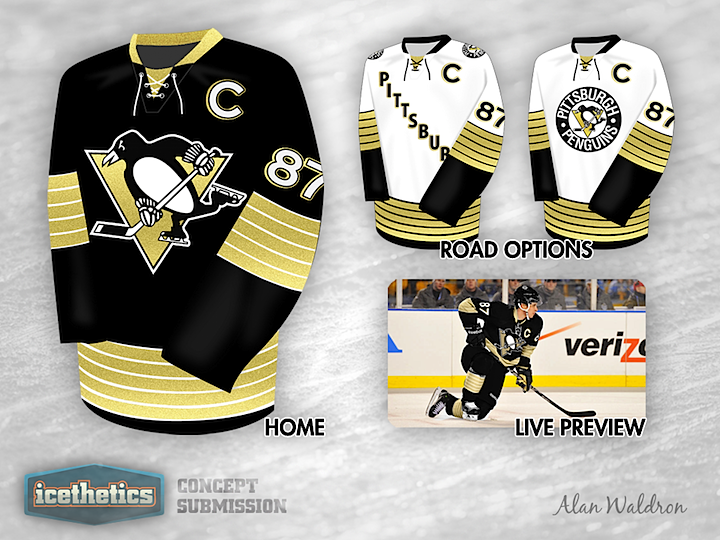
Last week I lent voice to the opinion that the Pittsburgh Penguins are overdue for a uniform overhaul. They wear a generic template with washed out colors and a weak design. I'm not saying Alan Waldron has the perfect solution, but this is certainly a step in the right direction. It minds the club's near half-century of history with bold lines and a design that stands out. If it were me, the one thing I'd change: forget Vegas gold and go with full on Penguins yellow from back in the day. Where do Pittsburgh fans stand on the matter?

Having said mine, it's only fair now that I let Alan say his peace on the design:

I kept the Pens 5-stripe pattern because I like the fact that it's a design element unique to the Penguins and featured on our inaugural uniforms. I know there aren't many people in the 'Burgh that like the diagonal Pittsburgh on the front, so I've included a second option with the circle logo which I think is equally as attractive.