Rebranding the East
 Saturday · Jan 9 · 2010 | 6:00 AM PST
  12 Comments
 I'm sure I'm enjoying Sin City right about now. And I'm sure you guys are enjoying these daily concept posts. This is the second of five auto-posts and today's theme is rebranding.
Rebranding has become a very popular topic among Icethetics concept artists — giving a complete uniform and logo overhaul to a given team. Sometimes the overhaul is drastic and sometimes it's subtle. But it usually results in something better than which actually exists.


 Robert Giannone Robert Giannone |
We start with Robert Giannone's rebranding of the Philadelphia Flyers. Robert isn't looking to replace the classic P logo so much as give it a nice complement that could be used as a shoulder page, third jersey crest or merchandising mark. He's created an F lettermark based on the P used on the team's old orange alternate sweater. And he's put an awful lot of work and thought into it. He's had patches embroidered and attached to an actual Flyers jersey as well as a cap. They don't look out of place at all. So I'm completely with him — that is until we get to his wordmark. That's where you lose me. That does not say Flyers at all. To me, it says graffiti. But aside from that, I like this logo, and although we've seen versions of it before — and by that I mean this Zephyr X-line hat — it's always nice to see someone putting some effort in. You can see more of Robert's work on his web site. |
 Ryan Broda Ryan Broda |
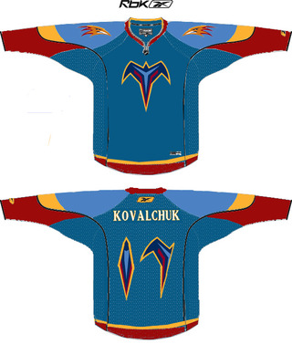
Next, Ryan Broda offers the Atlanta Thrashers a newer look. He's kept the same color scheme and wordmark but has made some adjustments to the other logos — ridding them of the primary mark often ridiculed as looking like a bird stirring itself into a bowl of soup. Ryan's kept the strongest element of that design — the bird head — and has added some additional details to the logos to make it look a little meaner. It's a very sharp concept. |
 Julian Kazmierczak Julian Kazmierczak |
Julian offers us something a little different for the Ottawa Senators. He's decided to drop the gold completely and stick with the black and red which were most prominent when the Sens first existed in the early 20th century and were later revived in 1992. The logo is back-to-basics but the striping may be a bit much. Overall, however, I think he may be on to something. It's simple and isn't that what we've been wanting ever since the beginning of the Age of Reebok? |
 Matt Marczel Matt Marczel |
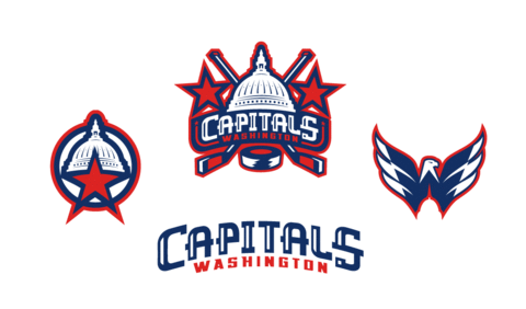
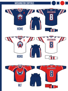
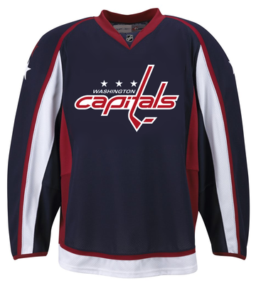
I've got one more item to share today. This comes from the always prolific Matt Marczel. However, Matt hasn't so much rebranded the Capitals here as offered up a third jersey to die for. Every time the topic comes up, we look for ways of getting the Caps into a blue third jersey with the Weagle heavily featured. This does that in the best way. But better yet, I'd vote that this be the primary home jersey. And even if we can't have that, what about putting the Weagle on the front of the red jersey? The Capitals have a brilliant logo here and it seems to just be going to waste. |
Excellent work by all of these artists. They should be proud. And you should come back tomorrow for more concept art.


