Entries in red wings (8)

Saturday
Jul032010

Creative Inspiration

Has it really been seven weeks since the last concept post? Unacceptable. Yes, there have been a lot of blog and tournament updates. And yes, I've been busy lately. But seven weeks is a long time. So I'm going to try some new things to keep the concepts flowing.

Since getting this page updated is lower on my list of website priorities due to the time/effort required, I'm going to start adding new concept art to our brand new Facebook page on a regular basis to keep everyone satisfied. However, I will continue to save some items to be showcased here on the site.

So I'm taking some time out this holiday weekend to post a handful of new work. Most of the concepts sent in tend to be a slight re-imagining of a team's uniform. Usually some stripes are rearranged or colors changed. But every so often, an especially creative concept appears. That's today's topic.
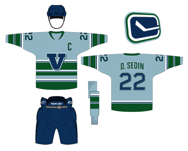

Peter Debay

Peter has an interesting take on the look of the Vancouver Canucks. Interesting choice of colors and type. Gives the sweater a very classic feel.
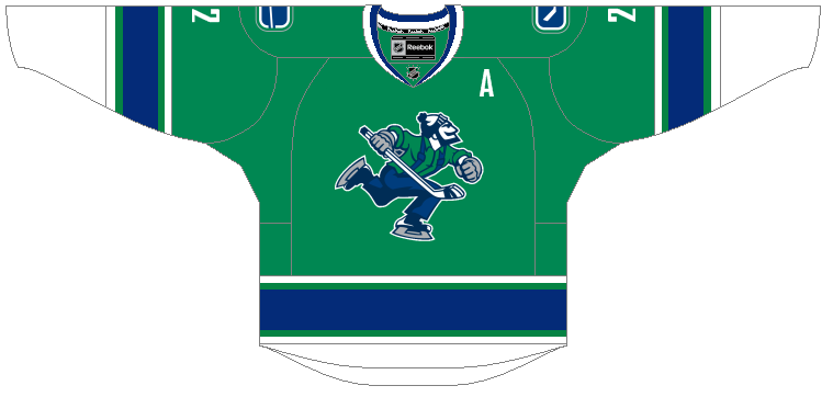
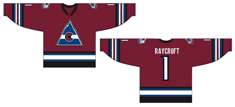
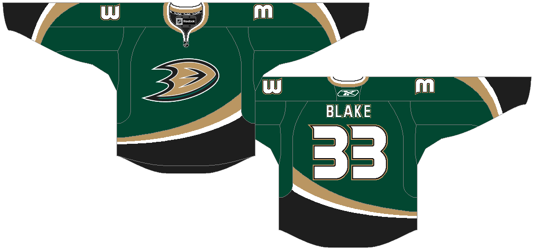
Ryan Haslett

Ryan is one of our most prolific designers, and here I've got three of my favorites. (I know there's only one rating, by the way, so just make it an average.) First, awesome Canucks jersey. Forgot the Johnny Canuck V logo, go Johnny Canuck all the way!

I also like this Avalanche concept. Great callback to the old Colorado Rockies logo in the burgundy and blue. And green is just what the doctor ordered for the Ducks. Heck, I'd settle for orange if they'd just use the webbed D on the front!
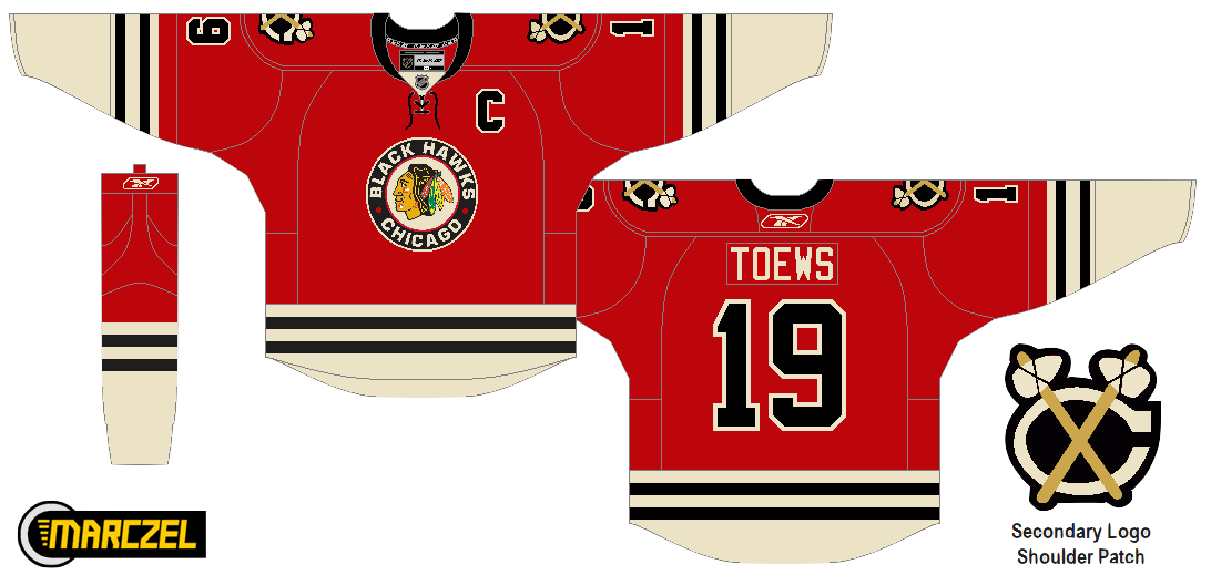
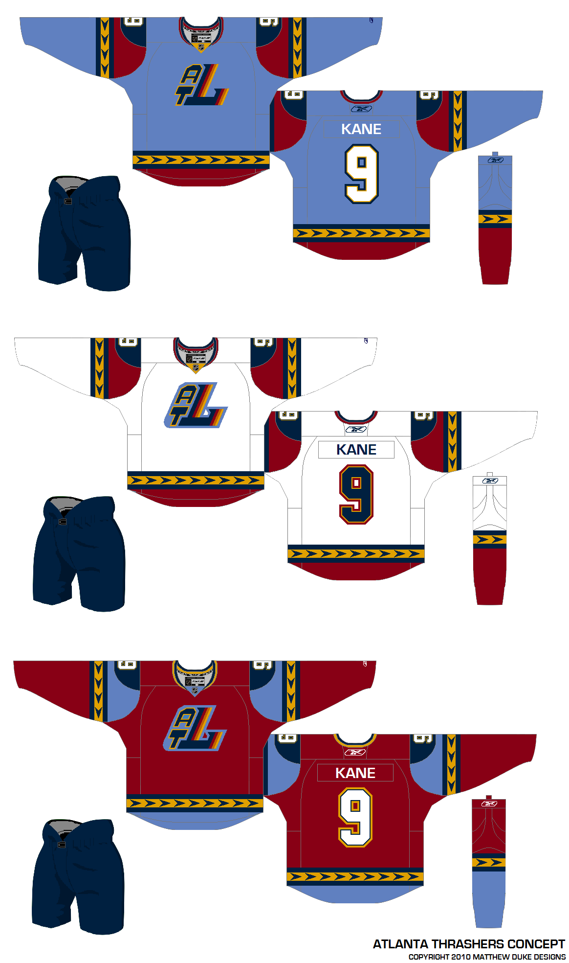
Matthew Duke

This post is about creativity and sometimes that can yield a somewhat disappointing result. I like where Matthew is going with the uniform designs, but that ATL logo was not well-liked as a 10th anniversary mark, and it's sure not any better here. But at least it gets us thinking about things for the Thrashers.
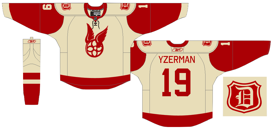
Vin Maccioli

Here's a cool one. Vin offers up a unique alternate sweater with a very retro feel. It may not work for the Red Wings on a regular basis, but maybe as a one-off specialty thing instead. And yes, I'm also posting this one as a tribute to my Bolts' new GM — Stevie Y! I'm expecting great things from him.
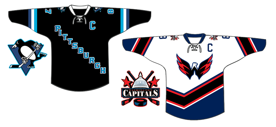
Jake Slavik

The last concept is a little Winter Classic 2011 bonus. And with all respect to Jake, this is pretty far out. He's combined so many different eras of the Penguins and Capitals that it's become kind of a jumble.

On the other hand, it does help us see what was good and what was bad about these clubs' past uniforms. For example, Weagle good, funky striping not. And sadly, he's left the gold out of the Penguins' jersey entirely. Despite the blue sweaters in the Pens' early years, the penguin logo was never without gold.

I'm shooting for concept updates on a weekly basis, but that may be too much to ask for. Just know that I'm doing the best I can. I'm assuming things will quiet down on the news front as the summer goes on, which will allow more time for concept posts.

Sunday
Feb072010

Midwest Modifications

It's Super Bowl Sunday so that means a super-sized concept post. (Also I haven't put up anything new since Wednesday, so I owe you.) Normally I'd make the big game the theme, but as there are no NHL franchises in Indiana or Louisiana, we'll have to settle for the Central Division.


Matt Marczel

Lately, I've been seeing a lot of great Blackhawks concept art. This one has to be one of my favorites. Matt has ditched white for "vintage white" and it's made all the difference. I love the color combination and the use of color in this uniform set.

He's got home/road/third jersey, in that order, and I have to say the third may be the best. If that was ever a real NHL sweater, I'd buy it in a heartbeat. No question. Very nice work here, Matt!

Brad McPelican

One thing you don't seen an awful lot of in hockey is striped shoulder yokes, the assumption being that it would look terrible. I think this design proves the opposite.

I think Brad's design is a winner right up until the third jersey. I just don't think that trumpet logo ever worked for the Blues. Just wasn't meant to be. I think the Blue Note represents the club much better than a literal logo.

So what about the third jersey then?

Mike Bell

Mike has this to offer and I think he hit the nail on the head. Throwbacks work for some teams and not others. For example, it was bad news for the Flyers at the Winter Classic but good news for the Blackhawks at the Winter Classic.

The Blues would look great in those vintage colors and stylings. All we need is that nameplate.

Ryan Haslett

But if your idea of a third jersey is something completely different, Ryan has the answer. I didn't think I'd like a gold Blues jersey. This has changed my mind. Great colors and striping. That is a hockey sweater.

Jeff Kennedy

One team that has struggled with their identity for the last decade — no, not the Canucks — is the Blue Jackets. I think they've finally settled on a good solid look. So that's a plus.

What they don't have yet is a third jersey, so Jeff has taken it upon himself to put forth a couple ideas. They're certainly unique, but I'm not sure I'm sold on these.

Josh Gagnon

So how about this one? Many of you will say you don't like the sweater number on the front, but it is presented in a unique way. However, I'm not sure the vintage white works with such bright shades of blue and red. Maybe something a bit muted.

To be sure, the last thing the Jackets need is to introduce yet another new jersey logo. So we'll just wait and see if 2010-11 is the year the alternate uniform returns to Ohio's capital.

Ryan Haslett

We can't leave out the winningest team in the Central Division. Ryan's made some minor changes to the Red Wings' unis. Not sure about the shoulder piping or the repetition of the winged wheel, but the rest of the striping works.

Matt McElroy

We'll finish off the division with the Predators. Actually, Matt has given us simplified jerseys and primary logos for both the Preds and the Wild. It sort of works for the Wild, but the saber-toothed tiger just looks washed out. And the jerseys may be a little too simple.

But let this final graphic today serve as a bit of foreshadowing to the next concept post.

I'll have new artwork up in a day or two featuring the self-proclaimed State of Hockey.

Tuesday
Dec012009

Strauss NHL Rebrand II

We recently began a new concept series in which designer Elliott Strauss takes on the immense task of creating the ideal look of the NHL. All 30 teams will receive his rebranding treatment — some with big changes, others small changes — all, hopefully, for the better.

In Part I, Elliott took on the Capitals, Coyotes and Panthers. Today, it's the Oilers, Red Wings and Thrashers. We start with Edmonton.

The bold text below are Elliott's own descriptions.

Edmonton Oilers 

I took a rarely used logo — the one from a shield with a gear and oil drop — and played with some elements to create a new primary mark.  

Uniforms are simple, inspired by the old blue and gray alternates. The wordmark is featured on the alternate.

I think most Oilers fans would agree that the new Reebok Edge jerseys need to go no matter what, and that old blue/orange combo of the '80s and early '90s is impossible to avoid.

The more I think about it, the more I think that vintage design should be an alternate worn on special occasions throughout the season.

And any attempt at joining the Thrashers and Stars with text and numbers on the front of the sweater should be nipped in the bud. Still, overall these are solid designs.

Now the one you've all been waiting for.

Detroit Red Wings

No logo changes. The uniforms are new, but from the stands you probably would barely notice. You can't do too much with the Wings.

This is one instance where I have to disagree with Elliott. I've posted many Red Wings concepts over the years but most have been met with rejection and disdain.

I think that's a mental block. We can improve upon the Red Wings' logos and uniforms but we choose not to out of a misguided reverence to tradition.

It's undeniable Detroit has a signature look and is one of the most recognizable teams in the NHL, but the idea it can't be changed without ruining years of history is silly.

Still, it would be nice to one day see the Wings add a third jersey — just not their 2009 Winter Classic one.

Atlanta Thrashers

The cereal bowl logo is simplified, as is the color scheme, orange and maroon are no more. The jerseys are pretty modern and put a heavy emphasis on the bird head pattern.

The changing crest logos from home-away reference the franchises' original uniforms.

The Thrashers are suffering from a color overload so this simplification is welcome. I did prefer the baby blue jerseys as alternates but I was always a fan of the asymmetrical sleeves — though I know I'm in the minority among Icethetics readers.

Each team should have an element to its uniforms that stand out and separate it from the rest. Slightly altering striping patterns usually isn't enough to create a unique identity. That's one thing the Thrashers achieved with the ATLANTA text down the sleeve.

And they can't get rid of those maroon third jerseys fast enough for me. I think Elliott just about hit the nail on the head with this concept.

Coming up in Part III, the Maple Leafs get a major makeover.