Sunday
Jul222012

0155: Rollin' on the River

It's been a while since our last Minor League Week and the concepts are starting to pile up. The AHL's Peoria Rivermen are currently holding a jersey design contest. When Gianluca Baggetta came up with his new look, he sent it along to Icethetics as well for all of us to enjoy.

Saturday
Jul212012

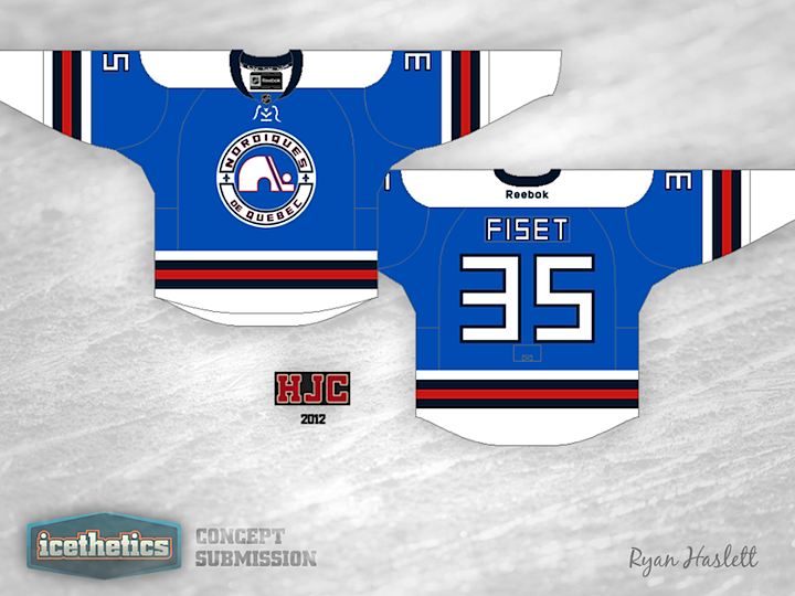
0154: Quebec Reset

The Quebec Nordiques haven't gotten as much love as they should on the Icethetics Concepts page but Ryan Haslett is here to take care of that. If the Nordiques still existed today, they're home and road jerseys would probably feature a wolf. So I like to think of this design as what they might be wearing today as a throwback jersey.

Friday
Jul202012

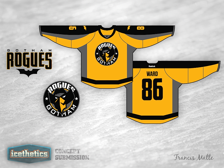
0153: The Gotham Rogues

With the next installment of the Dark Knight series hitting theaters today, Francis Matte took a stab at recreating the film's fictional football team as a hockey club. What do you think of this Gotham Rogues jersey design?

Thursday
Jul192012

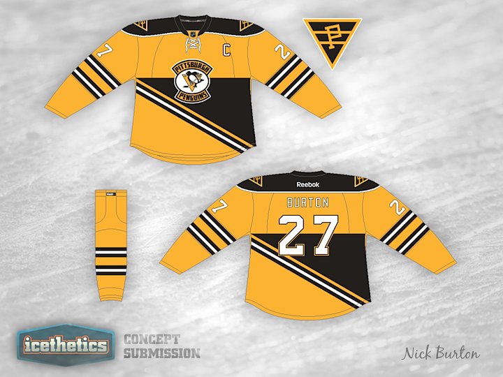
0152: Ahoy, Penguins! Arrrgh!

Maybe I should've saved this concept for Talk Like a Pirate Day, but that's still a couple of months down the road. Nick Burton has an interesting jersey offering for the Pittsburgh Penguins based on their Steel City NHL predecessor, the Pirates. This isn't the first concept we've seen from that era of the NHL in Pennsylvania...

You may recall a number of Quakers-inspired Flyers jerseys that started appearing when it was announced Philadelphia would host its first Winter Classic last year. This one by Jack Gambro was one of them. I'm reposting it here because I think it makes a good companion for the Penguins/Pirates look above. What do you guys think? Would these make for a great-looking game or what?

Wednesday
Jul182012

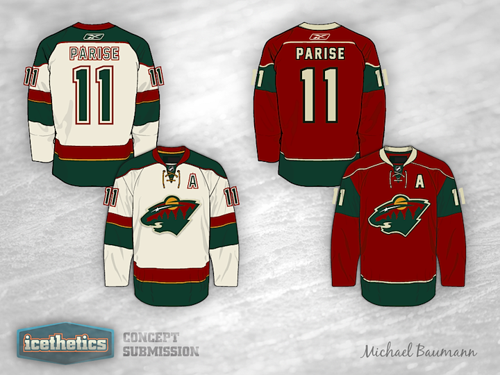
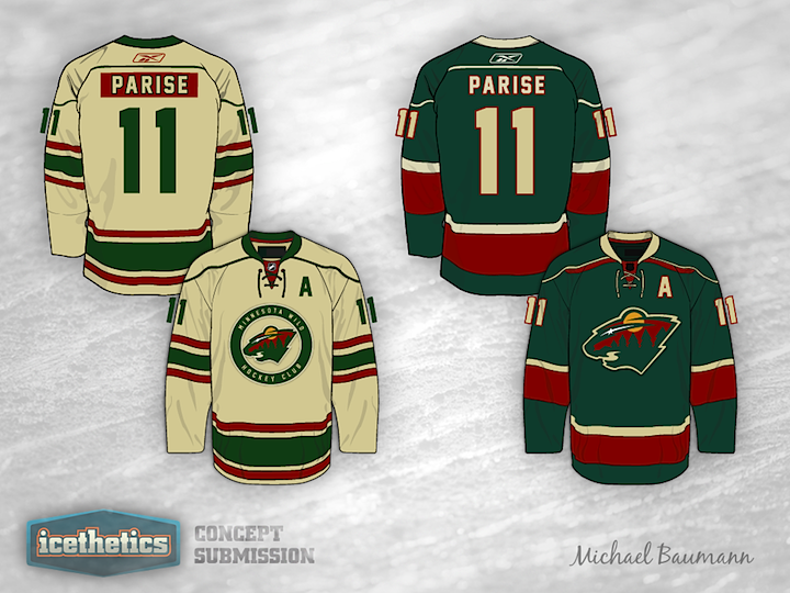
0151: That's Wild!

The recent addition of Zach Parise to the Minnesota Wild's roster got Michael Baumann thinking about new jersey design ideas. And it's just in time too. This is the first time we've seen the Wild since the Concepts page got a reboot. He's got a set of four sweaters here. Which one is your favorite?

Tuesday
Jul172012

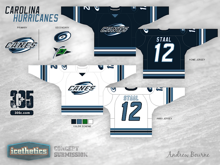
0150: Hurricanes Re-Bourne

Andrew Bourne's concept series continues today with a revised look for the Carolina Hurricanes.

What's wrong with the current red, black, white & silver scheme, you ask? Pretty much everything. The red does make sense in the fact that the flag warning system for indicating horrible weather conditions is red, but I'm not liking it. When I think hurricane, I think water and wind. Who first thinks of a red flag? Possibly people much smarter than I.

One year, I stumbled upon the hurricane toilet (in reference to the current Hurricanes logo). I actually kind of liked The Hurricane logo until I saw the toilet photo. Once you see something like that, you can't un-see it. So, I knew I had to do something drastic for The 305cHL Hurricanes. The primary logo is a mix of the Canes word mark and the swirling hurricane logo. I like the combination because you get a real sense of movement and you discourage the toilet...

Note: Sorry for the late post today. I didn't set my auto-publish date correctly. Better late than never though, right? Can't break the 150-day streak now!

Monday
Jul162012

0149: Ready for Take Off

The Winnipeg Jets have always been a popular subject on this page. But today we get something a little different. Chris Joannou put a lot of time into this one and I think it really shows.