Sunday
Jul152012

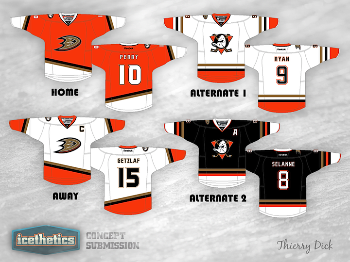
0148: Duck... Duck... Mighty!

All right, so on Friday I was just messing around with Ducks fans. Today, not so much. Thierry Dick has created a handful of great Anaheim sweaters that seem like they're only a moment away from being worn in an actual NHL game. Great look! Way to own the orange!

Saturday
Jul142012

0147: Sens See Red

I think this may be the first Ottawa Senators concept to show up here since this page was revamped. That's almost hard to believe. But today Ryan Yuck is happy to provide. My first thought was that it seemed a bit similar to the Devils, but actually it has a lot of unique features. Could you see the Sens sporting something like this in the future?

Friday
Jul132012

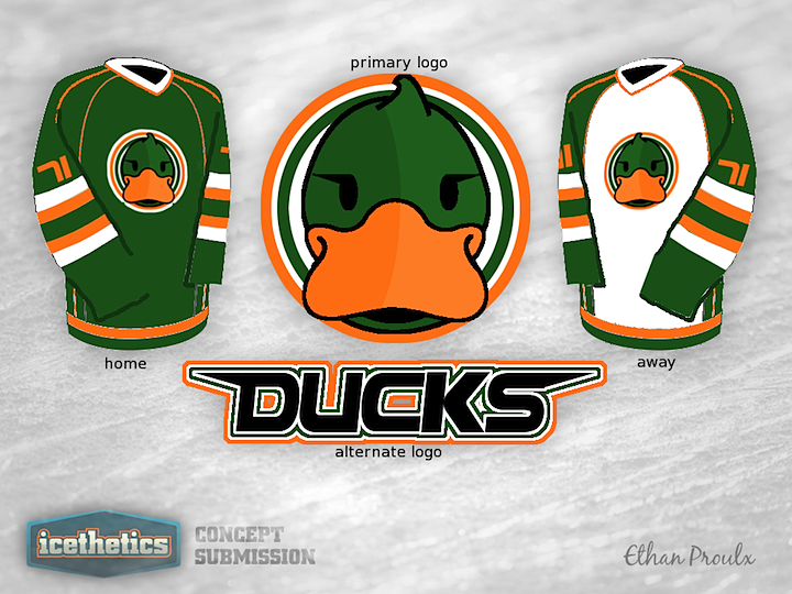
0146: Opposite Day

I knew we had another Friday the 13th coming up and this time I wanted something really memorable. Something that would be the complete opposite of what you'd expect to see on such an ominous day. Then I came upon Ethan Proulx's Ducks concept and I couldn't believe my luck. I don't have any words for this thing, so maybe you guys will. Comment away.

Thursday
Jul122012

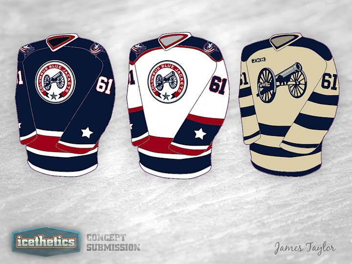
0145: Cannon Galore!

If there's one thing the Columbus Blue Jackets need more of, it's cannon. There are three cannon in this one concept alone by James Tyalor. What do you think? Should the third jersey logo become the primary mark some day?

Wednesday
Jul112012

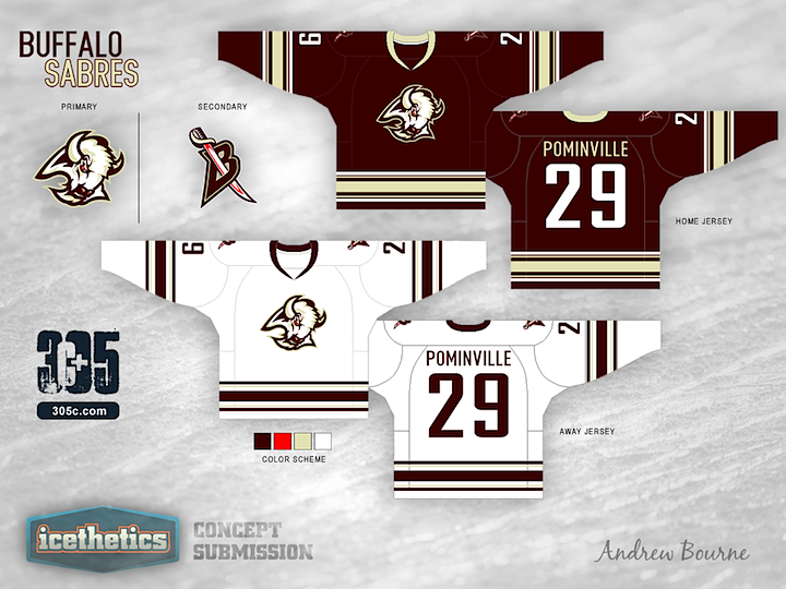
0144: Sabres Re-Bourne

Andrew Bourne's recurring series marks another installment here with the Buffalo Sabres. I'll admit, even I'm a bit skeptical on this one, but I'm curious to see the feedback it gets.

Although my reasoning for The 305cHL Buffalo color scheme might be laughable, at least I have a reason. I decided to ditch the blue and yellow from Buffalo because there is a blue epidemic in the NHL right now: teams with no blue in their color scheme are finding ways to use it in their 3rd jersey. So, one less blue team certainly wouldn't hurt. I believe that the team was onto something during their 'red and black era'. They looked intimidating. What I didn't like was the brightness of the red with the high contrast of the black.

I kept the bright red as a very small accent color and brought in a burgundy to replace the black. The change from yellow to light gold was to hint at the sabre and gives a regal element to the design. Finally, the laughable part: Buffalo can never escape from what they are known for. Yep, that's right, Buffalo Wings. No, I didn't want this team to literally be a buffalo wing with orange, red and brown swirls of color, but I did keep in mind that this is what Buffalo is known for. So, I kept the colors warm (red and gold) and tried to hint - if only slightly - to the big Buffalo claim-to-fame... Laugh now or forever hold your peace.

Tuesday
Jul102012

0143: Big D Green

We never tire of green NHL concepts around here. Alan John Herbert is all to happy to help us out with his creation for the Dallas Stars.

Monday
Jul092012

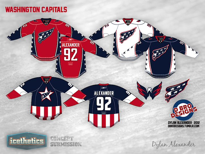
0142: Capital Patriotism

On the heels of yesterday's Team USA concepts comes this rather patriotic Washington Capitals design by Dylan Alexander. All of these are really cool options but none beat the Captain America-inspired alternate sweater. Count me as a fan!