0234: Jet Blues


Brian Brideau shares his two-tone blue Jets jersey today. It's a cool look but I'm not sure I'm a fan of the stenciled numbers and letters. (And I know, more blue. Hockey fans seem to like a lot of blue.)

|
Brian Brideau shares his two-tone blue Jets jersey today. It's a cool look but I'm not sure I'm a fan of the stenciled numbers and letters. (And I know, more blue. Hockey fans seem to like a lot of blue.)
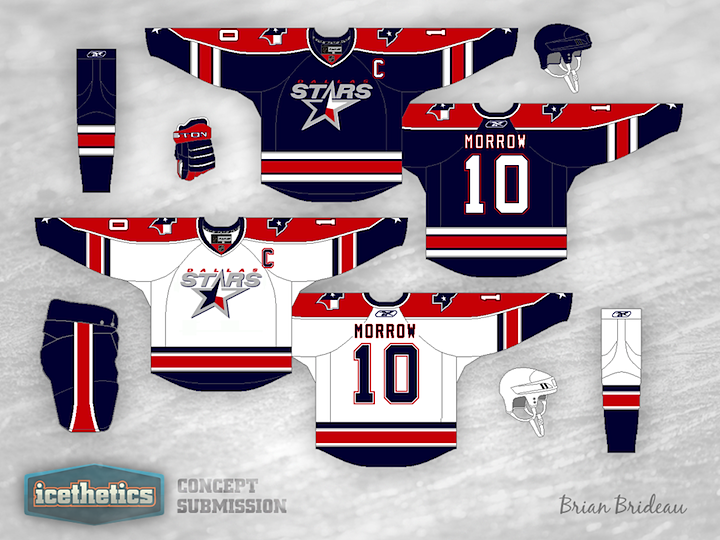
Don't expect the Dallas Stars concepts to slow down anytime soon. It's almost all I'm seeing. With a rebrand in the works for 2013, everyone's throwing their hat in the ring. Here, Brian Brideau suggests a color palette more in line with that of the team's home state of Texas. Is red, white and blue the way to go? Or do we already have too much of it in the NHL?
I can't explain it, but today feels like a Tampa Bay Lightning kind of day. And ever prolific, Brian Brideau has been working on a few different ideas. I'm sharing not one, not two, but three of them with you today!
Same idea for two different eras of Lightning hockey. And this last one is here just because I think it's too funny.
Brian decided to expand his series of Lightning jerseys to include the team's second logo, used between 2007 and 2011.
Bees. First thing I thought of when I saw this Bruins jersey by Brian Brideau. But as I keep looking at it, I can't help but like it. I realized that it's unlike any other jersey in the NHL because of one thing. There isn't a speck of white on it. Every other NHL jersey either has white or some variation (silver or something cream-like). It's true. Now, there's nothing wrong with white, I just think it might be something to see a jersey without it.
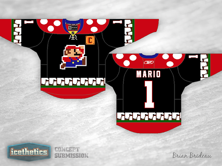
I'm not at all what you'd call a hardcore gamer, but when it comes to the Super Mario franchise, I can't get enough. That's why this is my favorite weekend of the year. Not only has Brian Brideau designed a Super Mario-inspired hockey sweater, but Mario Marathon 5 starts today!
Mario Marathon is an annual event in which a group of people in Indiana go nuts, playing Super Mario games nonstop while raising money for a charity that helps sick kids. They present a live stream of the marathon so everyone can watch their progress. It usually goes on for several days and always brings in an impressive amount of cash. I've watched bits and pieces of the marathon every year since they started, so I wanted to get in a plug.
While we're on the subject of video games, Dylan Alexander created this Pac Man hockey sweater which I think is pretty fantastic. Only thing it's missing is a Ms. Pac Man. No-Hockey Week wraps up tomorrow. Can you guess what the topic will be?
By the way, the Freak Out Friday feature returns next Friday. (Though if you think about it, Super Mario and Pac Man hockey jerseys are a bit freaky.)
Stars Week continues with a double feature. What if the New York Americans were still around? What might they look like today? These guys have a few ideas. Brian Bridea put together the first one. Very clean and simple. I could see it in use today. Of course something would have to be done to get the name on the back.
Meanwhile, Scott Saffran's design feels much less modern and more of a throwback. Maybe it's all that "vintage white" we love so much. It's still a neat look. Which of the two do you prefer?
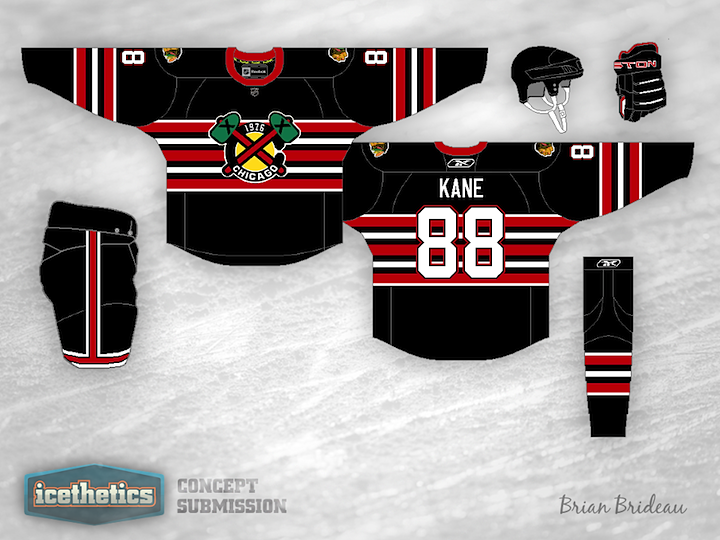
Today we're looking at some alternate jersey alternatives for the Chicago Blackhawks — both centered around the club's tomahawk-laden secondary logo. Brian Brideau's design actually doesn't use that logo directly, but rather a modified version that features the year of the team's founding. It could work great for a future Winter Classic what with the abundance of old-timey stripes and all.
Justin Wiltron's attempt is much simpler and to the point. Make it black and put the actual tomahawk logo on the front. Why hasn't this been done yet? It doesn't look bad at all. In fact, as Blackhawks jerseys go, I kind of like this one.