Entries in Colin May (13)

Tuesday
Jun122012

0115: The Stars of America's Capital

i
618 VOTES

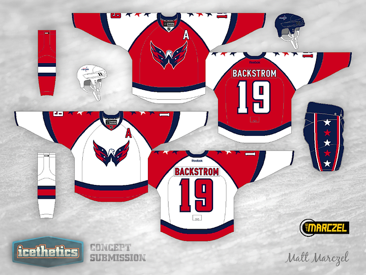
Another double feature on this Tuesday! Stars Week wouldn't be complete without a stop in America's capital city. In his Washington Capitals concept, Matt Marczel hasn't just added stars to the jerseys, he's added them to the logo as well. Look at these and tell me that "Weagle" logo doesn't belong on the front of a uniform. Granted, the stars may be a bit much.

i
513 VOTES

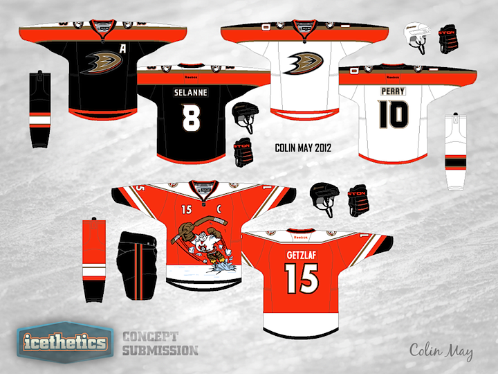
We have another prolific artist in Colin May who thinks the Caps jerseys need more stars. I find myself oddly enjoying the shoulder yoke on this one. You wouldn't think I'd like it that much in this context, but somehow it works. Got a favorite between these two?

Tuesday
Jun052012

0108: Bolts of Electricity

i
669 VOTES

It's my birthday and I'm celebrating with a Tampa Bay Lightning concept! You must be so surprised. This design is a little out there but I wouldn't mind it as an alternate. There certainly are a lot of lightning bolts all over it. Think it's too much? Or does it work?

Thursday
May312012

0103: A Novel Concept

i
649 VOTES

Today we're looking to Colin May's rather untraditional look for the Columbus Blue Jackets. I kind of like the sash-style striping, but I wouldn't cut it off there, I'd go all the way over the top and around the back.

Saturday
May052012

0077: Steel Town in the '70s

i
641 VOTES

New series this weekend. I'm shelving the Winter Classic stuff for a while in favor of Retro Weekends! We'll save it for special throwback-inspired jersey designs like this one from Colin May. The colors call back to the Pittsburgh Penguins from the 1970s. It's actually a neat look.

Saturday
Mar242012

0035: Pinstripes on Ice

i
643 VOTES

On this Winter Classic Weekend, we look beyond 2013. If the pattern we've seen over the years persists, it won't be long before the New York Rangers are back in action on the outdoor ice — and with hosting duties, to boot. If the Broadway Blueshirts were to, say, host the Islanders at Yankee Stadium, perhaps their uniforms could pay tribute to the sport normally housed there — baseball. Basically, Colin May shows us what it might be like if the Rangers were to adopt Yankees pinstripes. It's a cool look, but definitely the wrong sport.

Monday
Mar052012

0016: Mixing Old & New in SoCal

i
654 VOTES

Colin May proposes mixing the old and new for the Anaheim Ducks. Back in the late '90s, the Mighty Ducks, as they were known, used a sweater design quite similar to these. Think they looked better in jade and eggplant or the more modern orange and black? What do you think of the old logo coming back? (And before you comment on the misspelling of Selanne... we know.)

Page 1 2