Entries in anaheim ducks (32)

Friday
Jun012012

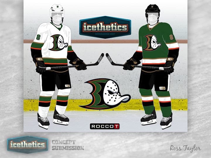
0104: The Brand-Blended Ducks

This week, Ross Taylor continues his brand-blending series by merging the new Ducks with the old Mighty Ducks — and throwing in a little green for good measure. I love the colors but I'm not sure the webbed D and the duck mask work all that well together.

Tuesday
May082012

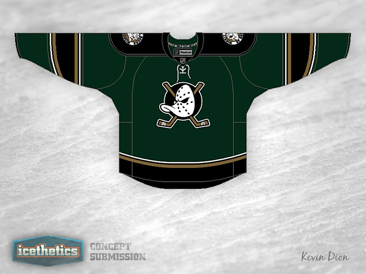
0080: Southern California Green

California Week rolls on with another shot of green in Anaheim. Kevin Dion proposes a rather dark jersey that swaps the Ducks' orange for a rarer hue. Of course that classic Disney logo is back on the front. What do you think of the overall feel of this one?

Wednesday
Apr112012

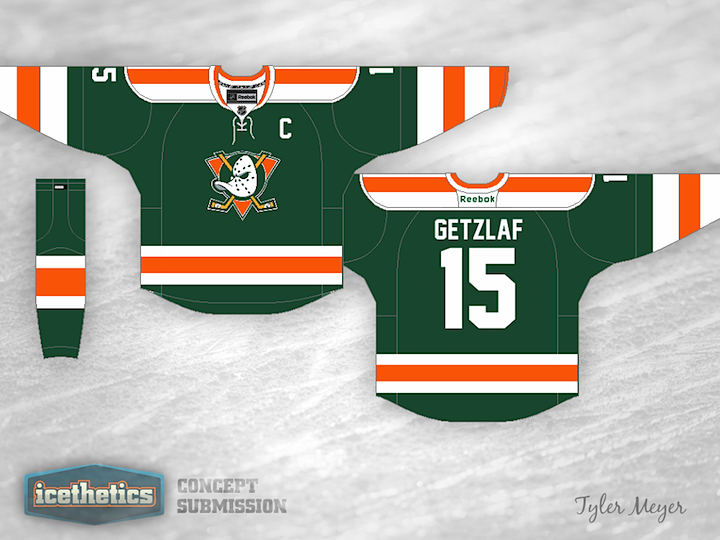
0053: Duck... Duck... Green!

In concept designing efforts, we often talk about the difficulty of finding a unique color scheme for a given team. I think Tyler Meyer has found the perfect one for the Ducks in green and orange. It has three things going for it in the color department alone: it's brighter, has no black, and lots of green! I even like the giant stripes on this jersey. Between this and the Kings concept I posted on Monday, the Pacific Division could look pretty amazing if Icethetics concept artists had their way.

Monday
Mar052012

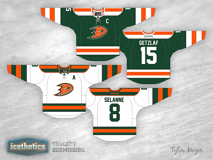
0016: Mixing Old & New in SoCal

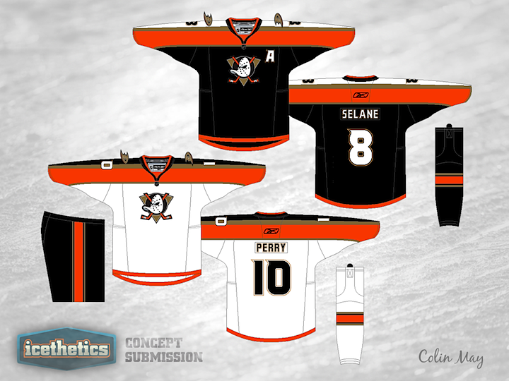
Colin May proposes mixing the old and new for the Anaheim Ducks. Back in the late '90s, the Mighty Ducks, as they were known, used a sweater design quite similar to these. Think they looked better in jade and eggplant or the more modern orange and black? What do you think of the old logo coming back? (And before you comment on the misspelling of Selanne... we know.)

Page 1 ... 1 2 3 4 5