Entries in anaheim ducks (32)

Thursday
Mar212013

0397: The Ducks Do Orange

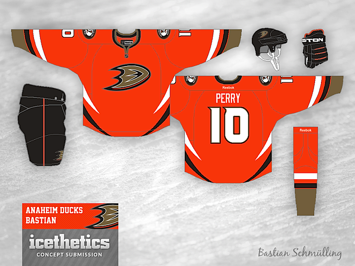
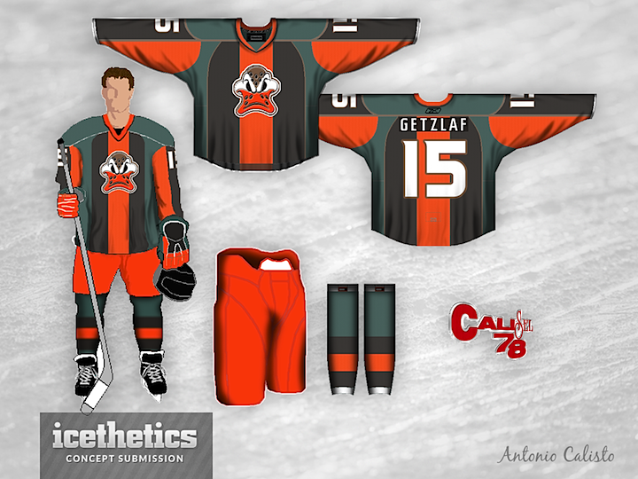
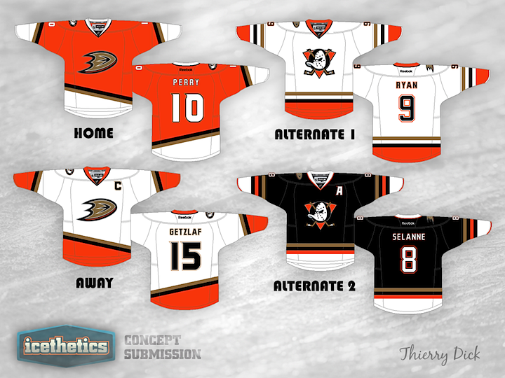
Orange. It's usually reserved just for the Flyers. But on Tuesday we saw how it could work for the Oilers. Today, Bastian Schmülling shows us what a sharp orange sweater could look like for the Anaheim Ducks. As orange Ducks jerseys go, I'm a big fan of this one. Am I alone there?

Friday
Dec142012

0300: Anaheim Freak Out

The Concepts page reaches another milestone today. Our 300th concept falls on a Freak Out Friday, so check out what Antonio Calisto has come up with for the Anaheim Ducks.

Saturday
Nov242012

0280: Waddell's Winter Classic, Part 3

The Waddell Brothers' Winter Classic series continues today with Part 3 — with two more teams chosen by you, the readers. Chance and Jake have produced retro-style sweaters for all 30 NHL teams and we're revealing them two at a time every Saturday. Last week, "P85" was first to comment and picked Anaheim and Florida for this week, so here they are.

Once again, first to comment gets to choose the next two teams. Remember, we've already done the Penguins, Kings, Rangers, Islanders, and now the Ducks and Panthers. Good luck!

Thursday
Oct182012

0243: Make Them Mighty Again

This is a classic merging of old and new. Tyler Johnson has given the Anaheim Ducks uniforms the retro treatment adding in old colors and logos. But one thing I really like about this one is the thin orange stripe. I won't go so far as to say it's good design, but it pops in a way I don't hate. What do you think? Should the Ducks have taken a similar route for their third jersey?

Sunday
Jul152012

0148: Duck... Duck... Mighty!

All right, so on Friday I was just messing around with Ducks fans. Today, not so much. Thierry Dick has created a handful of great Anaheim sweaters that seem like they're only a moment away from being worn in an actual NHL game. Great look! Way to own the orange!

Friday
Jul132012

0146: Opposite Day

I knew we had another Friday the 13th coming up and this time I wanted something really memorable. Something that would be the complete opposite of what you'd expect to see on such an ominous day. Then I came upon Ethan Proulx's Ducks concept and I couldn't believe my luck. I don't have any words for this thing, so maybe you guys will. Comment away.

Monday
Jul022012

0135: Ducks Re-Bourne

I'm launching a new concept series today from artist Andrew Bourne. He asked if I'd feature his rebranding series, tackling the entire NHL. I told him I'm game so you'll start seeing his work here every few days, starting with the Anaheim Ducks.

Now, what Andrew's doing doesn't exactly fall under the category of "rebranding" in my book. He's changing colors and redesigning jerseys and so forth. Instead, I'm calling his series "Re-Bourne." Hope you get a kick out of it, as I have. Below and in subsequent posts you'll find Andrew's explanation of his work.

Although the orange streak in the current jersey format connects Anaheim geographically (Orange County), I'm not a fan. The orange is a bit too distracting in the Black, Gold and White color palette. It seems to really jump out and take all of your eye's attention. So, I decided to mute the colors a bit and return to a near replication of the Jade & Eggplant. The green is a bit darker than the original, less teal and more 'pond scum' green. The eggplant was tweaked to a more full purple which worked well with the black.

You don't see a lot of asymmetrical jerseys in the NHL, or AHL... or KHL for that matter. Why? Because they usually don't work. I can't say that my idea will work, but I believe that it could work. In the current jersey, Anaheim has a few curved stripes from left to right across the bottom. I liked that idea but I didn't like how it just stops on the left edge of the jersey, leaving a strange black area. The sleeves in the third jersey have a simple striping similar to the bottom, except one side has purple while the other has green. It gives the alternate sweater a sense of asymmetry without actual asymmetry. Make sense? Probably not...