Entries in anaheim ducks (32)

Wednesday
Jul102013

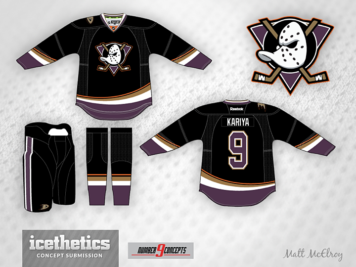
0508: Eggplant Revival

Matt McElroy has been all over the IceHL Project lately. He's had five logos adopted by the league — and now leads all designers in that area — and submitted plenty of jersey designs. So why not let him take over the Concepts page for a day as well? Here we have his take on a Ducks jersey involving the return of eggplant and that classic duck mask. I still think it's a bit dark with all that black. What about you?

Saturday
Jul062013

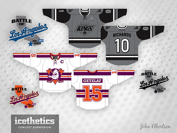
0504: Battle of Los Angeles

We've got another Stadium Series concept for this Winter Classic Weekend. John Elbertson plots out a couple of completely new Kings and Ducks uniforms for the game at Dodger Stadium. What do you think? Curious to hear what everyone says about this one.

Monday
Jul012013

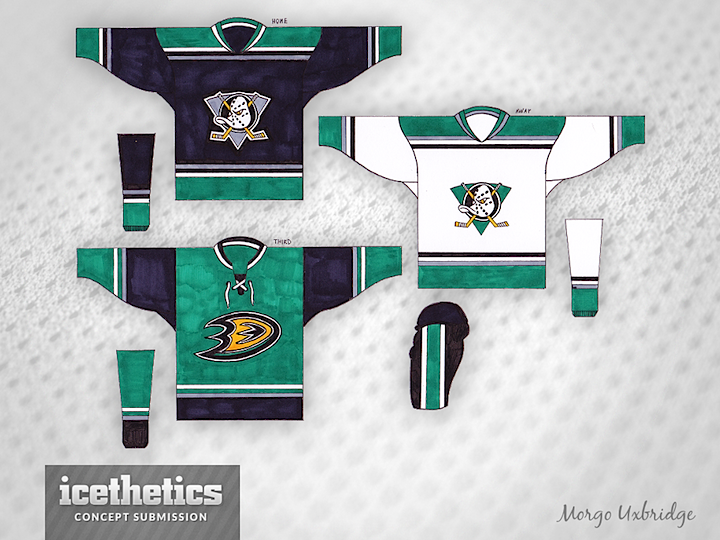
0499: Mighty Ducks by Hand

Morgo Uxbridge is back with another hand-drawn concept, this time for the Ducks. The new logo is worked brilliantly into the club's old Mighty Ducks branding. Just proves you don't need a computer to create an awesome uniform concept. It's a fantastic style.

Saturday
Jun152013

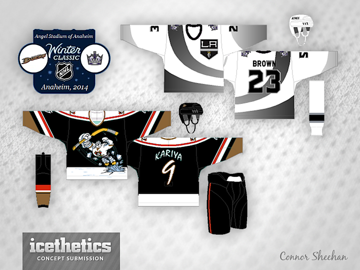
0483: Outdoor Hockey in Sunny CA

One of six outdoor NHL games scheduled for next winter will take place in Los Angeles when the Kings host the Ducks. Connor Sheehan proposes a couple of jerseys inspired by a special game played back in the winter of 1996. Who could forget those original third jerseys?

Friday
Jun072013

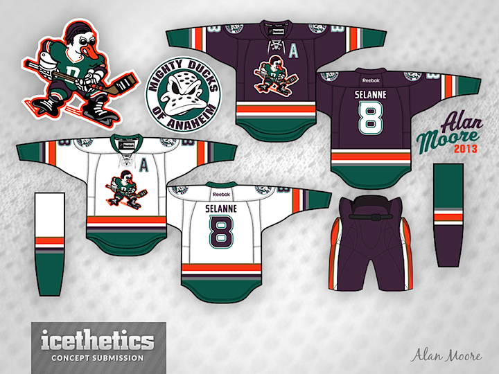
0475: Disney Duck Freak Out

The Ducks seem to be an easy mark for Freak Out Fridays. But I really love what Alan Moore has done both in terms of color scheme and adapting the logo from those classic Mighty Ducks movies. If not for the logo, I might make a case for these jerseys to one day hit the ice in Anaheim.

Friday
May032013

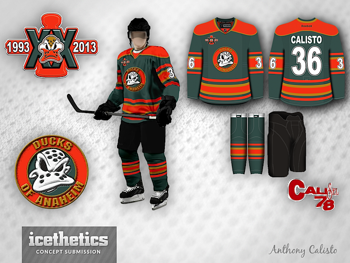
0440: Ducks Turn Twenty

The Anaheim Ducks will mark their 20th anniversary next season. Check out what Antonio Calisto has cooked up for the occasion. (And this isn't his first time playing with Anaheim.)

Wednesday
May012013

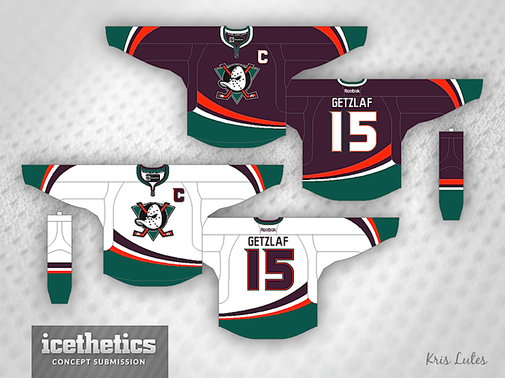
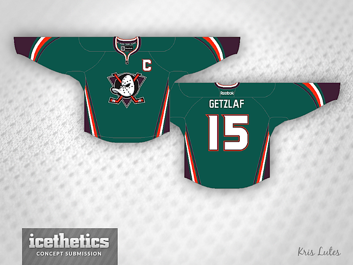
0438: Eggplant and Orange

When the Anaheim Ducks rebranded back in 2006, they lost their unique color scheme in favor of black and orange — already owned by the Flyers. Sure, there's a bit of gold in there, but it's underused. Kris Lutes put together a concept that sort of merges the new and old looks of the team by adding orange their old eggplant and jade palette. I think it would look fantastic on the ice!

Also, as you may have noticed, I'm debuting a new concept template today. It features a jersey material background texture now, replacing the old ice. Think it fits better with what we do here on a daily basis.