Sunday
Sep302012
0225: Alaska Anchorage Seawolves
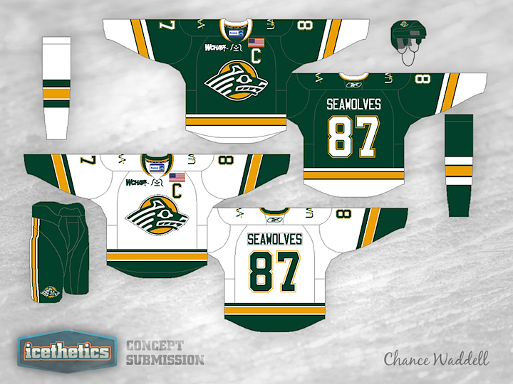
Another month is already gone but today does bring us another University Sunday. Chance Waddell sent in this look for the University of Alaska Anchorage. Count me as a fan!


Another month is already gone but today does bring us another University Sunday. Chance Waddell sent in this look for the University of Alaska Anchorage. Count me as a fan!
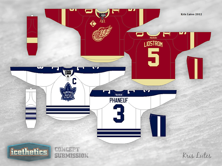
Here's another Detroit-Toronto Winter Classic concept. I'm posting this even as we wait for word on whether the game will even be played at all. I like this one because it's simple and quickly identifiable. Nobody turning on the TV on January 1 would have to look twice to see which teams were playing. Now let's just hope they get to play.
 Kris Lutes

It almost doesn't need words. Geil S. seems to be imagining what the Red Wings logo might look like if it sat next to a mirror. And being posted on a Freak Out Friday isn't to say this is a bad logo. Just very, very different.
Geil Schock
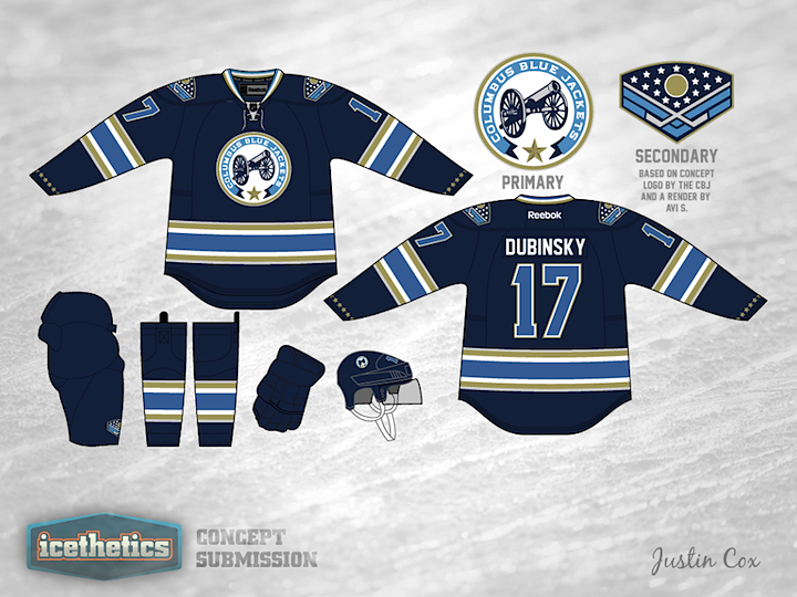
This week seems to be all about changing the color palettes of existing teams. So why not give it a shot in Columbus? If the Stars were to switch to red, white and blue, maybe the Blue Jackets could switch away from it. Justin Cox infuses some gold into a design inspired by the club's alternate jersey. It's a pretty sharp look and would certainly be unique in the NHL.
Justin Cox
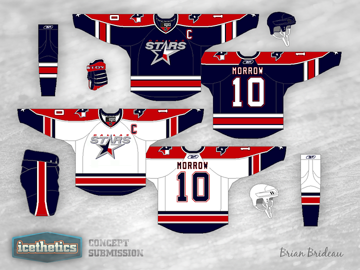
Don't expect the Dallas Stars concepts to slow down anytime soon. It's almost all I'm seeing. With a rebrand in the works for 2013, everyone's throwing their hat in the ring. Here, Brian Brideau suggests a color palette more in line with that of the team's home state of Texas. Is red, white and blue the way to go? Or do we already have too much of it in the NHL?
Brian Brideau

Michael Ozolnieks offers a new spin on the classic NJ logo used by the Devils.
Michael Ozolnieks
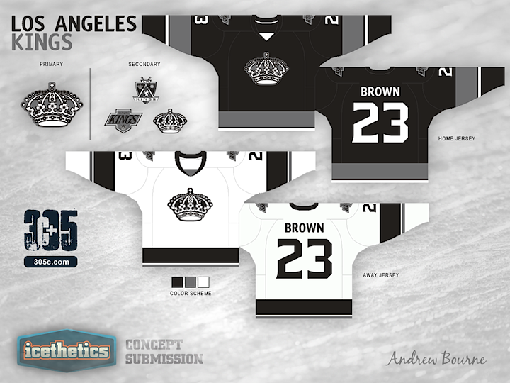
Andrew Bourne is back with the next team in his NHL makeover series. What are you thoughts on his monochromatic yet rather retro redo for the L.A. Kings?

Andrew Bourne 