Sunday
May272012

0099: Two Ways to Use the Tomahawks

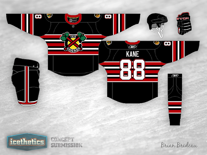
Today we're looking at some alternate jersey alternatives for the Chicago Blackhawks — both centered around the club's tomahawk-laden secondary logo. Brian Brideau's design actually doesn't use that logo directly, but rather a modified version that features the year of the team's founding. It could work great for a future Winter Classic what with the abundance of old-timey stripes and all.

Justin Wiltron's attempt is much simpler and to the point. Make it black and put the actual tomahawk logo on the front. Why hasn't this been done yet? It doesn't look bad at all. In fact, as Blackhawks jerseys go, I kind of like this one.

Saturday
May262012

0098: Every Color Except Green

It seems like green is the only jersey color that the Vancouver Canucks haven't used. They've had yellow, black, red, purple (let's be honest about that gradient-happy third from the 90s), and two different shades of blue. So seriously, why not green? Justin Cox has assembled a jersey with some historical elements and created what's actually a nice-looking uniform. I'm impressed. What do you think?

Friday
May252012

0097: The Chicago Cougar Hawks

A cougar hawk doesn't sound like anything I'd ever want to come across in the wild. Let alone Chicago. But of course it's Friday once again and that means Ross Taylor is on top of things blending brands and what not. So, half of this concept is clearly the Chicago Blackhawks, but does anyone here remember the Chicago Cougars? You might if you were around between 1972 and 1975 and followed the WHA.

So this Freak Out Friday is kind of a double feature. The concept above was Ross's revised set. Below you'll find the one he originally sent me — the one he wasn't as much a fan of.

Mainly, he didn't like how the crest turned out with the hockey rink shape. I don't blame him. The reason I'm even posting it is so you could get an idea of what the dark jersey might look like. But since they're both here, which do you prefer?

Thursday
May242012

0096: Roadrunners Resurrected

Minor League Week is wrapping up this time around with the old Phoenix Roadrunners of the ECHL. Ryan Haslett put together this new look for the defunct team and I thought it was worth sharing. Tomorrow is Friday so that means Ross Taylor is back again. Want to guess which team he has in store this time?

Wednesday
May232012

0095: Chicago Canucks

I know it's Minor League Week, but this just has to be wrong in so many ways. Alan Moore's Chicago Wolves look a lot like the Vancouver Canucks of the '90s. Of course that's by design but it's still a strange sight to see. And just for fun, he threw in a couple of alternate designs.

Tuesday
May222012

0094: Nashville Admirals

During the last Minor League Week, we got a look at what would happen if certain teams redesigned their uniforms to look more like their NHL affiliate. The Milwaukee Admirals' parent club is the Nashville Predators so Ricky Hajduk shows us what that would look like.

Monday
May212012

0093: Redesigning Rockford

The concept art keeps coming in so it's time for another Minor League Week here at Icethetics. We're getting started with the AHL's Rockford IceHogs. Dylan Alexander says he was always a fan of the team's old "pig butt" logo so he's brought it back for this set of sweaters.

But that's not all...

Benjamin Boese wanted to try something a little simpler as an alternate jersey for the IceHogs. What do you think of these two sets?