Sunday
Jun032012

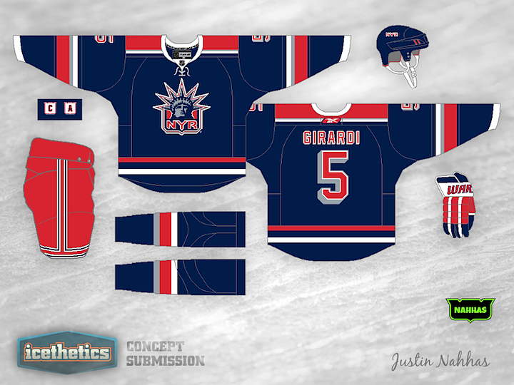
0106: Lady Liberty Liberated

Anyone else been missing the Rangers' Lady Liberty logo? Justin Nahhas created this look, which I think is even better than the original uniform from the mid-90s.

Saturday
Jun022012

0105: Black for the Winter Classic

I'm not saying the Philadelphia Flyers should take part in their third Winter Classic in the near future, but if the time comes, this would be an excellent uniform option! Mason Hesse put together this design that, while completely new, feels very much like a throwback. What do you think? Is this one case where black might actually work?

Friday
Jun012012

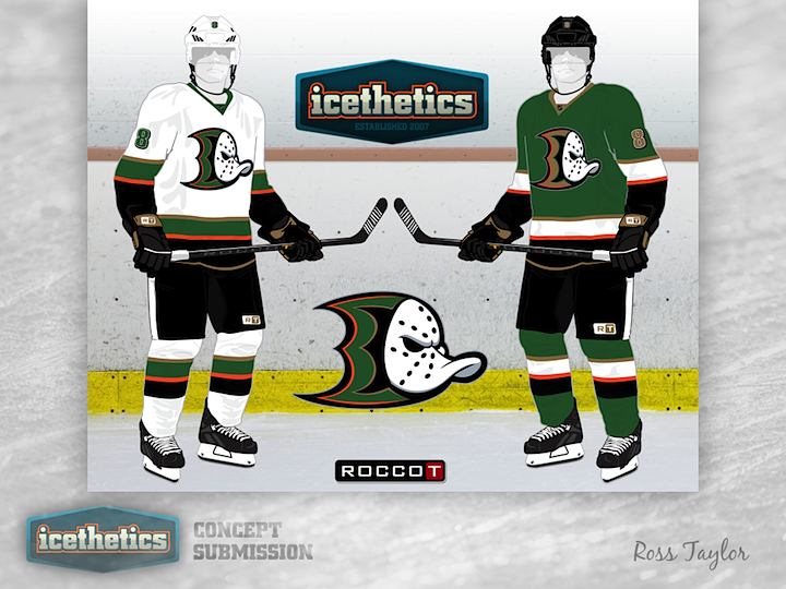
0104: The Brand-Blended Ducks

This week, Ross Taylor continues his brand-blending series by merging the new Ducks with the old Mighty Ducks — and throwing in a little green for good measure. I love the colors but I'm not sure the webbed D and the duck mask work all that well together.

Thursday
May312012

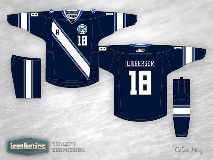
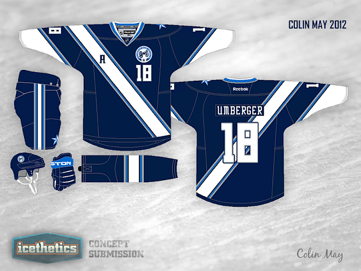
0103: A Novel Concept

Today we're looking to Colin May's rather untraditional look for the Columbus Blue Jackets. I kind of like the sash-style striping, but I wouldn't cut it off there, I'd go all the way over the top and around the back.

Wednesday
May302012

0102: Sabres with Swords

One of the gripes I hear a lot is about how the Buffalo Sabres logos tend to feature the animal for which the city is named as opposed to the weapon for which the club is. Jake Bartal's concept deals with that issue pretty well. But then I've never minded the Buffalo sports franchises allowing the symbol of their city to represent them. What's your take?

Tuesday
May292012

0101: Lighting the Way

According to the Islanders, their black third jersey is here to stay for a while. But the most common complaint I've heard, beyond the fact that it's black, is that it doesn't have a logo. And what could be a better logo for this team than a lighthouse? Kevin Dion set out to design a black alternate for the Isles with that in mind. And the best part is that the team already has a lighthouse logo in its history. But it's been overshadowed by the frozen seafood character that was placed on the front of the jersey. I'm guessing it won't be popular simply because it's black, but I think it actually works as a third color for the Islanders. How about you?

Monday
May282012

0100: A Hundred Concepts and Counting...

When I relaunched the Concepts page earlier this year, who really thought I'd be able to keep it going for 100 straight days? I know I've been flaky about this aspect of Icethetics in the past, but clearly you guys are enjoying it and I've finally found a way to keep it fresh.

That said, hitting triple digits seems like a special occasion we should mark. In honor of that and the 2012 Stanley Cup Final about to begin, how about this...

Following the overtime victory that sent the New Jersey Devils on to the final round of the playoffs to face the Los Angeles Kings, Matthew Henderson had an idea. He emailed me this pair of mutant logos in the vein of Ross Taylor's recent Freak Out Friday series.

Sure, this concept might be better suited to Friday, but sadly there are no Fridays between now and the start of the last playoff series of the season. Plus, I didn't want to make you guys wait to see this. I think they're pretty clever and pretty funny.

But since this is a special occasion — and so as to ground this post in reality a little bit — here are some more normal concepts for the NHL's conference champions.

I've been hanging on to this concept from Matthew Beck for a while. It has a very cool soccer-y feel. I'd love to see an NHL team try an idea like this some time, but it is a little out there.

And from Chance Waddell we get a new iteration of a black alternate for the Devils that will probably never happen. I know, we're a bit put off by the lack of color in the Stanley Cup series this year and adding more black wouldn't exactly help the cause. Still, it is something I'd like to see New Jersey try in the future. You know, when black is cool again.