Sunday
May202012

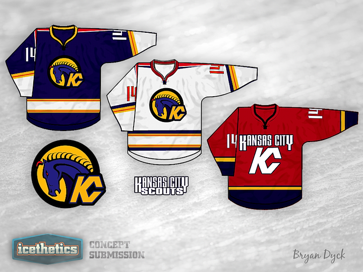
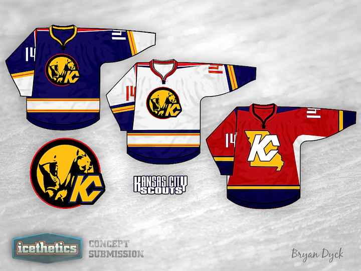
0092: Kansas City Scouts

Here's an interesting one for our Retro Weekend. Bryan Dyck is bringing back the old Kansas City Scouts with a whole new look. Tomorrow we kick off another Minor League Week.

Saturday
May192012

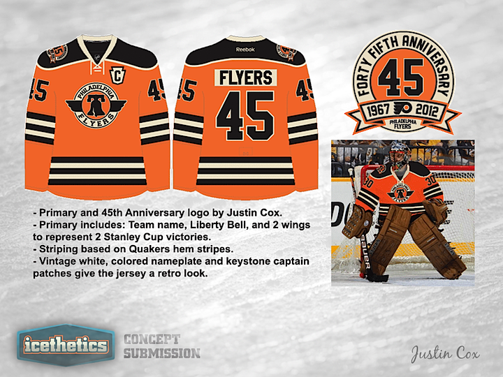
0091: 45 Years of the Flyers

The Philadelphia Flyers' 45th anniversary is around the corner and the subject of this half of the Retro Weekend. Justin Cox has put together a couple of logos and a jersey. Frankly, it's the best Liberty Bell-inspired logo I've seen yet.

Friday
May182012

0090: Two Kinds of Jets

In this week's Freak Out Friday, Ross Taylor is merging the two incarnations of the Winnipeg Jets. The pair of hockey sticks in the logo is pretty clever. So what do you think? Is it better than either of the two real-life looks?

Thursday
May172012

0089: Vintage Blackhawks

Recently, Micah Loyed's work was the subject of a concepts series called Vintage Week. Afterward, he wanted to throw in one more idea. This is what he put together for the Blackhawks. I really do like the simplified crest design.

Wednesday
May162012

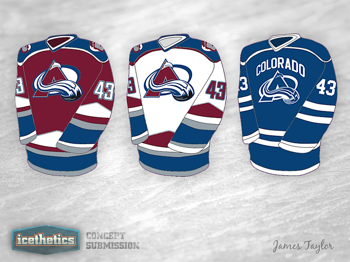
0088: Fixing the Avalanche

I keep seeing emails and comments asking when the Colorado Avalanche are going to finally fix their uniforms. I don't have an answer to that, but James Taylor has an idea about how they could do it. The wordmark notwithstanding, I actually like the monotone blue third jersey. Not a bad set here.

Tuesday
May152012

0087: Fixing the Islanders Third

There was some confusion in last week's NHL JerseyWatch update as to whether the Islanders would be altering or even dropping their new black third jersey. They put the rumors to bed with a tweet from their official Twitter account, but that doesn't mean we can't improve the jersey on the Concepts page. Matt Marczel has this to offer.

Monday
May142012

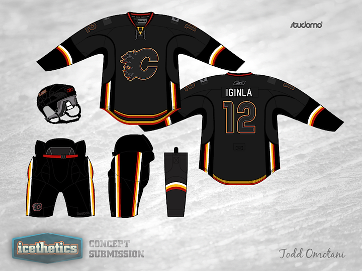
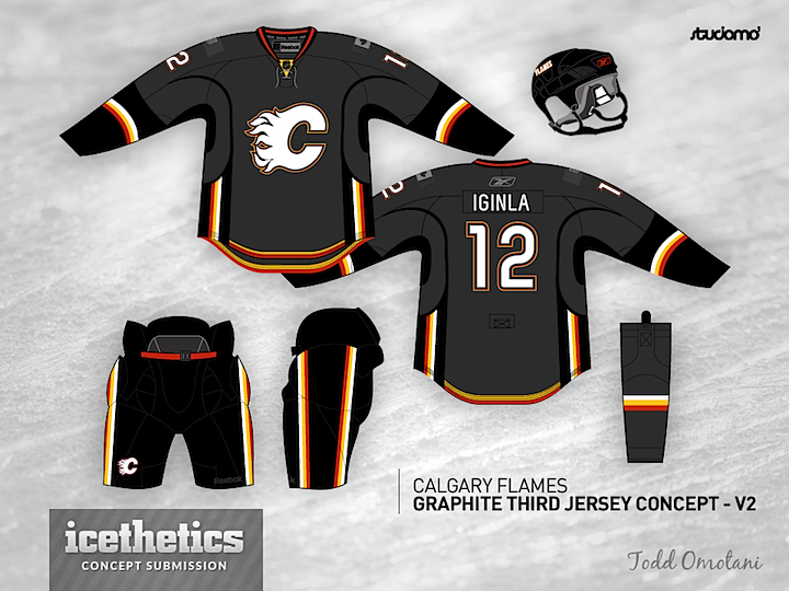
0086: Darkness Over Calgary

Hey, look! It's a Monday without an L.A. Kings concept. Weird. Seriously though, I wanted to go with a team we haven't had a concept for yet. And this one by Todd Omotani for the Calgary Flames is pretty cool, even if it wouldn't necessarily work in a game situation. Way too dark. It looks great. All the black and grey really make the red and yellow stand out. Looks a lot more fiery.